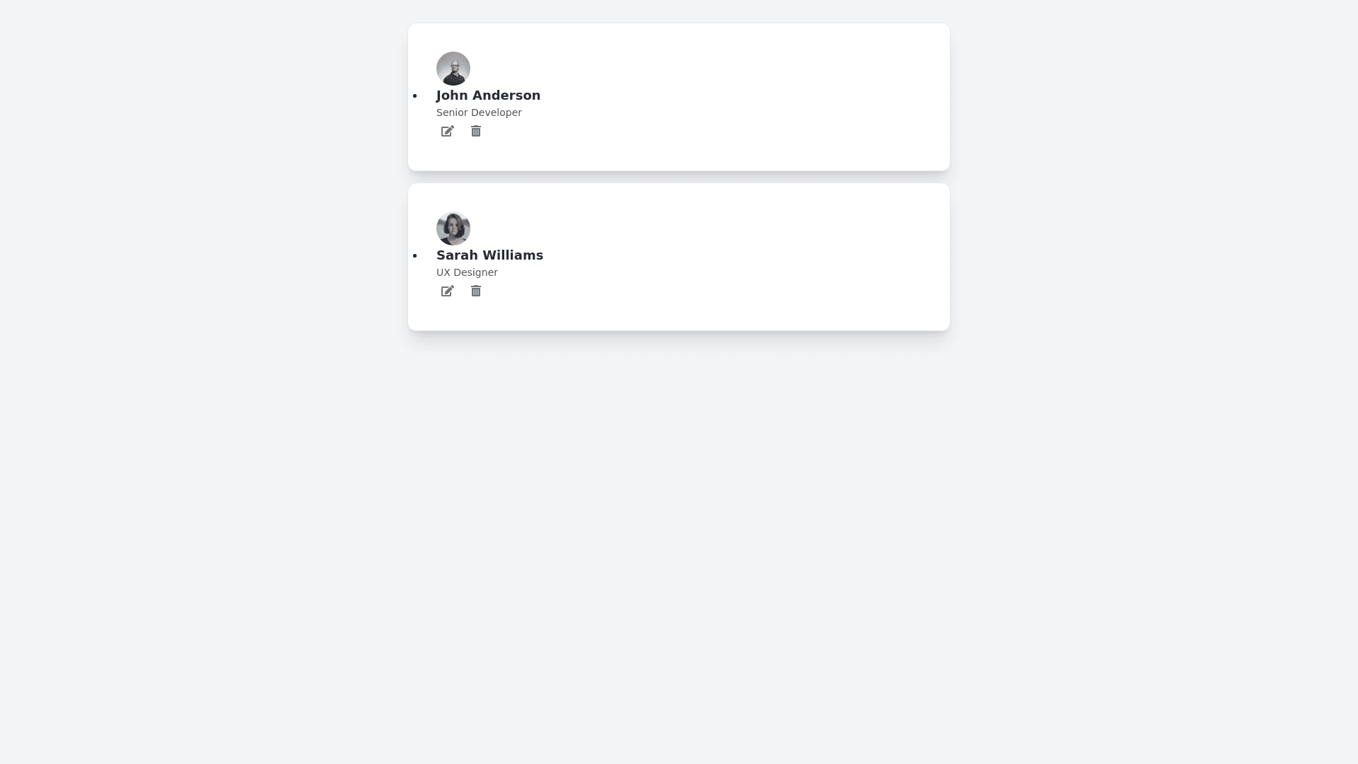
Material Design List - Copy this Html, Tailwind Component to your project
Generate-HTML,-CSS-(using-Tailwind-CSS),-and-JavaScript-code-for-an-advanced,-premium-list-component-inspired-by-Material-Design-principles.-The-list-should-have-a-sleek,-modern-appearance-with-enhanced-interactivity-and-animations,-and-the-following-features:-List-Structure-and-Layout:-List-Container:-The-list-should-be-displayed-within-a-card-like-container-with-rounded-corners-(rounded-xl),-a-subtle-shadow-(shadow-xl),-and-padding-on-all-sides-(p-6).-The-background-color-should-be-light-(e.g.,-bg-white)-with-a-slight-shadow-and-border-(border-border-gray-200)-for-a-premium-look.-List-Items:-Each-item-should-display-an-avatar-on-the-left,-a-title,-a-subtitle-or-description,-and-optional-icons-or-action-buttons-on-the-right.-Items-should-have-a-hover-effect-that-slightly-lifts-and-highlights-the-item-(scale-105-with-shadow-md-on-hover).-Each-item-should-have-a-subtle-divider-(border-b-border-gray-200)-between-it-and-the-next-item.-Titles-should-be-bold-(font-semibold),-with-secondary-text-slightly-smaller-(text-sm-text-gray-600)-and-spaced-below-the-title.-Interactivity-and-Animations:-When-a-user-hovers-over-an-item,-it-should-have-a-subtle-background-color-change-(hover:bg-gray-50)-and-a-smooth-scale-up-effect-(scale-105)-with-a-shadow.-Each-item-should-have-a-smooth-transition-for-these-effects-(transition-all-duration-300-ease-in-out).-Add-icons-on-the-right-side-for-actions-like-Edit-or-Delete.-When-hovered,-these-icons-should-change-color-to-indicate-interactivity.-Expanding-List-Item-Feature:-Include-an-"expand"-feature-where-clicking-on-a-list-item-expands-it-to-show-additional-content-(e.g.,-description,-extra-details)-within-a-smooth-accordion-style-animation.-Use-JavaScript-to-toggle-the-expansion,-and-ensure-the-expanded-section-has-a-smooth-fade-in-effect-(opacity-0-to-opacity-100)-and-slide-down-transition-(transform-scale-y-100).-Responsive-Design:-Ensure-the-list-is-fully-responsive-and-adapts-to-screen-sizes-from-mobile-to-desktop-using-Tailwind’s-responsive-utilities-(sm:,-md:,-lg:).-For-smaller-screens,-adjust-the-layout-so-that-avatars,-titles,-and-icons-stack-neatly.-JavaScript-Features:-Add/Remove-List-Items:-Include-a-JavaScript-function-to-dynamically-add-or-remove-list-items-with-smooth-animation-effects-(e.g.,-slide-down-for-adding-and-fade-out-for-removing).-Expandable-Content-with-Accordion-Animation:-Add-JavaScript-functionality-to-toggle-the-expanded-section-within-each-list-item.-When-expanded,-ensure-the-focus-is-on-the-content-for-accessibility,-and-provide-a-smooth-scale-or-slide-transition.-Hover-and-Focus-Accessibility:-The-list-should-be-keyboard-accessible,-allowing-users-to-navigate-items-using-the-"Tab"-key.-Ensure-focus-outlines-are-styled-consistently-(focus:ring-2-focus:ring-blue-500)-to-indicate-which-item-is-selected.-Styling-and-Classes:-Use-the-following-classes-for-styling:-Container:-bg-white-rounded-xl-shadow-xl-p-6-border-border-gray-200-List-Items:-flex-items-center-p-4-rounded-lg-hover:bg-gray-50-transition-all-duration-300-ease-in-out-Titles-and-Descriptions:-font-semibold-text-lg,-text-sm-text-gray-600-Expanded-Section:-opacity-0-scale-y-0-transition-transform-duration-300-ease-out-Icons:-w-5-h-5-text-gray-500-hover:text-blue-600-transition-colors-duration-200-Provide-both-the-HTML-and-the-CSS-(using-Tailwind-CSS)-and-JavaScript-code-to-create-this-advanced,-modern-list-component-with-interactivity,-animations,-and-responsive-design.
