Advanced Reporting Module - Copy this React, Tailwind Component to your project
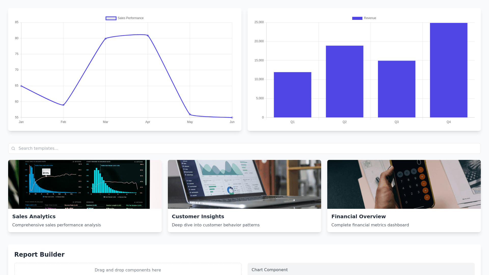
UI Design Concept for the Advanced Reporting Module Design Overview The UI for the Advanced Reporting module should emphasize clarity, customization, and interactivity, allowing users to effortlessly create, analyze, and share financial reports. The design will include the following sections: Interactive Dashboards A visually rich landing screen with widgets, live data visualizations, and user customization tools. Report Library A dedicated section for accessing pre built templates and saved custom reports. Report Builder A drag and drop workspace for creating and customizing reports. Export and Share Panel Tools for exporting and scheduling reports in various formats with branding options. Wireframe Details 1. Interactive Dashboards Header: Quick access navigation to Dashboards, Report Library, and Report Builder. A search bar with filters for timeframes, departments, and key metrics. Main Content: Dynamic Widgets: Interactive cards displaying real time financial data, such as Revenue, Expenses, Profit Margin, and Cash Flow. Customization Toolbar: Drag and drop panel to rearrange widgets, apply filters, or add new visualizations. Drill Down Charts: Interactive bar graphs, line charts, and pie charts with hover details and clickable drill down links. Sidebar: Quick filters for data sources (e.g., ERP, stock feeds). Alerts for significant updates (e.g., expense overages). 2. Report Library Header: Category Tabs: Pre built templates, Custom Reports, and Saved Drafts. A "Create New Report" button for quick access to the Report Builder. Main Content: Report Cards: Thumbnail previews of reports with quick action buttons: View: Open the report. Edit: Customize the report. Export: Save in a preferred format. Filters: Dropdown menus for categories like compliance standards (GAAP, IFRS) or industry specific templates. Action Toolbar: Bulk actions for export, share, or delete. 3. Report Builder Header: Undo/Redo buttons, Save as Draft, and Export. Formula Bar: For adding custom metrics (e.g., ROI, EBITDA). Main Content: Drag and Drop Workspace: Add tables, charts, and text blocks from the Component Library on the right panel. Resize and reposition elements with grid snapping. Data Filters: Left side panel with dropdowns to refine data by department, time frame, or metrics. Footer: Real time data sync status. "Help" icon linking to tutorials. 4. Export and Share Panel Modal Popup (triggered by Export button): Format Selection: Tabs for PDF, Excel, PowerPoint, and CSV. Customization Options: Add organizational branding. Include specific date ranges or visualizations. Automation: Scheduling options for recurring reports (daily, weekly, monthly). Sharing Options: Email to stakeholders directly or save to cloud platforms (e.g., Google Drive). 5. Additional Features Accessibility Tools: A toggle for dark mode. Font size adjuster. Mobile View: Responsive design for on the go access. Simplified dashboard widgets and easy access to recent reports. Color Palette Primary: Deep Blue (#264653) for a professional look. Accent: Golden Yellow (#E9C46A) to highlight actionable items. Background: Light Gray (#F4F4F4) for clean contrast. Charts and Graphs: Vibrant hues for clear data visualization. Typography Headings: Open Sans Bold. Body Text: Roboto Regular. Icons: Material Design Icons.