Gradient Animation - Copy this React, Tailwind Component to your project
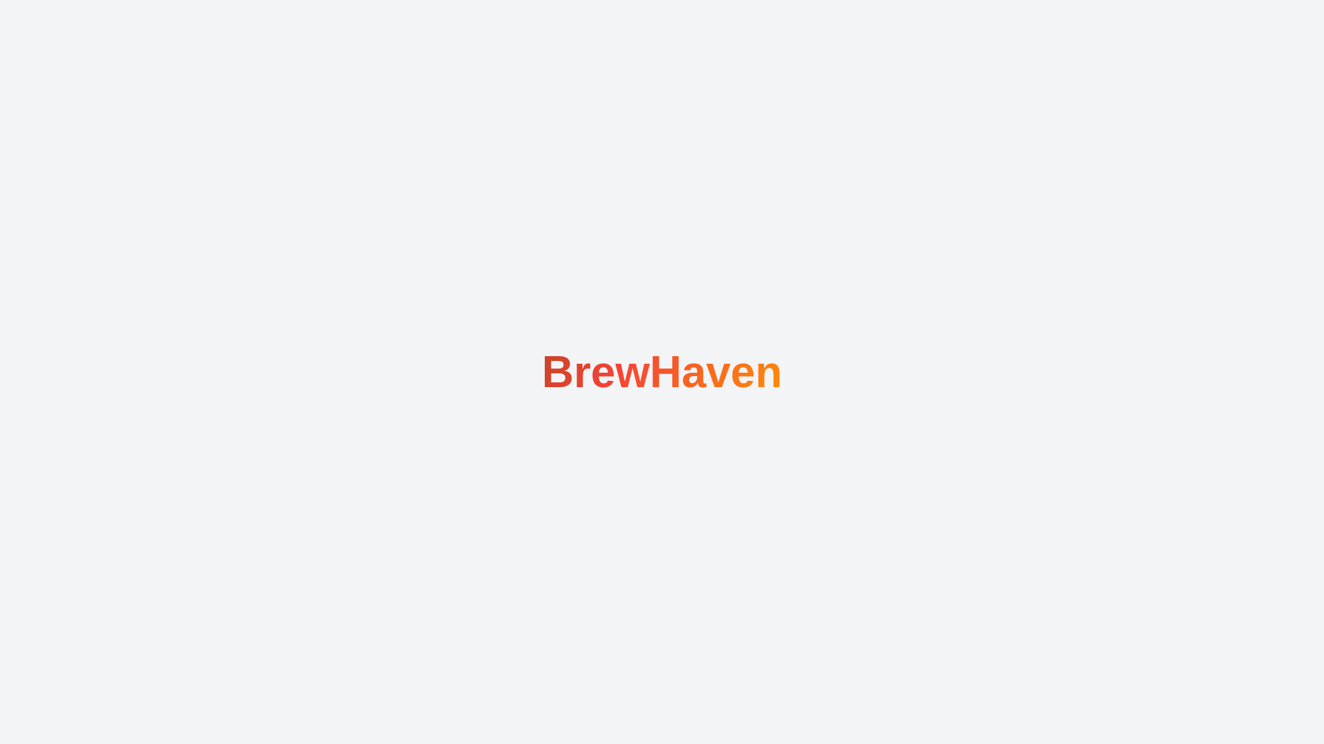
The goal is to create a visually striking <p> element that features the text "BrewHaven" with an animated gradient color effect. The text should not only be aesthetically pleasing but also convey a sense of motion and vibrancy, drawing the viewer’s attention through a smooth and continuous transition of colors. Design Concept: Text Style and Size: Begin with a bold, modern font that is large enough to make the text stand out. The font size should be significant to ensure the gradient effect is prominent. Aim for a font weight that enhances readability while providing a strong visual impact. For example, use a font size of around 4rem to ensure the text is easily visible and impactful. Gradient Color Scheme: Use a gradient that transitions between a carefully chosen palette of colors: yellow, green, orange, red, and brown. This color scheme not only provides a lively and engaging visual effect but also reflects a sense of warmth and richness. The gradient should start with a soft yellow, transitioning through a vibrant green, then to a bright orange, followed by a rich red, and finally ending with a deep brown. This sequence should create a harmonious flow that is both pleasing to the eye and dynamic. Animation Effect: The text should feature an animation that makes the gradient color appear to move and change over time. This can be achieved by animating the background gradient, creating a sense of movement and energy. The animation should be smooth and continuous, with the gradient shifting in a subtle, flowing manner. Aim for a duration of around 8 seconds for a complete cycle to ensure the transition is gradual and aesthetically pleasing. The movement should not be too abrupt; instead, it should mimic the natural flow of colors blending into one another. Implementation Details: To achieve this effect, use CSS techniques to apply the gradient and animation to the text. The gradient should be applied as a background to the text, with the text itself being rendered in a way that allows the gradient to show through. Using properties like background clip and text fill color ensures that the gradient is visible within the text while keeping the text itself clear and readable. The animation can be managed using keyframes to define the gradient’s movement, adjusting the background position to create a seamless transition. Visual Impact and User Experience: Ensure that the final design is not only visually appealing but also enhances user experience. The gradient animation should be smooth and not overly distracting. It should complement the overall design rather than overpower it. The text should remain readable and clear, with the animation serving as a dynamic enhancement rather than a distraction. Conclusion: By carefully selecting a vibrant color palette and implementing a smooth gradient animation, the <p>BrewHaven</p> text design will achieve a visually engaging effect that captures attention and adds a dynamic element to the design. The goal is to create a fluid and harmonious color transition that enhances the text's appearance while maintaining readability and visual interest.
