Apple Navbar - Copy this React, Tailwind Component to your project
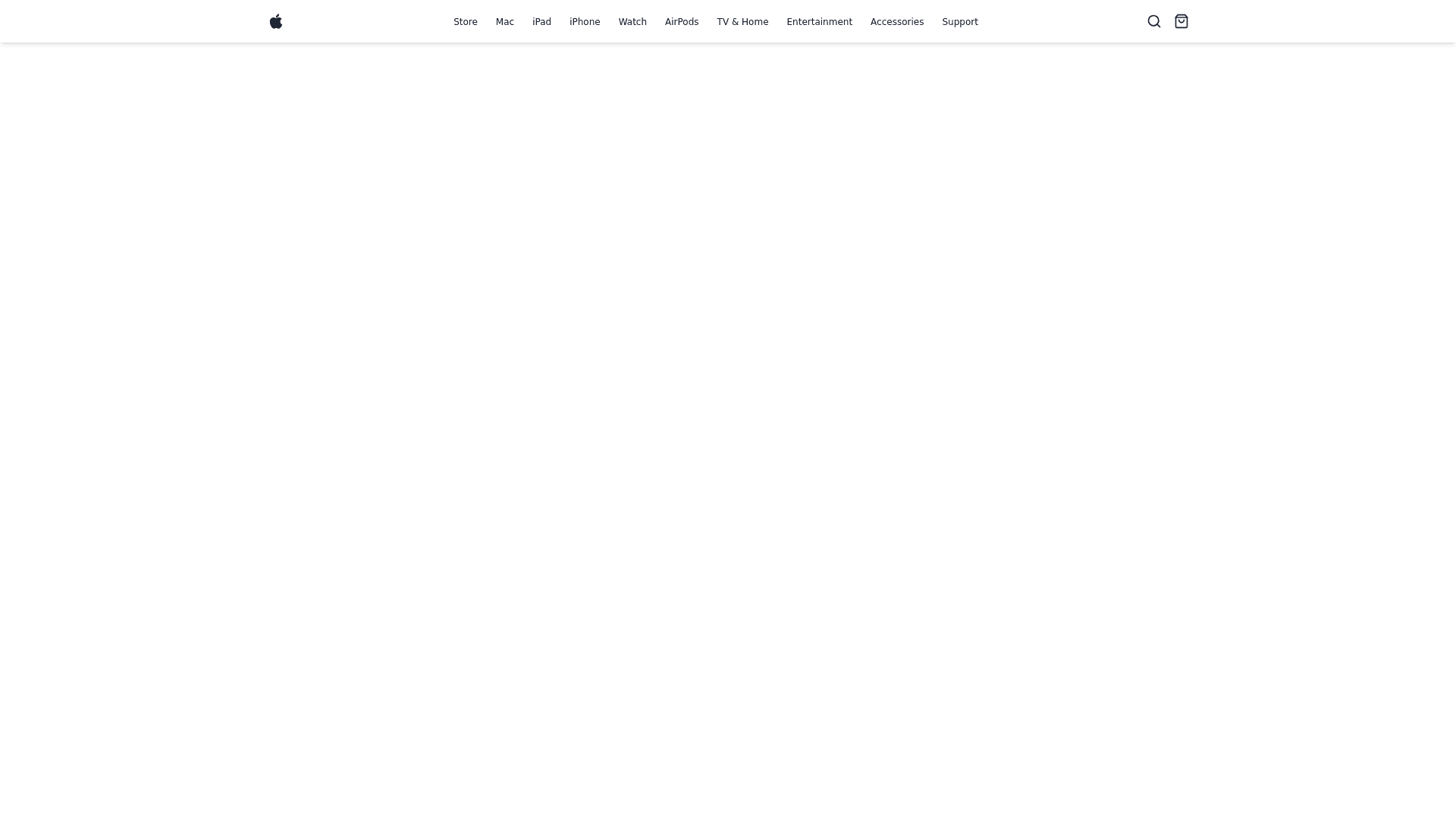
Replicate the exact navigation bar layout from Apple's website, as shown in the provided image: Font Style & Size: Use Apple's system font (San Francisco) or a similar modern sans-serif font with precise sizing for the navbar items. Each navbar item (Store, Mac, iPad, iPhone, etc.) should have consistent spacing between them, matching Apple's minimalist and clean design. Icons: Place the search icon on the right side of the navbar, followed by the shopping bag icon. Ensure these icons are in line with the text items, maintaining a balanced horizontal alignment. Navbar Layout: Create a horizontal navbar with evenly distributed items, centered in the middle. The icons (search and cart) should be floated to the right. The Apple logo should appear on the far left of the navbar, keeping it minimalistic like Apple's design. Hover Effects: Implement a subtle hover effect for each of the navbar items, like changing the font weight or color on hover to match Apple's user interface behavior. Responsive Design: Ensure the navbar is responsive. On smaller screen sizes, the spacing between the items should adjust without overcrowding. Consider using a hamburger menu for mobile, while keeping the full layout intact for larger screens. CSS: Write minimal CSS using Flexbox for the layout, ensuring that the items are horizontally centered with space between each item. Match the navbar's height, item spacing, and alignment exactly as shown in the image. Colors: Use a white background for the navbar, black text for the items, and neutral colors for the icons (black/grey). Positioning & Alignment: The entire navbar should be centered horizontally on the page with equal padding on both the left and right sides, ensuring perfect symmetry."