Asset Dashboard - Copy this React, Tailwind Component to your project
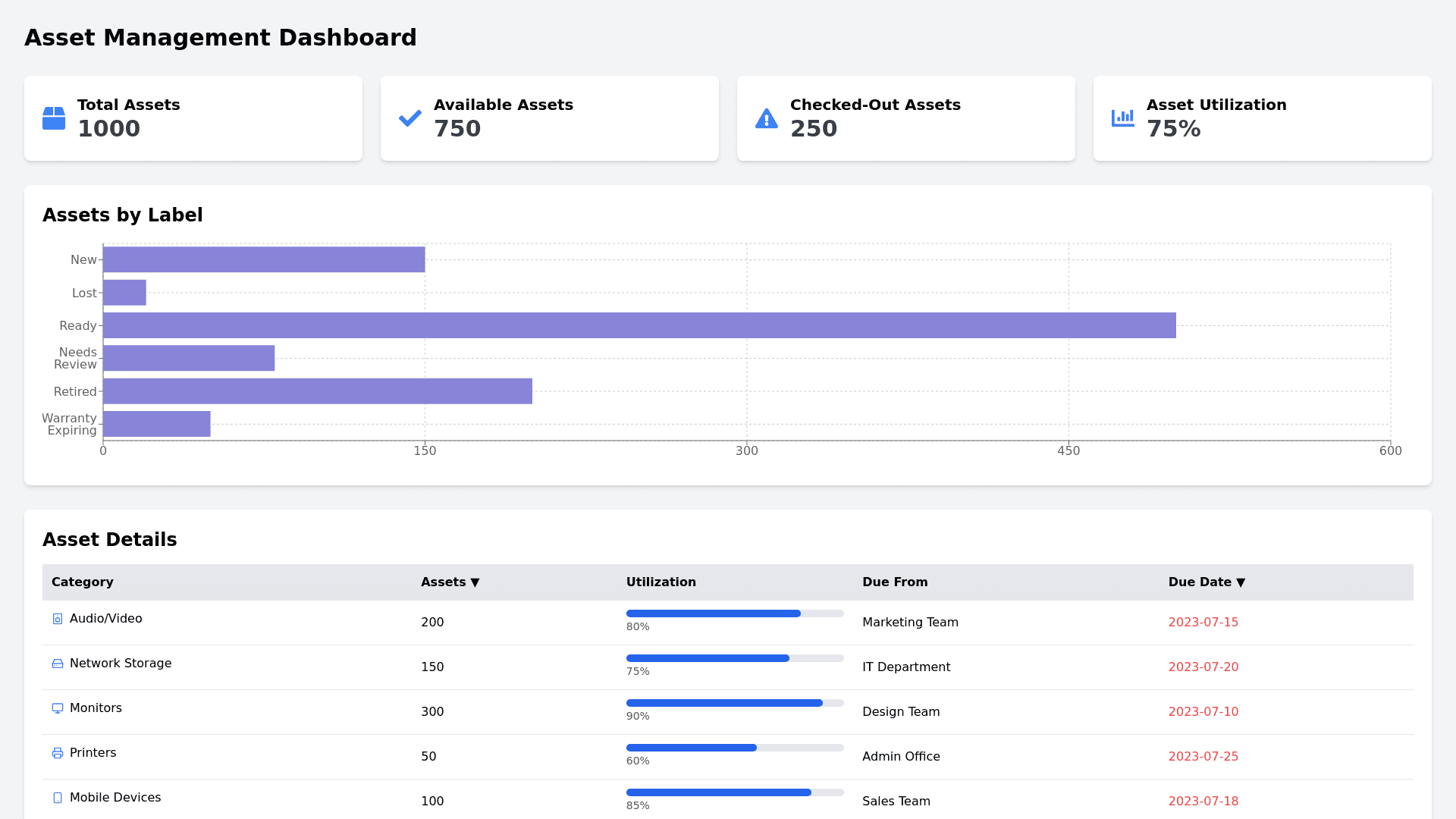
Create a responsive web dashboard for an asset management system with a clean and structured layout. The page should display the following key components: Header Section: Total Assets, Available Assets, Checked Out Assets, and Asset Utilization: Design rectangular cards at the top displaying summary statistics with icons on the left side. The cards should display: Total Assets (e.g., "12") Available Assets (e.g., "1") Checked Out Assets (e.g., "10") Asset Utilization percentage (e.g., "83%") Use a light background color for the cards and bold, easy to read fonts for the values. Main Graph Section (Assets by Label): Assets Distribution by Status: Below the summary cards, include a horizontal bar chart or graphical representation displaying assets categorized by labels like "New," "Lost," "Ready," "Needs Review," "Retired," and "Warranty Expiring." Each label should be represented in different colors, with a number of assets displayed in each category (e.g., 2 in "New," 1 in "Lost"). Use a muted color palette with soft pastels, such as blue for "New" and green for "Ready," for a clean and modern look. Table Section (Asset Details): Category Table: Design a table layout under the chart with columns for asset categories and statistics: Category: Include icons next to each category name, like "Audio/Video" or "Network Storage." Assets: Number of assets in each category. Utilization: Display percentages of asset usage in this column with aligned values. Due From: Names of individuals or teams responsible (e.g., "Operations Manager"). Due Date: Upcoming due dates in red font for clarity. The table should allow users to sort columns by "Assets" or "Due Date," with sortable icons or arrows next to the headers. Footer and UI Considerations: Use a minimalistic design with ample white space: Focus on using a light background and soft borders around sections to create a visual hierarchy. Ensure that icons are used sparingly but effectively to guide the user without overwhelming them. Typography and Colors: Use sans serif fonts for a modern, clean look. Color coding: Red text for critical information (e.g., overdue assets), green for available assets, and pastel tones for the overall dashboard to maintain consistency and readability. Interactive Features: Ensure that elements like table headers are clickable for sorting, and the dashboard updates in real time based on asset status changes. Allow hovering over sections of the graph or table to display tooltips with additional details. This dashboard should provide an intuitive user experience for asset managers to quickly monitor the status of their assets, upcoming due dates, and utilization rates at a glance.