Auth Forms - Copy this React, Tailwind Component to your project
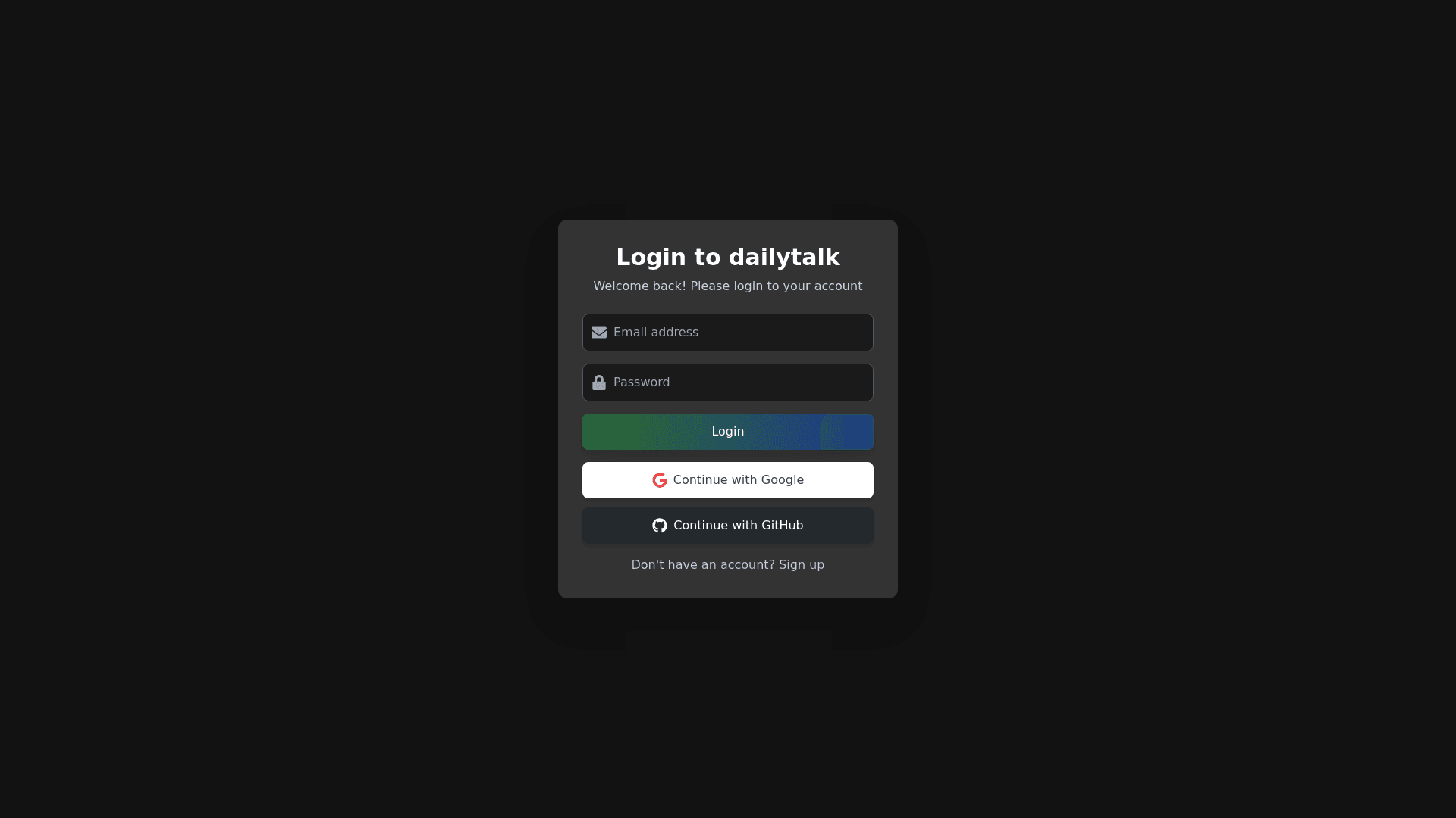
Generate a modern and sleek user interface for login and sign-up forms for a chat application called "dailytalk". The interface should have a black color scheme as the main theme, with complementary colors that create a stylish and balanced look. The forms should include options for login via Google and GitHub. Here are the details: 1. **Login Form**: - A title "Login to dailytalk" with a clean, modern font. - Two input fields: one for username (or email) and one for password. - A "Login" button with a gradient mix of black and a rich color like dark green (#2C6B2F) or dark blue (#1E3A8A) that fits with the black theme. - Login buttons for Google and GitHub, each with their corresponding logo and distinctive colors (Google’s red, blue, yellow, green, and GitHub’s black and white). - A link below the button saying "Don’t have an account? Sign up" (styled like a button or link, and colored with a light grey or light blue accent). - Background should be dark (#121212 or #1A1A1A) with the form container having a slightly lighter shade of grey (#333333) to make the form pop. - Rounded corners and subtle shadows to give the form a modern touch. 2. **Sign-Up Form**: - A title "Create an Account" with a clean, modern font. - Three input fields: username (or email), password, and confirm password. - A "Sign Up" button with a vibrant gradient (mix of dark green or dark blue like in the Login button). - A link below the button saying "Already have an account? Log in" (similar style to the link in the login form). - The sign-up form should follow the same design guidelines as the login form for consistency. 3. **General Styling**: - Use black as the primary background color, with accents in dark shades of blue (#1E3A8A) and green (#2C6B2F) for buttons and links. - Input fields should have a dark border with a hover effect (e.g., slightly lightened border on focus). - Buttons should have hover effects (e.g., darker shade on hover or a subtle glow effect). - Font should be clean and modern, such as Arial, Roboto, or Montserrat. - The overall design should be minimalistic with smooth rounded corners, subtle drop shadows, and consistent padding. - The layout must be responsive and work well on both desktop and mobile devices. - For the Google and GitHub login buttons, ensure their branding colors (Google’s red, blue, yellow, green and GitHub’s black and white) are incorporated in a minimalistic and stylish way that fits the overall dark theme. 4. **Colors**: - **Primary color**: Black (#121212), dark grey (#333333) for the background. - **Accent colors**: Dark Green (#2C6B2F), Dark Blue (#1E3A8A) for buttons. - **Text color**: White (#FFFFFF) for form labels and inputs. - **Button colors**: Google red, blue, yellow, green for Google login button, GitHub black and white for GitHub login button. - **Links**: Light grey or light blue (#B0C4DE). 5. **Special Instructions**: - Buttons for Google and GitHub login should be clearly distinguishable, each with its own branding colors. - The form should be centered on the page, with the rest of the page having a dark background to create focus on the form. - The sign-up process should be seamless with minimal distractions, so the form layout should not be too cluttered.
