Billing Section - Copy this React, Tailwind Component to your project
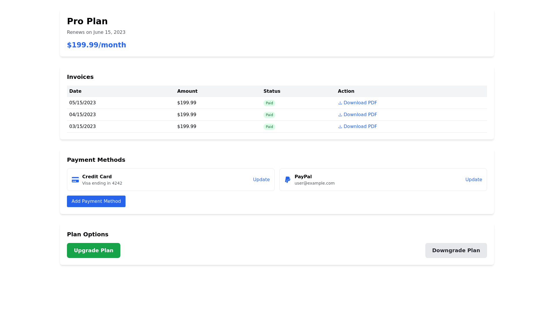
Billing Section Design for SaaS App Overall Design Principles: Minimalist Aesthetic: Light backgrounds with accent colors for important elements (e.g., buttons, amounts). Consistent Typography: Clear hierarchy with headings, body text, and labels. Use sans serif fonts for a modern look. Accessibility Focus: Sufficient contrast, large clickable areas, and responsive design for easy navigation. Desktop Layout 1. Billing Overview Card Location: Top section Components: Current Plan: Large font, bold. Renewal Date: Smaller font, regular weight. Next Billing Amount: Highlighted with accent color. Design: Card with subtle shadow, rounded corners, clear dividers. 2. Invoices Section Location: Below Billing Overview Design: Tabular layout for easy scanning. Columns: Invoice Date: Date format (MM/DD/YYYY). Amount: Currency format with color coding (green for paid, yellow for pending, red for overdue). Status: Clear labels with color coded backgrounds. Actions: “Download/View PDF” link. Hover Effects: Row highlighting for better visibility. 3. Payment Methods Section Location: Below Invoices Components: List of existing payment methods (e.g., credit card, PayPal). Add/Update buttons with clear action labels. Each method displayed in a card format with: Last four digits for cards. Provider logos (e.g., Visa, PayPal). 4. Plan Upgrade/Downgrade Options Location: Bottom section Components: Clear upgrade and downgrade buttons. Tooltips explaining differences in plans. Design: Prominent buttons, large enough for easy clicking. Mobile Layout 1. Billing Overview Card Design: Stacked vertically, remains at the top. Tappable Areas: Large and finger friendly. 2. Invoices Section Design: Card view for mobile. Components: Each invoice displayed in a card with: Invoice date, amount, status, and action buttons. Scrolling: Allow horizontal scrolling for quick navigation through cards. 3. Payment Methods Section Design: Stacked vertically. Components: Clear add/update buttons. Compact view of existing methods. 4. Plan Upgrade/Downgrade Options Design: Stacked vertically with buttons clearly separated. Components: Accessible buttons with confirmations to prevent accidental clicks. UI/UX Considerations Clarity and Feedback Use clear headings and subheadings for each section. Implement loading indicators and success/failure messages for actions. Error Prevention Tooltips and confirmations for critical actions (e.g., changing plans). Inline validation for forms (e.g., when adding payment methods). Performance Optimization Minimize image sizes for faster load times on mobile. Optimize CSS and JavaScript to ensure quick responsiveness. Visual Style Color Palette: Light backgrounds (white or light gray) with accent colors (blue, green, orange) for action buttons and important notices. Button Styles: Rounded corners, shadows for depth, hover effects on desktop. Icons: Modern, simple icons for payment methods and actions. Accessibility Ensure contrast ratios meet WCAG standards. Provide alt text for icons and images. Design interactive elements with sufficient padding for easy tapping.