Login Page - Copy this React, Tailwind Component to your project
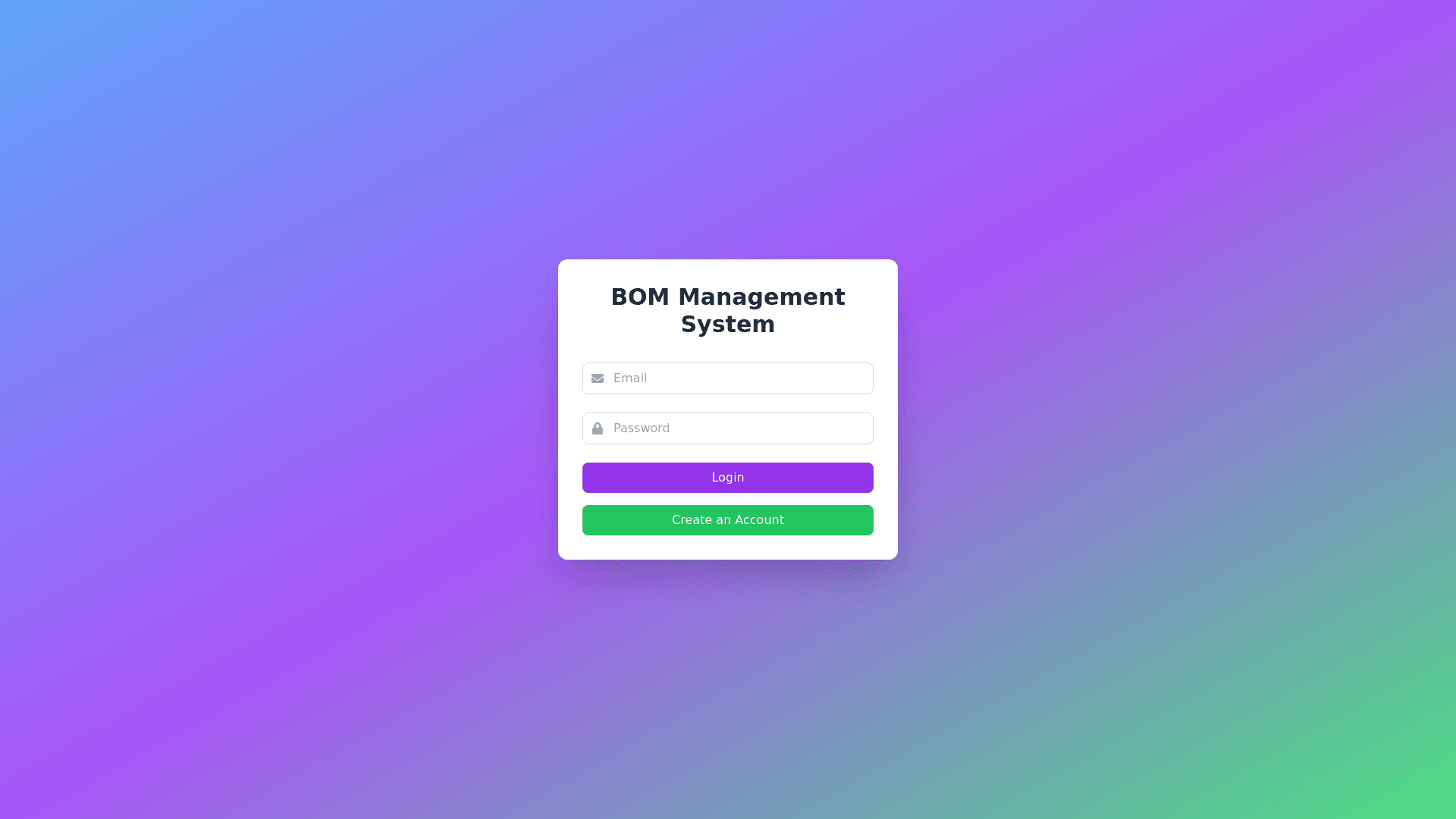
Design a vibrant, visually engaging, and intuitive web based user interface for a BOM Management System that offers clear navigation, interactive elements, and a smooth user experience. Follow these guidelines: 1. Login / Create Account: Use bright, welcoming colors for the login screen (e.g., soft blues, greens, and purples). Include an eye catching "Login" and "Create an Account" button with modern, rounded edges and a subtle glow effect on hover. Display the email and password fields with sleek input boxes and animated icons. Upon successful login, display a dynamic loading screen with engaging micro animations (e.g., progress bar with vibrant colors). 2. Home Screen: Create a color coded dashboard that’s easy to navigate: PCB Part Number/Project Name: Use a large, bold input box with a highlight color (e.g., teal or orange) when active. Quantity: Create a number input field with a visually distinct up/down arrow interaction. Display the main three options as large, colorful buttons: Saved BOM List: A bright, green button with an icon representing saved files. Create a New BOM: A bold, blue button with an animated "+" icon. Upload Partial BOM: A vibrant purple button with an upload icon that animates on hover. Dynamic Animations: When users hover over these options, buttons should expand slightly, with smooth transitions and glowing effects. 3. BOM Upload Section: Create a drag and drop zone with a playful animation (e.g., swirling colors) when a file is dragged over it. Provide an import button with a colorful file folder icon that rotates slightly on hover. Supported file formats should be clearly displayed using bold icons in multiple colors, each representing a different format (e.g., .csv in green, .pdf in red, .xlsx in blue, etc.). When an unsupported file is uploaded, display a colorful error message in red with a shaking animation to capture attention, and a retry button in yellow. 4. BOM Cases and Process: Case 1: Create New BOM: Use a colorful table with alternating row colors and smooth inline editing animations. Item number fields should be in a light background, while editable cells (e.g., MPN, Quantity, Reference Designators) should change color when active, using soft transitions. Case 2: Upload Partial BOM: As the file is uploaded, show a progress bar with gradient colors and a checkmark animation when done. Case 3: Saved BOM List: Present the list with color coded tags (e.g., green for active, orange for drafts) and icons next to each BOM for quick recognition. 5. Light/Dark Mode Toggle: Add a toggle bar with a sun and moon icon, changing smoothly between light mode (soft whites and grays) and dark mode (deep blues and grays). When toggling, apply a subtle color fade animation to avoid abrupt transitions. 6. Technical Assistance Service: A bright orange help button at the bottom right with a glowing question mark icon. When clicked, display a colorful chatbox with friendly UI elements, quick tips, and large buttons to access resources. 7. AI Assistance: Add a floating, circular AI assistant icon in vibrant colors (e.g., gradient of blue, purple, and pink). When clicked, display a speech bubble interface with a friendly bot, using soft animations and helpful prompts. Conversational UI: Provide AI responses in a colorful chat window with different color schemes for each message. 8. Sample BOM: A sample BOM button with a prominent color (e.g., bright yellow) and a clipboard icon. When clicked, provide an interactive guide or tooltip with sample data that users can download. 9. Confirmation and Error Messages: Confirmation messages should appear as pop ups in soft green with checkmark animations for successful uploads or saves. Error messages should be red pop ups, with a bouncing animation to grab attention, followed by a bright yellow retry button.