Styled Top Bar - Copy this React, Mui Component to your project
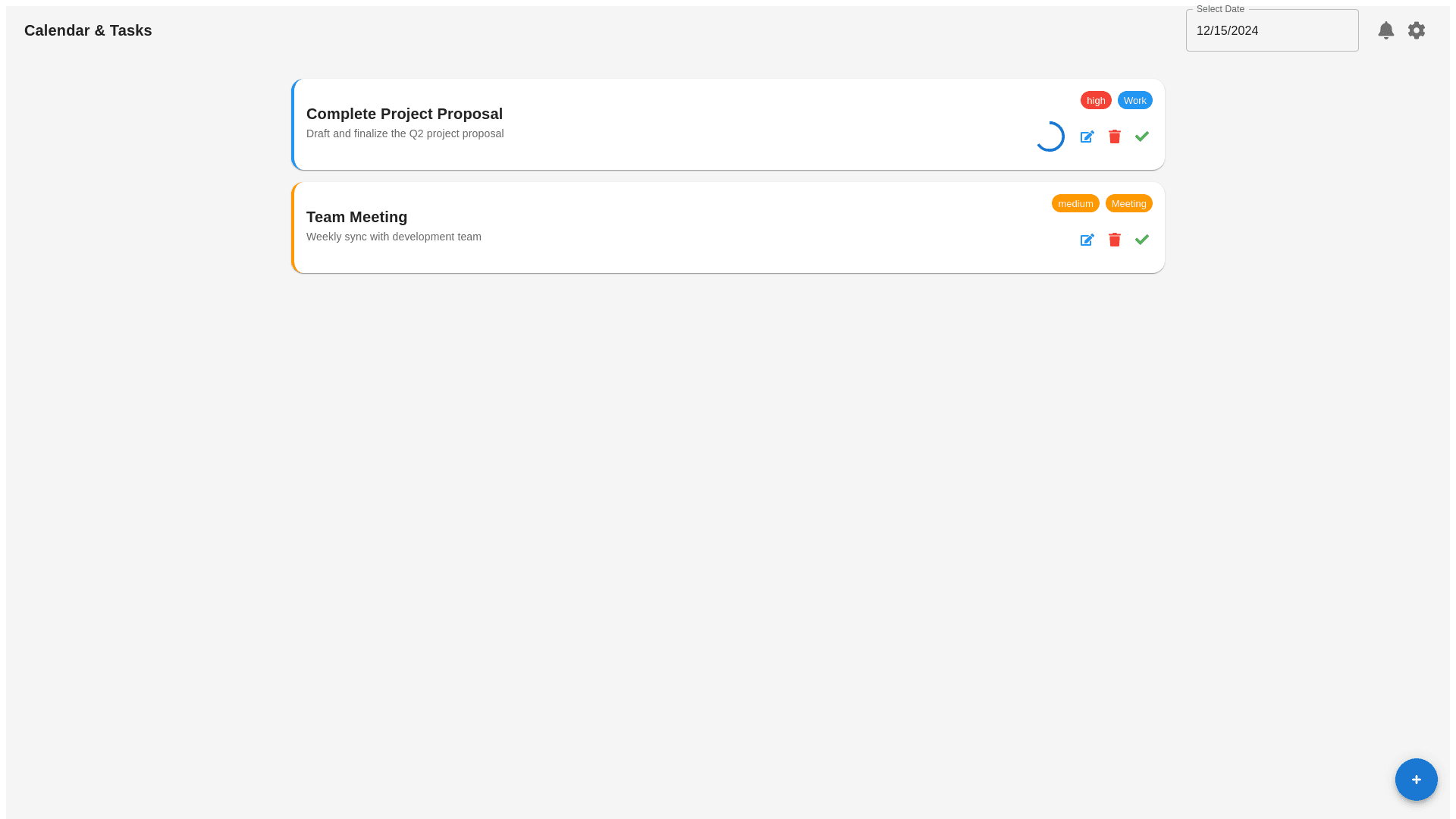
here's a more refined design idea to enhance the interface: Redesign Concept for Calendar & Tasks Interface: 1. Header & Navigation: Navigation Bar: The top bar can have a more minimalist approach, featuring a clean logo or title ("Calendar & Tasks") on the left, with a more intuitive calendar view selector. The “Select Date” field could include a dropdown or a date-picker icon, enabling users to select a date more easily. Icons: Use more colorful, action-driven icons on the right side (e.g., filters, settings, notifications) for quick access. 2. Task Display: Task Cards with Rounded Corners: Each task is presented in a card format with rounded edges. This creates a softer, more modern look. Each card has: A title with bold text, clearly distinguishing the task name. A brief description/notes of the task beneath the title. A progress bar that’s color-coded by category (e.g., blue for work, orange for meetings), indicating how much of the task is completed. Small, intuitive action buttons (edit, delete, mark as complete) at the bottom of each card, to ensure easy access without cluttering the design. 3. Task Actions: Task Priority: Add a colored tag (red, yellow, or green) to indicate the priority level, placed in the top-right corner of the card. Add New Task Button: A floating action button at the bottom-right of the screen for adding tasks. It should be a bright color (like blue or green) to draw attention, and use a plus sign for visual clarity. 4. Colors: Background: Use a clean, white background with soft shadows for the cards to create depth. It will ensure the focus remains on the tasks and calendar events. Task Colors: Use a light color palette for progress bars (e.g., soft blues, greens) to show task progress, with color coding for categories: Work: Light blue Meeting: Light orange Personal: Light green Urgent: Bright red Buttons & Icons: Use a contrast of vibrant colors for the action buttons to ensure that they stand out, while keeping them within a cohesive color palette. 5. Interactivity & User Engagement: Hover Effects: Add hover effects for the task cards (like a subtle shadow effect or color shift) to give a more interactive feel when users move the cursor over them. Task Completion Progress: A circular progress indicator (instead of just a bar) could be placed inside the task card to visually display completion status in a more engaging way. 6. Mobile Optimization: Ensure that the layout is fully responsive. On mobile screens, tasks can switch to a stacked, vertical layout. The calendar view would still function with a touch-friendly date picker, and tasks can be swiped left or right for actions like edit or delete. This approach brings a more visually appealing, user-friendly interface that balances functionality with modern design principles. Would you like me to generate a prototype or mock-up based on