Custom Calendar - Copy this React, Tailwind Component to your project
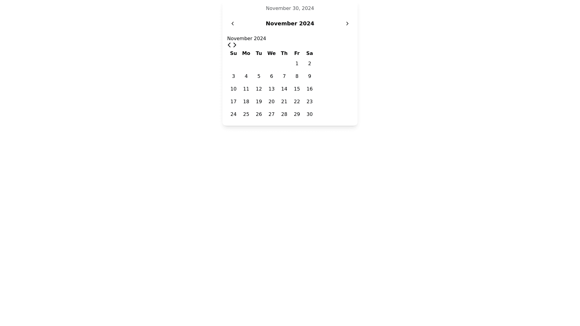
Generate-a-calendar-component-using-'react-day-picker'.-The-header-of-the-calendar-have-three-modes.-Each-mode-have-left-and-right-icon-to-navigate-on-its-respective-content.-The-three-modes-as-defined-below:---"default-mode"-is-"Month-Year"-and-showing-the-respective-dates-of-the-month.-The-header-nav-contains-the-specific-month-and-year-value---"month-mode"-is-enabled-when-we-click-on-the-"month-and-year-value"-in-header-nav-of-the-"default-mode".-The-header-nav-now-contains-the-specific-year-value.-The-"month-mode"-contains-the-list-of-months-of-the-year.-If-we-select-the-month-in-this-mode-then-we-switch-back-to-the-"default-mode"-and-wait-for-the-day-selection.---"year-mode"-is-enabled-when-we-click-on-the-header-nav-year-value-in-the-"month-mode".-The-header-nav-now-contains-the-year-range,-and-the-content-list-contains-all-the-year-values-of-the-specific-range.-On-selection-of-specific-year-we-move-to-"month-mode"-and-from-there-by-selecting-the-specific-month-move-to-the-"default-mode"-and-wait-for-the-day-of-the-month-to-be-selected.-Below-gives-an-explanation-of-what-happens-when-we-click-left-and-right-nav-button-on-the-header-nav-in-each-mode:---"default-mode":-by-clicking-nav-buttons-we-move-through-"month-year"-combination-left-and-right---"month-mode":-by-clicking-nav-buttons-we-move-through-"year"-values-left-and-right---"year-mode":-by-clicking-nav-buttons-we-move-through-"year-range"-values-left-and-right-Below-gives-an-explanation-of-what-contents-needs-to-be-shown-in-each-mode:---"default-mode":-header-nav-value-is-"month-year",-and-the-content-is-days-of-that-specific-month---"month-mode":-header-nav-value-is-"year",-and-the-content-is-months-of-the-years---"year-mode":-header-nav-value-is-"year-range",-and-the-content-is-all-the-years-withing-the-year-range-Below-gives-an-explanation-of-what-happens-when-we-select-a-value-in-each-mode:---"default-mode":-on-selection-of-day-we-stay-in-the-same-mode-"default-mode"---"month-mode":-on-selection-of-month-we-switch-back-to-"default-mode"---"year-mode":-on-selection-of-year-we-switch-back-to-"month-mode"-Finally-have-a-text-representing-the-selected-date-if-there-is-an-selection-or-else-have-the-latest-date-as-the-default-selected-date.-Have-this-on-top-of-the-calendar.-Also-we-need-a-onSelection-listner-function-to-fire-when-there-is-an-date-selection.