Card Carousel - Copy this React, Tailwind Component to your project
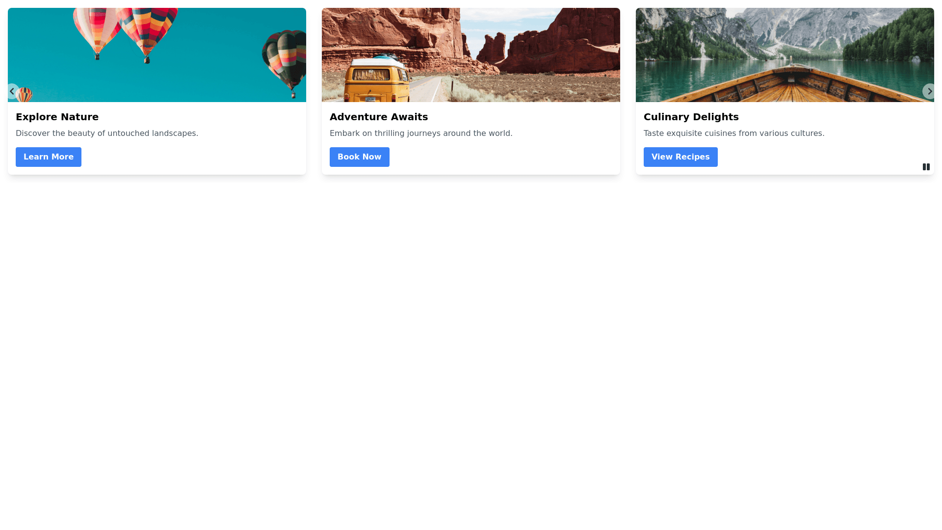
Create a card section that contains multiple cards, displayed in a carousel. Each card should feature an image at the top, a title, a short description below the title, and a call to action button at the bottom. The cards should be evenly spaced in the carousel, with navigation arrows on either side to scroll through the cards. On hover, apply a 'waoooo' animation to each card that includes: A subtle zoom in effect for the card's image. A smooth color transition for the card background. The card should slightly elevate with a shadow to give a 3D effect. Use smooth transitions and ensure that the animation feels impressive without overwhelming the user. Make sure the carousel is responsive, with at least 3 cards visible on larger screens, 2 on tablets, and 1 on mobile.
