AZ
Ailen Zepold
Group Selection Card - Copy this React, Tailwind Component to your project
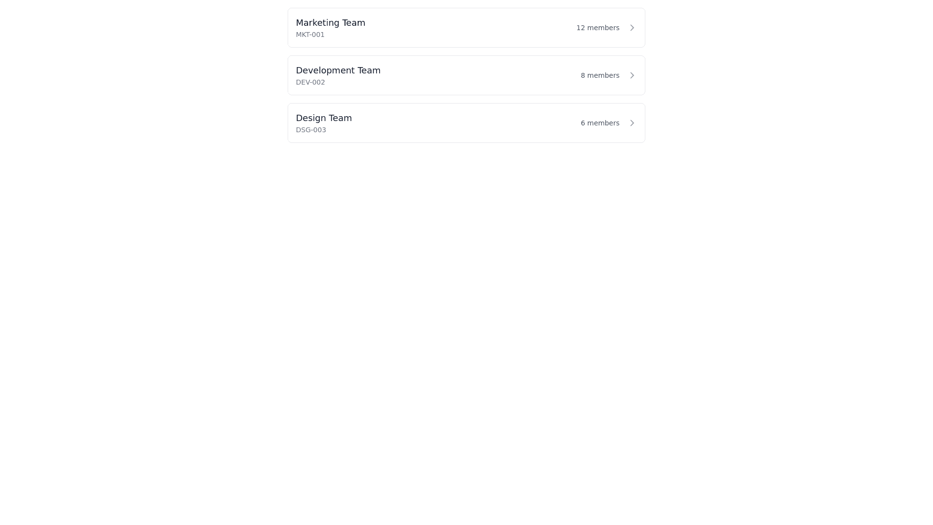
genera un esqueleto para 3 card en columna con esta estructura <div key={group.id} className="flex flex col gap 3"> <Card key={group.id} isPressable={false} className={`border 1 shadow sm ${selectedGroupId === group.id ? 'border primary' : 'border default'}`} > <CardBody className="p 3 flex flex col gap 2 cursor pointer " onClick={(e) => { e.stopPropagation(); handleGroupSelect(group); }} > <div className="flex justify between items center"> <div className="flex flex col"> <div className="font medium text sm">{group.name}</div> <div className="text tiny text primary">Código: {group.code}</div> </div> <div className="text lg"> {selectedGroupId === group.id ? '▼' : '▶'} </div> </div>
Prompt