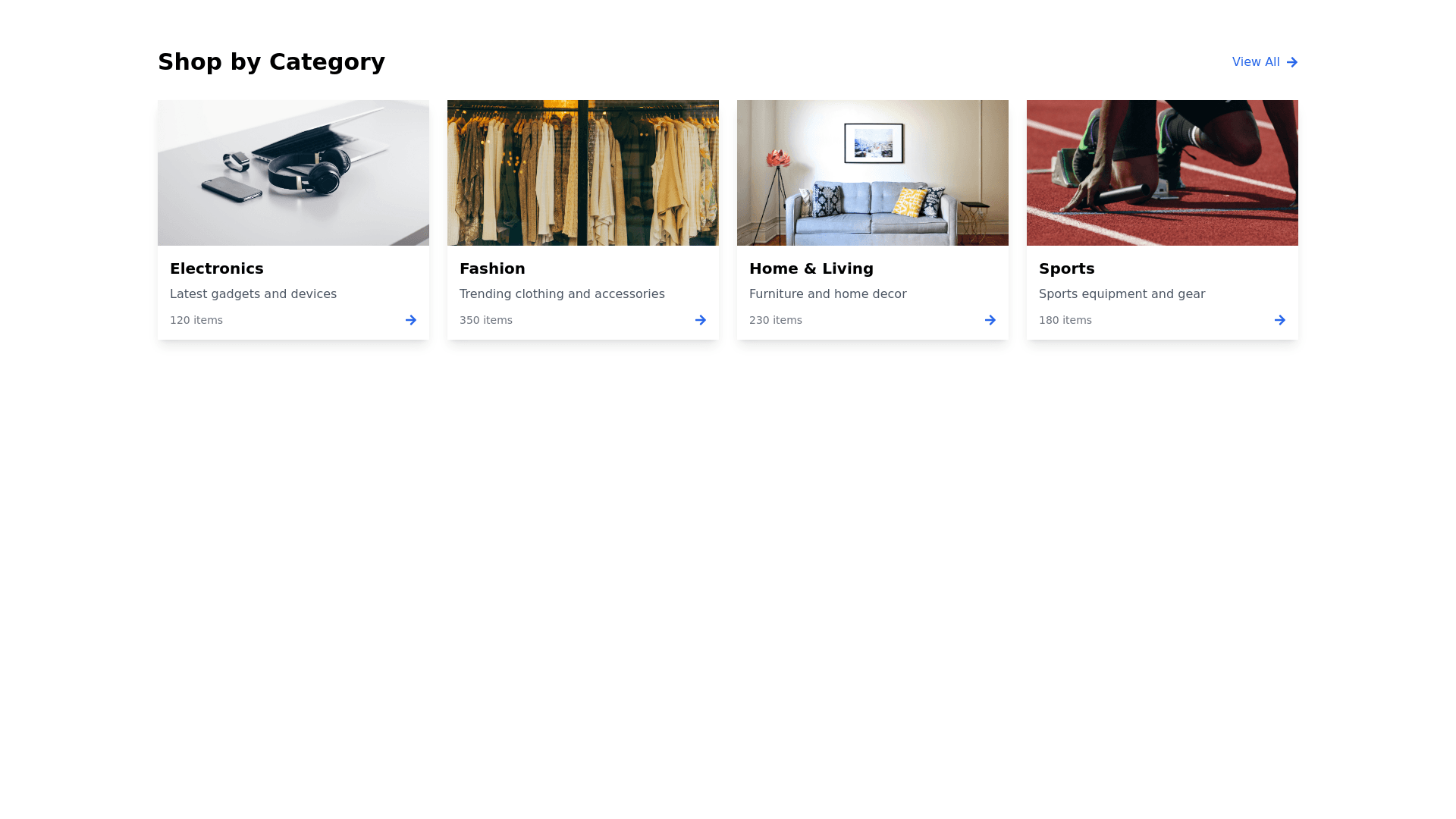
Categories - Copy this React, Tailwind Component to your project
<style> .custom collection slider { margin: 0 auto; } .custom collection slider .icon wrap { display: none; } .custom collection slider .card__heading { text align: center; color: #000; } .custom collection slider ul { justify content: center; } .custom collection slider .card__media, .custom collection slider .card__inner { border radius: 0 !important; /* Make the shape square */ } .custom collection slider .card:hover .media.media hover effect>img:first child:only child { transform: scale(1.1); transition: .3s ease in out; } .custom collection slider .card__content .card__heading { font size: 14px; } .custom collection slider .grid__item { width: calc(7.66% var( grid desktop horizontal spacing) * 5 / 6); } .custom collection slider .card__media { border: 2px solid #dadada; padding: 2px; overflow: hidden; /* Ensure content fits within the square */ } .custom collection slider .card:hover .card__media { border: 3px solid #000; transition: .3s ease in out; } @media only screen and (max width: 800px) { .custom collection slider ul { display: webkit inline box; } .custom collection slider .card__content .card__heading { font size: 13px; } .custom collection slider .grid__item { width: calc(40% var( grid mobile horizontal spacing) 3rem) !important; } } </style> using this same code make changes to make the categories section display square and not round corners