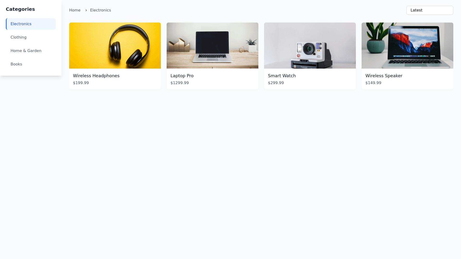
E-commerce Layout Grid - Copy this Html, Tailwind Component to your project
I need you to generate the HTML and CSS for a category page. This page corresponds to the path /category/[slug].astro and should have the following structure and features: 1. Page Layout: Sidebar (left): Displays a list of all existing categories. Main Content (right): Divided into two sections: Top Section: On the left, a breadcrumb for navigation. On the right, a product filter selector. Bottom Section: Takes up all remaining space. Displays a grid of products for the selected category. The grid should show a maximum of 4 products per row and be fully responsive. 2. Focus on the Categories Sidebar: CSS Styling: Animations for Selected Category: Smooth background color change (background color) with a 0.3s transition. Slight scale effect (transform: scale(1.05)) to highlight the selected category. Accent left border (border left: 4px solid #color) to indicate selection. Bold text (font weight: bold) for better visual hierarchy. Hover Effects: Subtle background color change (background color: #f0f0f0). Smooth transition (transition: all 0.3s ease) for a fluid experience. Responsive Design: On small screens (mobile), the sidebar should collapse into a dropdown or hamburger menu. Use flexbox or grid to ensure the sidebar adapts properly to different screen sizes. Add adequate padding and margin to avoid cramped elements. Typography: Use a modern and readable font (font family: 'Arial', sans serif or similar). Responsive font size (font size: 16px on desktop, 14px on mobile). Spacing and Visual Hierarchy: Add internal padding (padding: 10px 15px) to let elements breathe. Separate categories with a subtle border (border bottom: 1px solid #e0e0e0). Accessibility: Ensure proper contrast between text and background (color: #333 on background: #fff). Add focus styles for keyboard navigation (outline: 2px solid #color). Scrollbar (if needed): Customize the scrollbar for a modern look (:: webkit scrollbar). Ensure it’s discreet and doesn’t interfere with the user experience. 3. Additional Notes: The product grid should adjust automatically on smaller screens, showing fewer products per row (e.g., 2 products per row on mobile). The sidebar should have a fixed width on large screens but collapse or adapt on mobile devices. Use modern and clean design principles to ensure a great user experience (UX) and user interface (UI).
