Certificate Viewer - Copy this React, Tailwind Component to your project
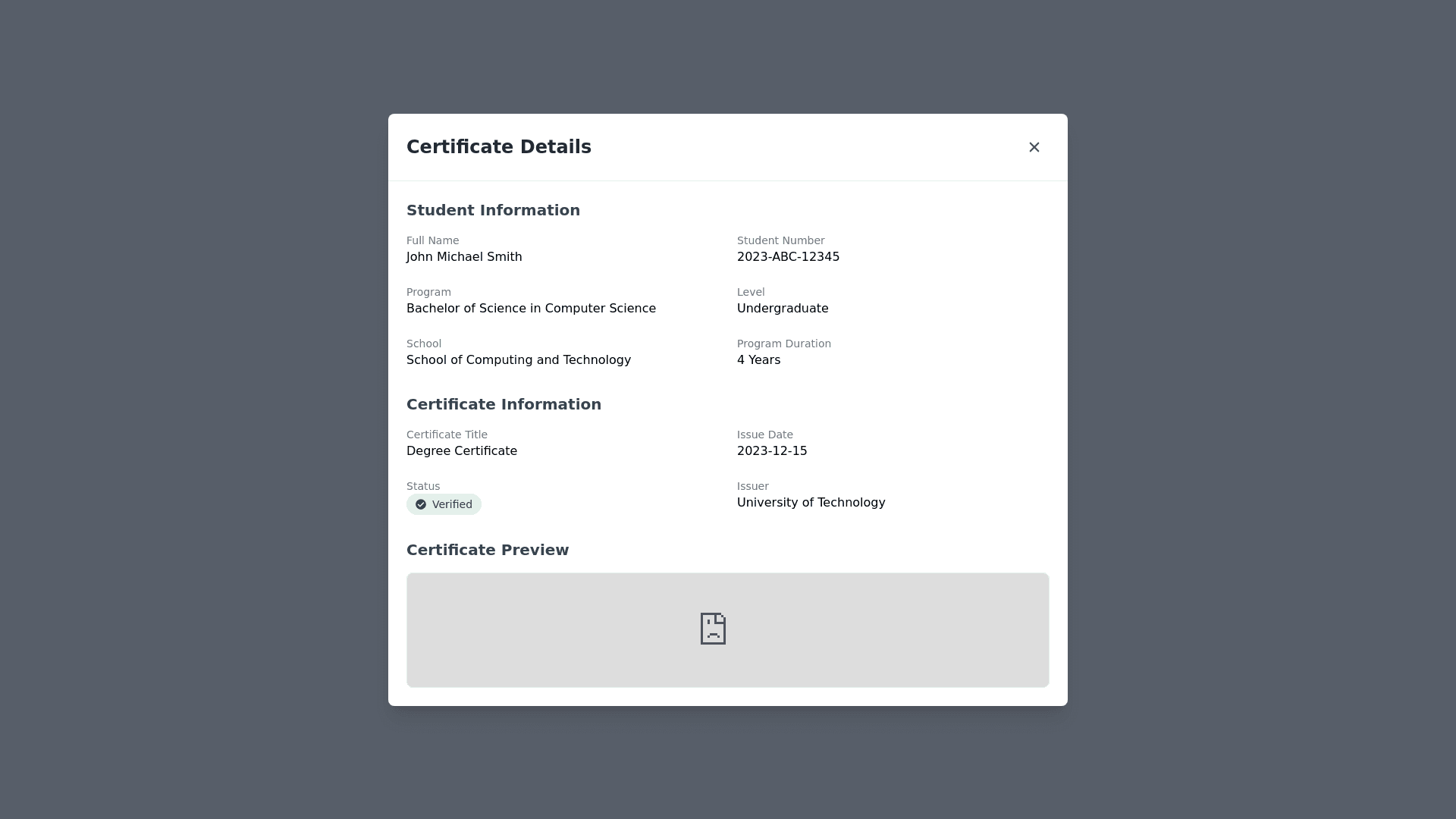
Develop-a-user-interface-for-the-CertificateViewer-component-that-displays-detailed-information-about-a-student-and-their-certificate-within-a-centered-modal-window.-The-modal-should-have-a-fixed,-full-screen-dark-gray-background-overlay-with-a-semi-transparent-effect,-and-the-content-should-be-placed-in-a-white,-rounded-container-with-a-shadow-for-elevation.-The-top-section-of-the-modal-includes-a-title-("Certificate-Details")-and-a-close-button-with-an-'X'-icon.-Below-the-header,-the-student’s-information-is-shown-in-a-two-column-grid,-displaying-fields-like-full-name,-student-number,-program,-level,-school,-and-program-duration.-Each-field-is-accompanied-by-clear-labels-and-corresponding-student-data.-Similarly,-certificate-information-such-as-the-title,-issue-date,-status-(verified-or-pending),-and-issuer-is-displayed-in-a-grid-format,-with-status-highlighted-using-badges-in-green-(for-verified)-or-yellow-(for-pending).-The-bottom-section-includes-a-certificate-preview,-rendered-inside-an-iframe-that-loads-the-certificate-from-an-IPFS-URL.-The-modal-should-be-responsive,-scaling-well-across-different-screen-sizes,-with-vertical-scrolling-enabled-if-the-content-exceeds-the-available-viewport-height.-The-user-can-close-the-modal-by-clicking-the-close-button,-triggering-a-callback-function.-The-overall-design-should-be-clean,-with-a-neutral-color-scheme-and-sufficient-spacing-to-ensure-readability-and-a-pleasant-user-experience.