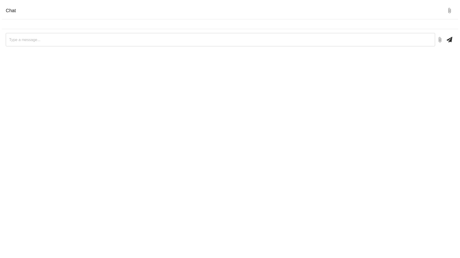
Chat Container - Copy this React, Mui Component to your project
Develop a Chat Component for a web application using React. This component facilitates user interactions through messaging, supports image attachments, includes various user actions (like edit, delete, pin), and integrates keyboard shortcuts. The component should be responsive, visually appealing, and provide smooth animations to enhance user experience. Component Structure & Layout Main Container (.chat) Display: Flex Flex Direction: Column Position: Relative Height: 100% Header (.window header) Elements: Mobile Actions (.window actions for mobile screens): Return Button: Navigates to the chat list. Title Section (.window header title): Main Title (.chat body main title): Displays the chat topic. Clickable to enable message editing. Subtitle (.window header sub title): Shows the number of messages. Action Buttons (.window actions): Refresh Button: Refreshes the chat session. Edit Message Button: Opens the message editing modal (hidden on mobile). Export Button: Opens the export message modal. Fullscreen Toggle Button: Toggles the chat view between fullscreen and normal. Chat Body (.chat body) Display: Flex Flex Direction: Column Overflow: Auto (with hidden horizontal overflow) Padding: 20px (bottom padding increased for input panel) Position: Relative Overscroll Behavior: None Messages (.chat message & .chat message user) Display: Flex Flex Direction: Row (reverse for user messages) Container (.chat message container): Max Width: Variable based on viewport Display: Flex Flex Direction: Column Alignment: Flex start (or flex end for user messages) Hover Effects: Show message actions and edit button Avatar (.chat message avatar): Displays user or assistant avatar. Message Content (.chat message item): Background Color: Light gray for assistant, distinct for user Border: Light border with slight opacity Padding: 10px Border Radius: 10px Word Break: Break word for long texts Images: Supports single and multiple images with responsive sizing Message Actions (.chat message actions): Actions: Stop, Retry, Delete, Pin, Copy Display: Visible on hover Icons: Corresponding SVG icons for each action Timestamp (.chat message action date): Font Size: 12px Opacity: 0.2 Alignment: Right Input Panel (.chat input panel) Display: Flex Flex Direction: Column Position: Relative Padding: 20px (top padding adjusted) Border Top: Light border Box Shadow: Subtle shadow for elevation Elements: Prompt Hints (.prompt hints): Dropdown suggestions based on user input. Chat Actions (.chat input actions): Buttons for uploading images, attaching images, showing prompt modal, scrolling to bottom, and displaying shortcut keys. Textarea (.chat input): Placeholder: Dynamic based on submitKey. Auto Grow: Adjusts height based on content. Styles: Rounded corners, no border, subtle shadow, padding, and responsive font size. Send Button (.chat input send): Position: Absolute (bottom right of input panel) Styles: Primary color background, white text, rounded corners. Modals & Toasts Export Modal: For exporting messages. Edit Message Modal: For editing existing messages. Shortcut Key Modal: Displays available keyboard shortcuts. Prompt Toast (.prompt toast): Notification when the user scrolls away from the bottom.
