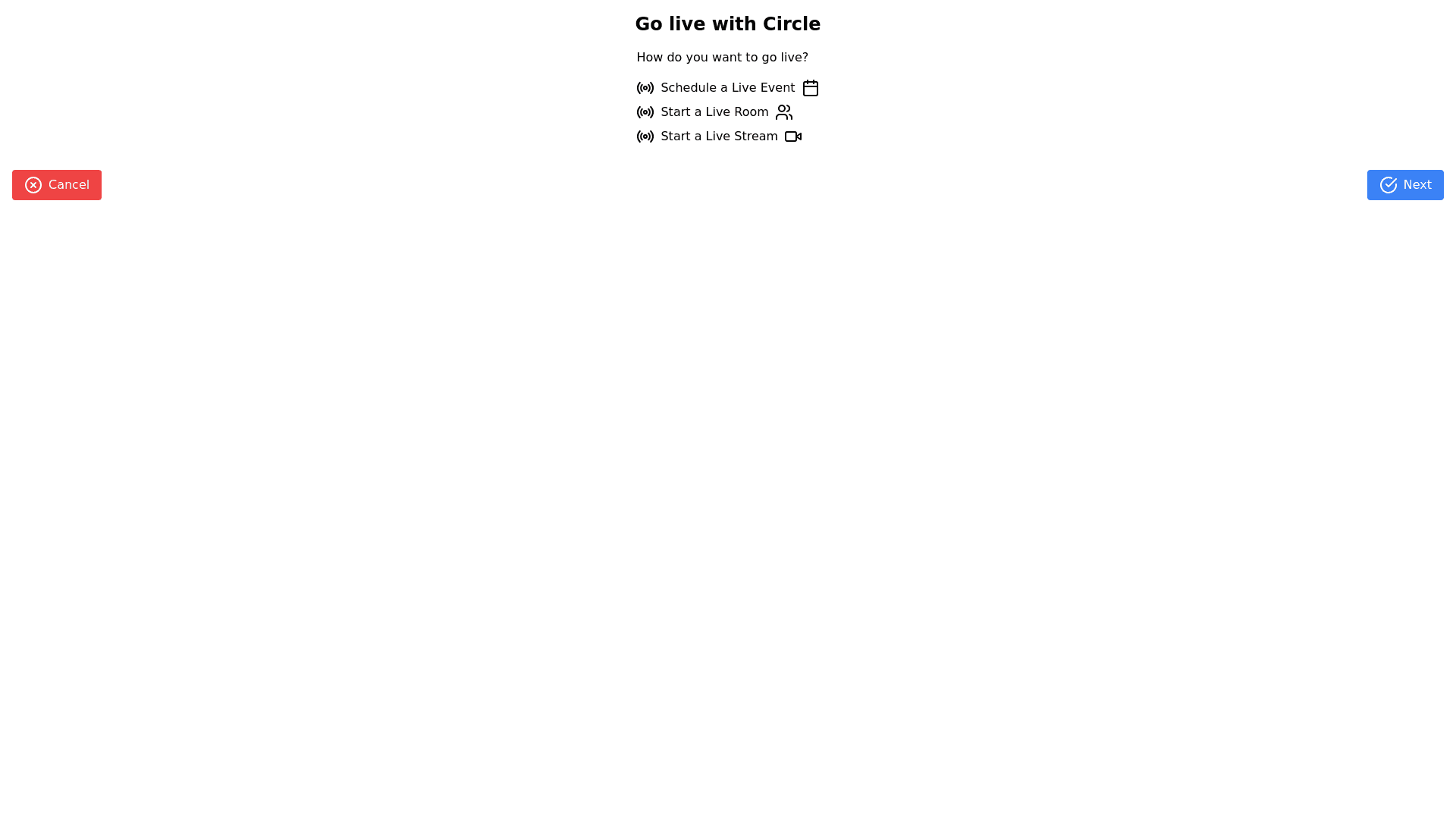
Go Live Options Step - Copy this React, Tailwind Component to your project
Design-an-interactive-step-by-step-interface-for-a-platform-called-"Circle"-to-facilitate-users-going-live,-which-includes:-A-title-at-the-top:-"Go-live-with-Circle".-A-central-question:-"How-do-you-want-to-go-live?"-to-guide-the-user.-Three-distinct-sections,-each-representing-a-different-live-option:-Schedule-a-live-event:-With-checkboxes-for-scheduling-in-the-event-space,-allowing-RSVPs-and-calendar-integration,-automated-event-recording-posting,-and-member-hosting-permissions.-Start-a-live-room:-Aimed-at-smaller-gatherings-like-meetings-or-coaching-sessions,-with-details-on-participant-limits-and-interactive-capabilities-such-as-audio/video-and-text-chat.-Start-a-live-stream:-For-larger-audiences,-suitable-for-webinars-and-presentations,-specifying-the-audience-cap-and-interaction-levels-(co-host-communication-and-audience-promotion-options).-Radio-buttons-to-select-one-of-the-options.-A-footer-indicating-the-step-sequence-("Step-1-of-3")-and-navigation-buttons-("Cancel"-and-"Next")-to-progress-through-the-setup-or-abort-the-process.-The-design-should-facilitate-a-straightforward-and-seamless-setup-process-for-the-user,-providing-clear-choices-and-ensuring-the-interface-is-not-overcrowded.-Visual-indicators-like-icons-or-graphics-can-accompany-each-option-to-enhance-understanding-at-a-glance.-The-layout-should-be-consistent-with-the-branding-and-design-language-of-"Circle".
