Classroom Overview - Copy this React, Tailwind Component to your project
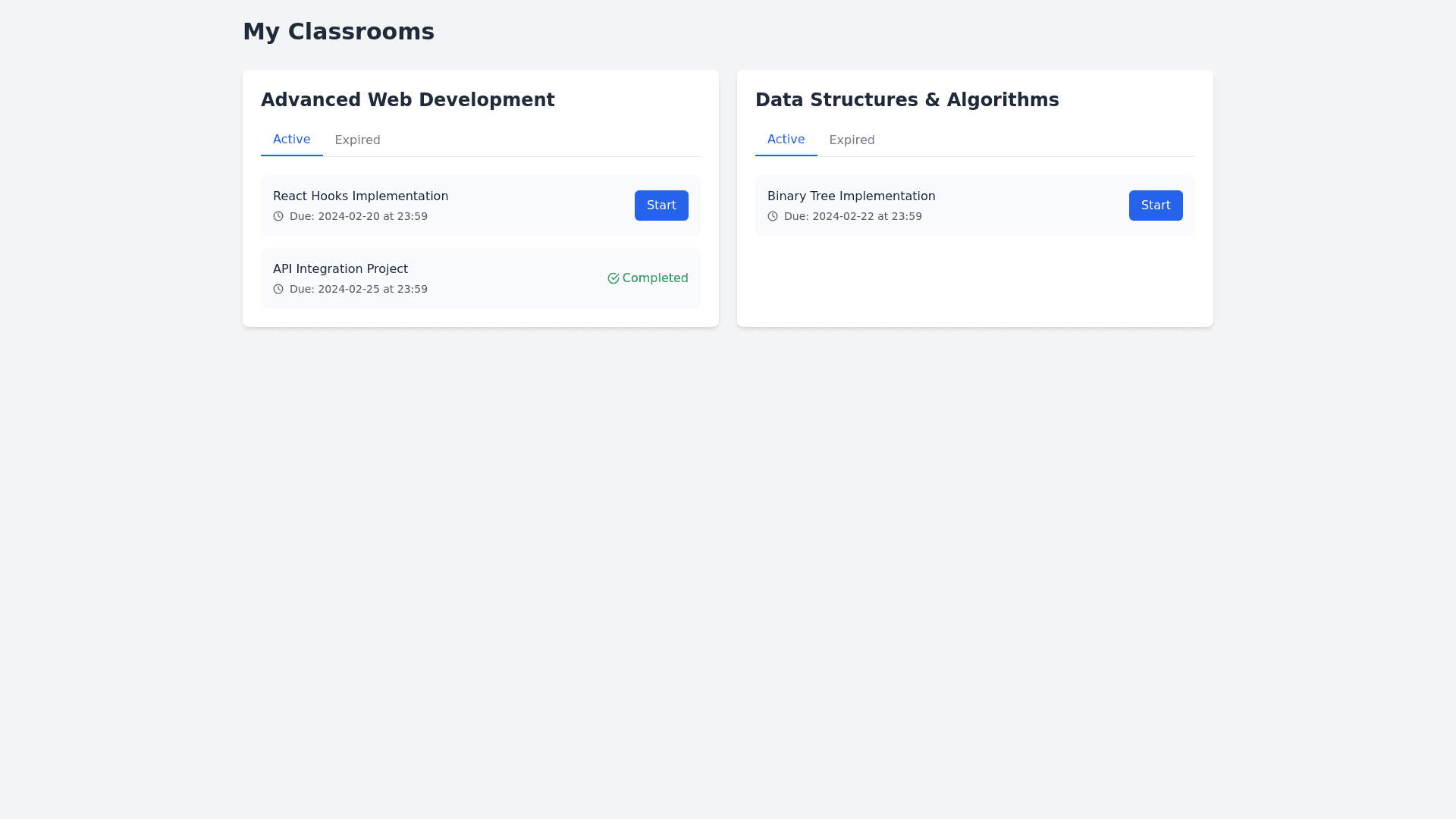
Overview: Layout: The layout is a card based structure, where each classroom (or course) is represented by a separate card. The interface uses a grid based design, with cards arranged to show multiple classrooms on the page. Key UI Elements: Classroom Information Card: Each classroom is enclosed in a rectangular card with a light background and rounded corners. The card has a shadow effect that becomes more prominent when hovered over (providing a subtle 3D effect). Inside the card, the name of the classroom is displayed in bold, large text at the top. The card includes sections that allow users to interact with the content, such as clicking tabs to view different types of classroom data. Tabs for Class Activity: Active Tab ("Đang hoạt động"): The first tab is highlighted in blue (with a blue underline), indicating that it is the currently active tab. It shows ongoing assignments, lessons, or activities. Expired Tab ("Đã hết hạn"): The second tab is inactive, with a gray text color and no underline. This tab displays past assignments or content that has expired. Assignments/Content Overview: Inside the active tab, there is a grid that lists each assignment or lesson associated with the classroom. Each grid item has the following columns: Assignment Name: The name of the assignment or lesson. Due Date and Time: The deadline for submission, formatted as a date and time. Status: The progress status of the assignment. If it’s completed, it shows as "Completed", with a progress percentage displayed if applicable. Action Button: A button labeled "Start" is available for assignments that are not yet started. If the assignment is completed, a "Completed" label appears. The content area is scrollable, allowing users to view and interact with all available assignments. Visual Design: The design features subtle gradients, with a light gray background and white containers for each card, contributing to a modern and clean aesthetic. Buttons are clearly visible and have hover effects, offering a smooth and interactive experience. The fonts are clear and legible, with larger, bold text for headings and smaller, lighter text for descriptions and progress statuses. Responsiveness: The layout appears to be responsive, adapting to different screen sizes. On larger screens, multiple classroom cards can be displayed side by side, while on smaller screens, they might stack vertically for better readability. Functional Aspects: Dynamic Tab Switching: The interface supports switching between different views (active assignments vs. expired ones) by clicking on tabs. The active tab's content is displayed dynamically based on the user’s selection. Assignment Progress Tracking: Users can view the progress of their assignments and whether they are still active or completed. For active assignments, users can start working on them directly from the dashboard. Summary: This interface is well suited for a classroom or learning management system (LMS) where users (likely students) can track their progress, view assignments, and manage their learning activities. The combination of a clean layout, interactive tabs, and visual progress tracking ensures an intuitive and user friendly experience.