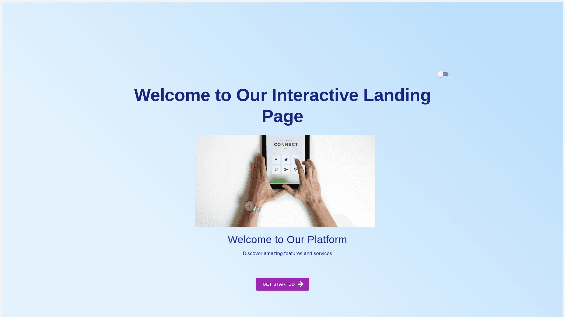
Animated Box - Copy this React, Mui Component to your project
To modernize the design of the clickable cards page while keeping the sections intact, here’s a detailed description you can use to provide instructions for a website generator: --- **Project Objective:** Revamp the current layout of the clickable cards interface with a fresh, modern design that enhances usability and aesthetics, while maintaining the existing functionality and structure. **Design Guidelines:** 1. **Overall Look & Feel:** - Use a minimalist, clean design that is visually appealing and highly functional. - Introduce a sleek color scheme with modern gradients or solid pastel colors. - Incorporate soft shadows and subtle animations for a more dynamic and interactive feel. 2. **Sections Layout:** - Keep the existing section structure, but improve spacing and alignment for better readability and navigation. - Each section should have more breathing room (add padding and margin). - Use larger and more readable fonts, modern typography, and icons that fit a contemporary style. 3. **Card Design:** - Replace the current blocky card design with rounded, edge cards. - Include hover effects, such as slight elevation or color change, to provide feedback when a user interacts with a card. - Add icons or images on each card to visually represent the function (e.g., automation icon for "Automation Framework Documentation"). - Keep the primary red tone of the buttons but modernize with a gradient or a flat material design look. 4. **Typography:** - Use modern sans-serif fonts for titles and body text (e.g., Roboto, Open Sans, Lato). - Increase font size for clarity, especially for headings. - Make sure text contrast is high for accessibility. 5. **Background:** - The background can be replaced with a sleek gradient or subtle pattern. - A dark-to-light gradient could replace the solid black background for a more modern and engaging look. - Keep the map background, but make it more translucent or stylized to avoid overwhelming the content. 6. **Interactivity:** - Add smooth transitions and hover effects for each clickable element. - Ensure that all buttons and cards have a slight animation or effect on hover (e.g., shadow, brightness change). - Add dynamic animations like slide-ins for when the sections load to give a modern web experience. 7. **Responsiveness:** - Ensure that the entire design is fully responsive, with cards resizing and rearranging based on the screen size. - Implement a mobile-friendly version with collapsible sections and touch-friendly card designs. **Additional Features:** - Include an option for dark and light themes, allowing users to switch between modes. - For each section header, add a small description or icon to enhance the understanding of its function. **Suggested Technologies:** - Material UI (MUI) components, but with customizations for a more personalized modern look. - Utilize CSS Grid or Flexbox for better responsiveness and flexibility. - Consider using modern front-end frameworks such as React or Vue.js to handle the interactive elements smoothly. **Reference:** The original design includes clickable red cards in various sections such as Knowledge Repo, Tools, QA Desk, and Dashboards. Ensure the new design maintains a clear distinction between these sections while upgrading the overall aesthetics. --- This will provide clear guidance for redesigning the UI while ensuring it maintains modern web design principles and functionality.
