Order History - Copy this React, Tailwind Component to your project
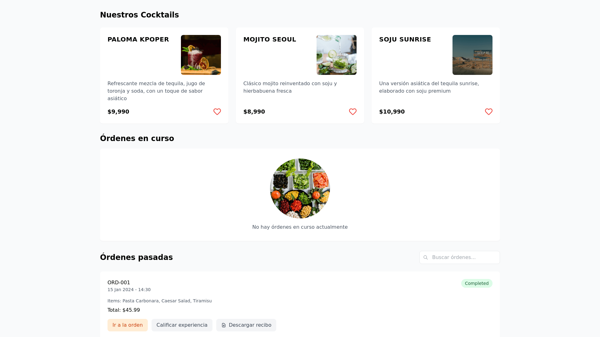
This form displays a grid of rectangular cards, each describing a different cocktail. The design is clean and visually appealing, with an emphasis on high-quality images of each drink. General Structure: Grid Layout: The elements are arranged in a three-column grid (visible in the partial screenshot). It is expected that this layout will adapt to different screen sizes (responsive design). Individual Card: Each cocktail is contained within an individual card with the following main sections: Header: Cocktail Name: Prominent text in the top left (e.g., "PALOMA KPOPER"). This text should have a distinct visual style (font, size, weight). Cocktail Image: An attractive and centered photograph of the cocktail occupies a significant portion of the card, generally to the right of the header and description. Description: A short paragraph describing the cocktail, its main ingredients, and/or its inspiration. The text has a readable size and a contrasting color against the card background. Price: Located in the bottom left, indicating the price of the cocktail (e.g., "$9.990"). The currency symbol and price should be clearly visible. Heart Icon: A heart icon located in the bottom right, presumably for marking as a favorite or a similar action. Style and Design Elements: Typography: Different fonts and sizes are used to create a hierarchy of information (cocktail name larger and more prominent, description with a smaller size, price visible). Colors: The background of the cards is a light and neutral color, allowing the cocktail images and text to stand out. Consistent colors are used for text elements and icons. Spacing: Adequate spacing exists between elements within each card and between the cards, contributing to a clear and organized presentation. Borders: The cards appear to have subtle borders or are defined by the space between them. Images: The images are high quality, well-lit, and showcase the cocktails in an appealing manner. Considerations for UI Development: Componentization: Each cocktail card should be a reusable component. Responsive Design: The grid should adapt to different screen sizes (mobile, tablet, desktop), possibly using a flexible grid system (CSS Grid or Flexbox). Accessibility: Ensure that the text has sufficient contrast with the background for readability. Consider text alternatives for images for screen readers. Interaction: The heart icon will likely have hover and active states. Clearly define the behavior upon interaction with this icon. Image Loading: Optimize images for fast loading without compromising visual quality. Consider using lazy loading to improve initial performance. Visual Consistency: Maintain consistency in typography, colors, spacing, and icon style across all cards. In summary, this form is presented as a grid of content cards, each displaying key information about a cocktail with a visually appealing design focused on clarity of information.