Whiteboard App - Copy this React, Tailwind Component to your project
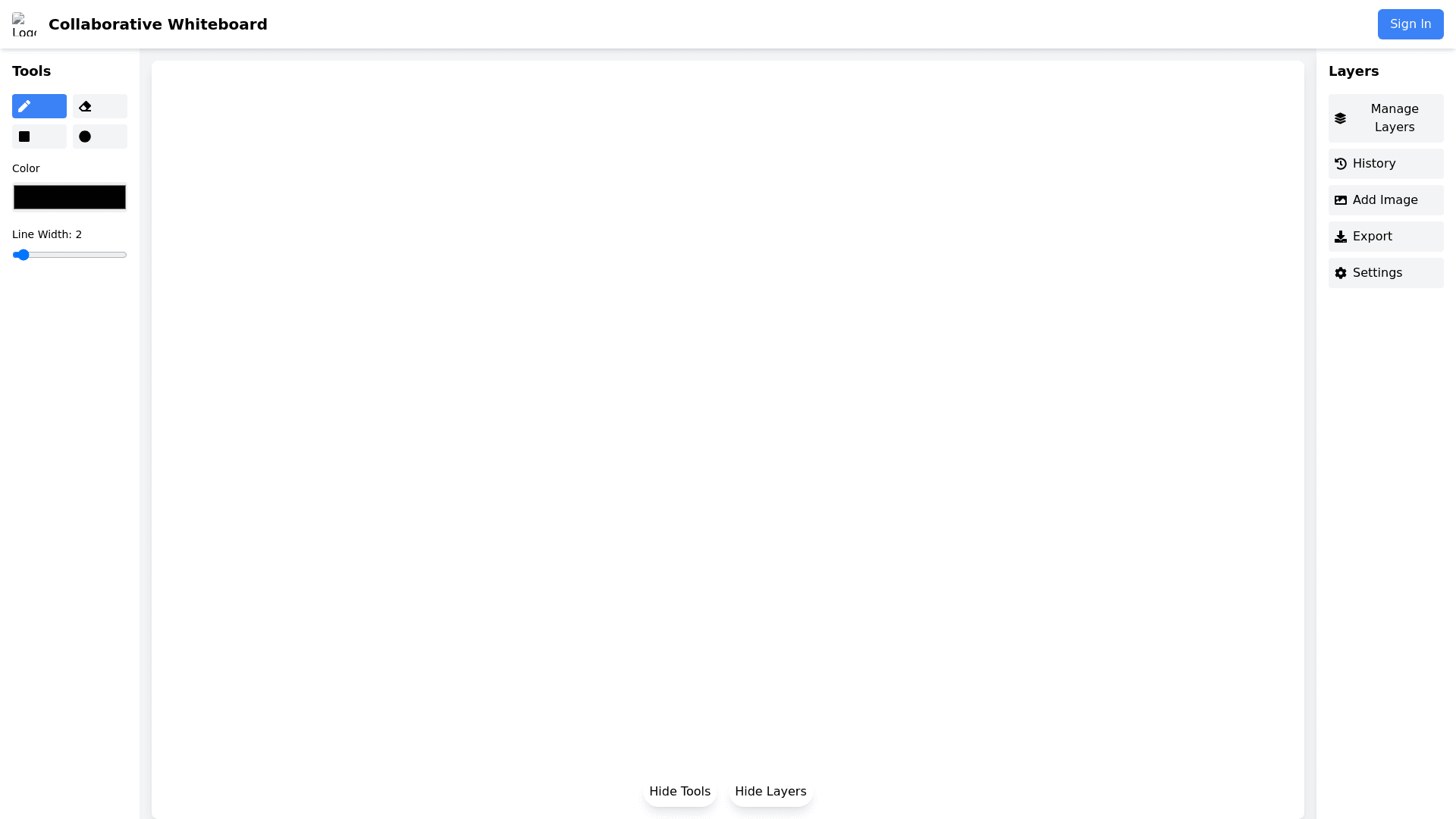
Design-a-minimalistic,-user-friendly-UI-for-a-collaborative-whiteboard-application-similar-to-Excalidraw.-The-app-should-be-clean,-intuitive,-and-focused-on-ease-of-use-for-drawing,-sketching,-and-diagramming.-Key-Features:-Header:-The-header-should-feature-a-simple,-recognizable-logo-on-the-left-side.-Include-navigation-links-to-"Home,"-"Docs,"-and-"GitHub"-on-the-right-side.-A-central-"Create-New"-button-should-allow-users-to-start-a-new-drawing.-Drawing-Canvas:-The-main-focus-of-the-interface-should-be-a-large,-blank,-grid-like-drawing-canvas-with-a-hand-drawn-style.-The-canvas-should-allow-users-to-draw-shapes,-freehand-sketches,-and-add-text.-It-should-support-zoom-in/out-functionality-and-smooth-dragging-to-navigate-around-the-canvas.-Design-the-canvas-to-look-like-a-traditional-whiteboard-but-with-a-soft-background-grid-for-alignment.-Left-Sidebar-(Toolbox):-The-sidebar-should-contain-drawing-tools-like-pencil,-shapes-(rectangles,-circles,-lines),-and-text-tools.-Each-tool-should-be-represented-by-a-simple-icon.-Include-a-color-picker-for-selecting-different-stroke-colors-and-thickness.-The-icons-should-be-clear-and-intuitive,-with-labels-or-tooltips-for-clarity.-Top-Toolbar:-Provide-buttons-for-basic-functions-like-undo,-redo,-zoom-in/out,-and-clear-canvas.-Include-an-Export-button-for-saving-the-drawing-as-PNG-or-SVG.-Add-a-Share-button-that-generates-a-link-to-the-drawing.-A-Settings-button-for-adjusting-canvas-preferences-(e.g.,-grid-toggle-or-background-color)-should-be-available.-Right-Sidebar-(Properties-Panel):-When-elements-are-selected-on-the-canvas,-show-their-properties-such-as-color,-stroke-width,-rotation,-and-alignment-options.-Include-layer-control-options-for-element-ordering-(e.g.,-bring-to-front,-send-to-back).-Footer:-Keep-the-footer-minimal,-with-only-copyright-information-and-credits-to-the-project-or-contributors.-Interactive-Features:-Design-a-real-time-collaboration-feature-where-multiple-users-can-work-on-the-same-canvas-simultaneously.-Display-multiple-cursors-with-distinct-colors-to-represent-different-users.-Responsive-Design:-The-UI-should-be-responsive,-adapting-seamlessly-to-different-screen-sizes-(desktop,-tablet,-mobile).-Ensure-the-canvas-resizes-appropriately,-and-controls-should-remain-easily-accessible.-Style-&-Aesthetics:-Use-soft,-muted-colors-for-buttons-and-controls-to-avoid-overwhelming-the-user.-The-primary-focus-should-be-on-the-content-within-the-canvas.-Incorporate-a-hand-drawn-aesthetic-for-the-canvas,-with-a-clean,-modern-look-for-the-UI-elements.-Maintain-a-minimalistic-design-to-avoid-clutter,-focusing-on-usability-and-simplicity.
