Collections Page - Copy this React, Tailwind Component to your project
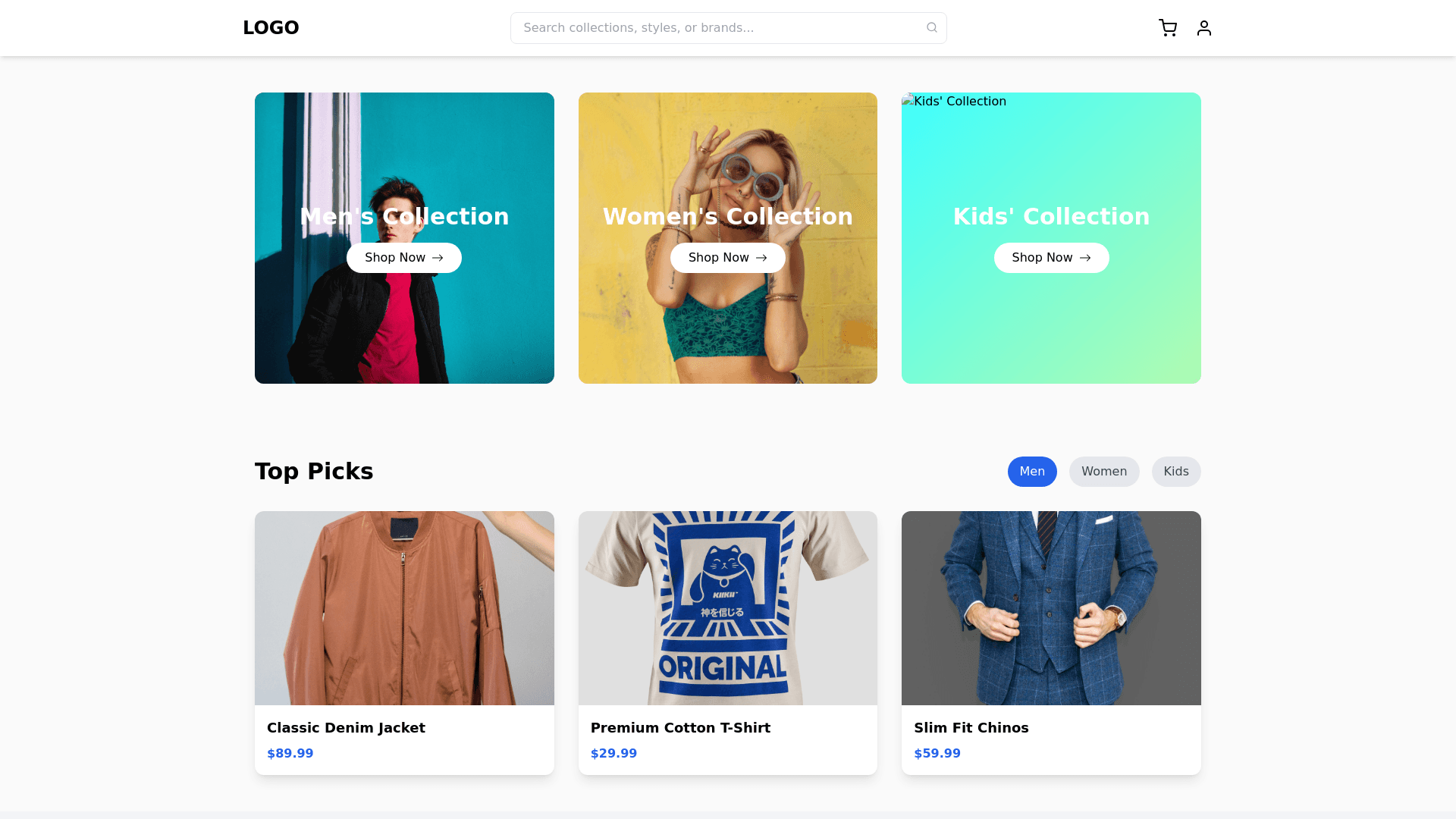
Collections Page Design This page will highlight Men’s, Women’s, and Kids’ Collections with an engaging, interactive, and visually appealing design. Key Sections and Features 1. Top Navigation Bar (Sticky) Minimal and clean design with the following elements: Logo on the left. Search Bar in the center with a placeholder like “Search collections, styles, or brands...” Cart and Profile Icons on the right. Sticky behavior to stay visible during scrolling. 2. Featured Collections Section This section divides the page into three main cards for Men, Women, and Kids: Layout: Three large, side by side interactive cards (stacked vertically on mobile). Card Design: Men’s Collection: Background: A bold gradient (e.g., black to dark blue). Foreground: Image of a man in a stylish outfit (formal/casual mix). Text Overlay: Headline: “Men’s Collection” Subtext: “Bold styles for the modern man.” CTA Button: “Shop Now” with a glowing border animation on hover. Women’s Collection: Background: Soft pastel gradient (pink to lavender). Foreground: Elegant image of a woman in a trendy outfit. Text Overlay: Headline: “Women’s Collection” Subtext: “Graceful styles for every occasion.” CTA Button: “Shop Now” with hover effects like a subtle bounce. Kids’ Collection: Background: Bright and cheerful gradient (yellow to aqua). Foreground: Fun image of kids wearing colorful clothes. Text Overlay: Headline: “Kids’ Collection” Subtext: “Playful and vibrant styles for every age.” CTA Button: “Shop Now” with hover effects like a playful shake. Hover Effects: Image zooms in slightly, and the CTA button becomes more vibrant. 3. Category Highlights Section A grid layout showing categories within each collection: Men’s Collection Categories: T Shirts, Shirts, Jeans, Jackets, Accessories. Icon based representation with labels. Women’s Collection Categories: Dresses, Tops, Handbags, Footwear, Jewelry. Soft pastel icons or images with hover effects. Kids’ Collection Categories: Age groups (0 2, 3 5, 6 10), Toys, Accessories. Rounded icons or playful illustrations for categories. 4. Product Grid Preview A section with top picks from each collection in a carousel format: Grid Features: 4 5 products displayed per collection with a horizontal scroll. Each product card includes: Product image with hover zoom. Product name and price (original + discounted). Quick actions (Add to Cart, Add to Wishlist). Interactive Feature: When users hover over a product, show alternate angles or colors. 5. Special Offers Section Highlight deals for each collection with a bold, contrasting design: Example: Men: “Flat 30% Off on Shirts!” Women: “Buy 1 Get 1 Free on Handbags!” Kids: “20% Off on All Kidswear!” Layout: A row with cards for each offer and a “Shop Deals” button. 6. Call to Action Section (Final Section) Full width, high impact section with a unified message: Background: A collage of Men, Women, and Kids wearing your brand’s products. Text Overlay: Bold Headline: “Styles for Everyone” Subheading: “Explore Men’s, Women’s, and Kids’ collections now.” CTA Buttons: “Shop Men” “Shop Women” “Shop Kids” Include micro animations, like a slow fade in or text slide in effect. Interactive Design Elements Hover Effects: Subtle glow or shadow effects on cards and buttons. Parallax Scrolling: Create depth with layered images moving at different speeds. Animations: Smooth transitions for product cards and buttons. CTA buttons can change gradient or glow when hovered over. Color Palette Example Men’s Collection: Black, Navy Blue (#1E2A38), Metallic Silver (#BCC6CC). Women’s Collection: Pastel Pink (#FFC0CB), Lavender (#E6E6FA), Gold (#FFD700). Kids’ Collection: Aqua Blue (#00FFFF), Lemon Yellow (#FFF44F), Light Green (#98FB98). Background: Neutral tones like Off White (#FAFAFA).