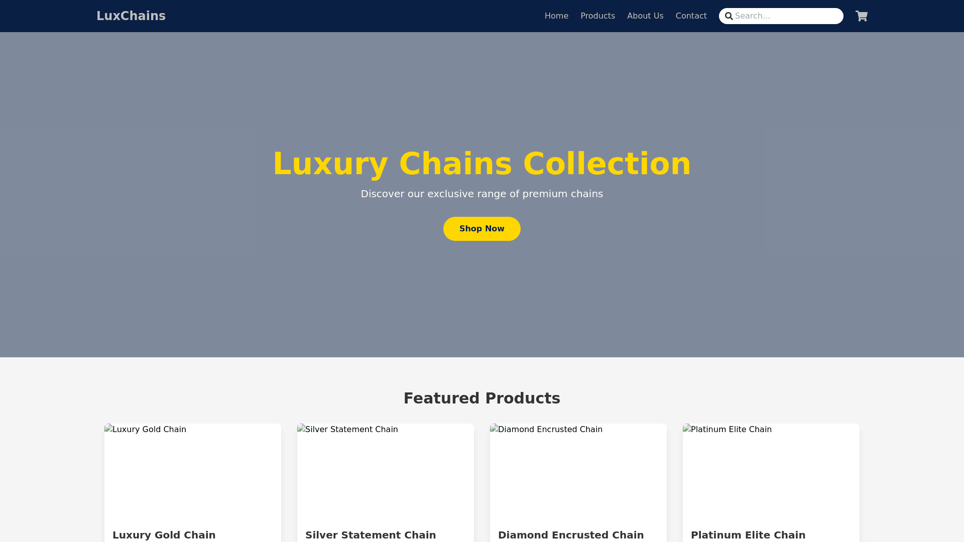
Product Showcase - Copy this React, Tailwind Component to your project
Color Scheme Primary Color: Dark Blue (#0A1F44) Conveys trust, professionalism, and reliability. Secondary Color: Silver (#C0C0C0) Evokes the metallic nature of chains, adding a sleek, modern touch. Accent Color: Gold (#FFD700) Highlights call to action buttons and important elements to draw attention and suggest value. Background: Light Gray (#F5F5F5) Ensures readability and complements the primary colors without overpowering them. Text Color: Charcoal (#333333) Provides excellent contrast for readability against the light gray background. Main Interface Header: Logo: Positioned on the top left, featuring a minimalistic design in dark blue. Navigation Bar: Horizontally aligned, including links to Home, Products, About Us, Contact, and a Search bar. Uses silver text on a dark blue background. Hero Section: Full Width Image: Showcasing high quality images of the chains in use or displayed professionally. Tagline: Bold and succinct, placed centrally in gold text over a semi transparent dark blue overlay. Product Display: Grid Layout: Organized into a clean, responsive grid. Each product has a thumbnail, name, brief description, and price. Hover Effect: Products have a subtle gold border on hover to enhance interactivity. Call to Action: Prominent buttons like "Buy Now" or "Learn More" in gold, placed strategically across the site. Sticky Footer: Contains contact details, quick links, and social media icons in silver. Footer: Dark Blue Background: With white text for contrast, it includes company details, a subscription form for newsletters, and trust badges.
