Contact Management - Copy this React, Mui Component to your project
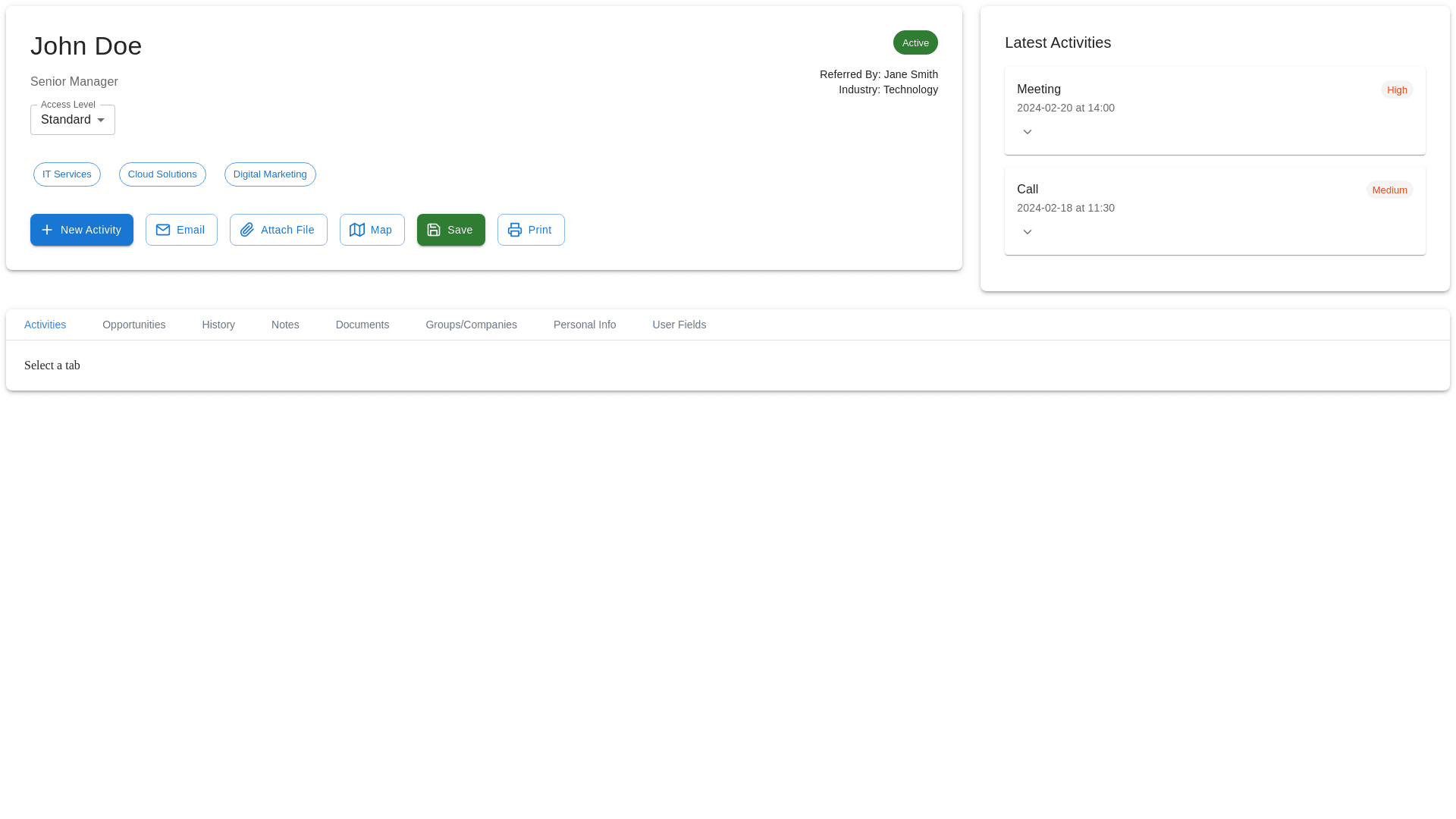
here’s an enhanced Contact Management Design Concept that could improve both the user experience and the overall functionality. Key Features to Improve the Contact Management UI: 1. Contact Overview Section: This should provide a clear and concise presentation of the contact's details, making it easy for users to quickly access essential information. Contact Header: Display the contact’s name, title, company, and contact details (phone, mobile, email) in a visually appealing way. Active Status: Use a color indicator (e.g., green for active, red for inactive). Action Buttons: Buttons like New Activity, Email, Attach File, Map, Save, and Print should be placed together in a group, with distinct colors to denote their importance. UI Update Idea: A clean rounded card layout for the contact details. Icons for each button (e.g., FiMail for email, FiSave for save) to make them visually easy to identify. 2. Latest Activities Section: This section should display recent actions, including meetings, calls, and other activities, using clear status indicators such as High, Medium, and Low priorities. UI Update Idea: Utilize color-coded labels next to each activity (e.g., Red for High, Yellow for Medium) to signify the priority. Include hover-over effects to expand more details about each activity (like time, duration, and assigned person). 3. Tab Navigation for Detailed Information: Provide multiple tabs for accessing different sections related to the contact (e.g., Activities, Opportunities, History, Documents). UI Update Idea: A horizontal navigation bar with easy-to-read text and icons for each tab. On selecting a tab, its content should be displayed below, while the others remain collapsed. 4. Filter & Sorting Options: Allow users to filter activities by time frame (today, week, month), priority (high, medium, low), and status (completed, pending, cancelled). UI Update Idea: Filters should be presented in a grid with dropdown menus for each option to ensure quick selections. Make use of active tags (e.g., blue, green) to show currently applied filters. 5. Activity & History List: List out all activities associated with the contact and allow easy access to update or view them in detail. UI Update Idea: Each activity should have its own expandable section, showing duration, assigned person, and status. Hover effects can show more actions such as edit or delete for activities. 6. Documents Section: Make it easy to upload and manage documents associated with the contact. UI Update Idea: Display documents in a card grid layout, with each card containing document name, type, size, and upload date. Add action buttons such as Preview, Download, and Delete. 7. Divisions & Company Profile: If the contact is associated with a company, show the company’s divisions and the user’s role in those divisions. UI Update Idea: Use tags/chips to show the divisions, with a distinct color for each division. Display the Company Profile in a side panel, clearly segmented into sections like Revenue, Number of Employees, and Region. Key Features of the New UI/UX Design: Consistent Layout: Use of Cards and Grids to ensure a consistent design layout across sections. Color Codes for Priorities: Clear visual representation of activity priority (e.g., High Priority = Red, Medium = Yellow). Tabs for Organization: Easy-to-navigate tabs to view different sections, making the page less cluttered. Interactive Elements: Hover effects, action buttons, and dynamic content that encourages users to interact with the contact details. This design approach will improve the usability and visual appeal of the contact management page, providing an efficient workflow for users managing contacts and activities. Would you like to explore specific features further or refine any sections?