Contact Management - Copy this React, Mui Component to your project
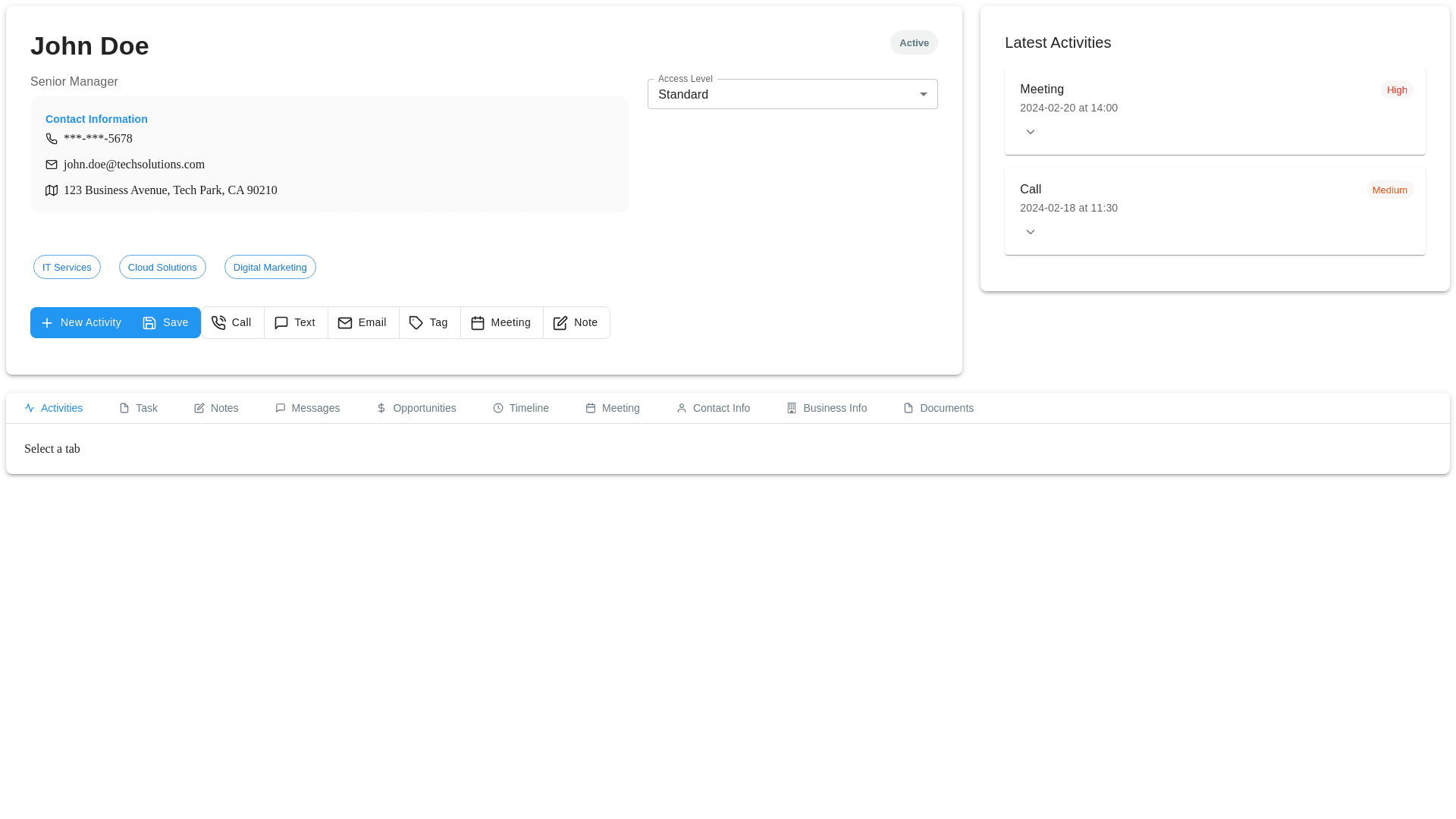
here’s a refined concept with added icons for Notes, Call, Text, Email, Tag, Meeting, and others, specifically tailored for a CRM (Customer Relationship Management) interface. 1. Updated Contact Overview Section: We can enhance the Contact Information area and add the necessary icons to each action button. Below are some suggestions: Contact Header: Contact Name: Display John Doe prominently with his title and company below. Status: Use a color-coded badge for status, like green for Active and red for Inactive. Action Buttons: Group buttons for New Activity, Save, Email, Attach File, Map, and Print in a horizontal row. 2. Icons for CRM Actions: Add icons for common CRM-related activities to the button list for better clarity and interactivity: Note: A paper and pen or sticky note icon to represent adding notes. Call: A phone icon to initiate a call. Text: An SMS/chat bubble to indicate text messages. Email: An envelope icon for emails. Tag: A tag or label icon for categorizing or tagging contacts. Meeting: A calendar or clock icon for meeting scheduling. 3. Latest Activities Section: The Latest Activities section should display recent activities clearly and efficiently: Activity Card Layout: Organize activities in cards or rows with priority badges, date, time, and assigned person. Expandable Activity: Clicking an activity should expand to show more details such as assigned users, duration, and status. 4. Improved Tab Navigation: Revamp the tab system to allow users to quickly switch between sections (e.g., Activities, Tasks, Notes, Opportunities, Documents, etc.). Icons for Each Tab: Each tab should have a distinct icon (e.g., Task as a checklist icon, Notes as a notepad icon, Documents as a paperclip icon). Highlight the active tab with a colored underline or background. 5. Detailed Layout Concept: Contact Overview Section: Add a card with John Doe’s information, status, and actions such as New Activity, Email, Attach File, Save, and Print. Latest Activities Section: Each activity (like a meeting or call) should have a color-coded label indicating priority (e.g., High = Red, Medium = Orange). Activity Details should be shown when expanded (assigned person, duration, status). Tab Navigation: Tabs should allow users to switch between Activities, Tasks, Opportunities, Notes, Documents, Messages, Timeline, Business Info, etc. Each tab should be represented by an icon, making the UI easier to navigate. Updated Design Concept: Here’s a conceptual update with the improvements: Contact Info Section: A card layout with a large name, title, company, and contact info. Icon-based buttons for New Activity, Save, Email, Attach File, Map, Print. Latest Activities: A list of recent activities shown in cards or rows, with priority color coding and expandable details. Tabs with Icons: Use icons to represent tabs like Activities (Checklist), Messages (Speech Bubble), Notes (Sticky Note), Tasks (Calendar), Documents (Paperclip), Opportunities (Briefcase), and others. General Layout: Keep the layout responsive for mobile and desktop users, ensuring the design adjusts for different screen sizes. Proper spacing and padding around sections for clarity. This updated design includes a modern layout with icon-based actions, activity cards, and a tabbed interface for easy navigation across different CRM sections. Let me know if you need further adjustments or additional features!