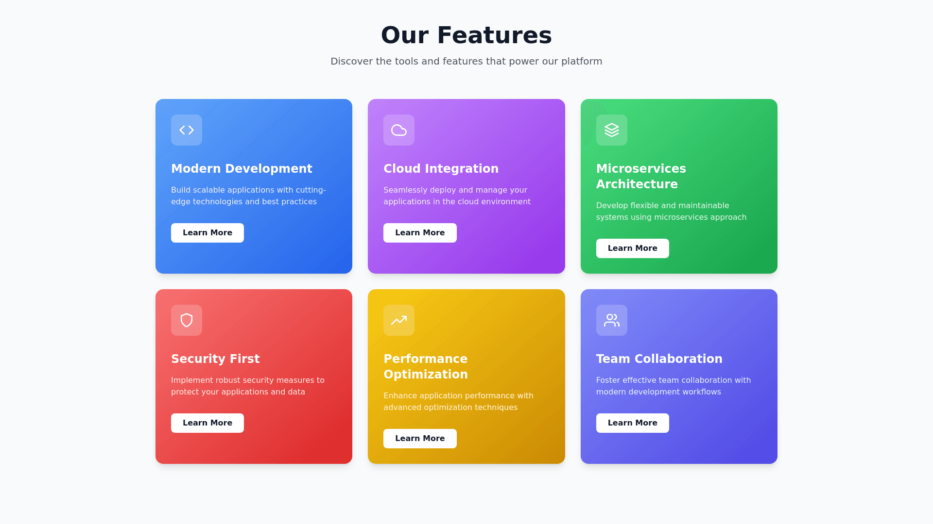
Feature Cards - Copy this React, Tailwind Component to your project
Make the page looks provisional its in nextjs: "use client"; import dynamic from "next/dynamic"; import { MagnifyingGlassIcon, DocumentTextIcon, PuzzlePieceIcon, DocumentDuplicateIcon, BookOpenIcon, ChatBubbleBottomCenterTextIcon, PencilSquareIcon, AcademicCapIcon, } from "@heroicons/react/24/outline"; import { Card, CardHeader, CardContent } from "@/components/ui/card"; // Dynamically import the motion components we need const MotionDiv = dynamic( () => import("framer motion").then((mod) => mod.motion.div), { ssr: false } ); interface FeatureCard { title: string; description: string; icon: React.ElementType; } const features: FeatureCard[] = [ { title: "Search Words", description: "Powerful word search functionality with advanced filters and suggestions", icon: MagnifyingGlassIcon, }, { title: "Cross Words", description: "Interactive crossword puzzles with varying difficulty levels", icon: PuzzlePieceIcon, }, { title: "Documents", description: "Secure document management and organization system", icon: DocumentTextIcon, }, { title: "Library", description: "Extensive collection of digital resources and references", icon: BookOpenIcon, }, { title: "Text Analysis", description: "Advanced text analysis tools and insights", icon: ChatBubbleBottomCenterTextIcon, }, { title: "Notes", description: "Smart note taking with organization features", icon: PencilSquareIcon, }, { title: "Learning", description: "Personalized learning paths and progress tracking", icon: AcademicCapIcon, }, { title: "Templates", description: "Ready to use document templates for various purposes", icon: DocumentDuplicateIcon, }, ]; const container = { hidden: { opacity: 0 }, show: { opacity: 1, transition: { staggerChildren: 0.1, }, }, }; const item = { hidden: { opacity: 0, y: 20 }, show: { opacity: 1, y: 0 }, }; export default function CreateDocument() { return ( <main className="min h screen py 8 px 4 sm:px 6 lg:px 8"> <div className="max w 7xl mx auto"> <MotionDiv variants={container} initial="hidden" animate="show" className="grid grid cols 1 md:grid cols 2 lg:grid cols 4 gap 4" > {features.map((feature, index) => ( <MotionDiv key={index} variants={item}> <Card className="group hover:shadow lg transition shadow duration 300 rounded xl overflow hidden bg background mb 4"> <CardHeader className="flex flex row items center p 3"> <div className="h 10 w 10 bg muted rounded xl flex items center justify center group hover:bg muted transition colors duration 300"> <feature.icon className="h 5 w 5 text foreground" /> </div> <h3 className="text md font semibold text foreground ml 2"> {feature.title} </h3> </CardHeader> <CardContent className="mt 2 text left px 3 pb 3"> <p className="text sm text muted foreground mb 3"> {feature.description} </p> <button className="px 3 py 1 bg blue 600 text white rounded lg hover:bg blue 700 transition colors text sm"> Start </button> </CardContent> </Card> </MotionDiv> ))} </MotionDiv> </div> </main> ); }
