Styled Container - Copy this React, Mui Component to your project
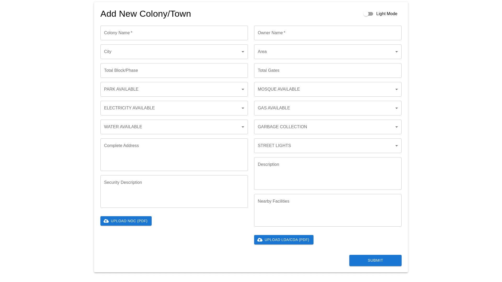
Create-a-responsive-"Add-New-Colony/Town"-form-that-matches-the-provided-layout.-The-form-should-have-two-fields-per-line-on-desktop-devices-and-adapt-to-a-stacked,-single-column-layout-on-smaller-screens-(tablet/mobile).-It-must-support-dark-mode-and-light-mode-with-a-toggle-feature.-Design-Features:-1.-Form-Layout:-Two-fields-per-row-(Desktop):-Align-form-fields-side-by-side-with-equal-width-to-maintain-symmetry.-Maintain-consistent-vertical-and-horizontal-spacing-between-rows-and-columns.-Single-column-layout-(Mobile/Tablet):-Stack-fields-vertically-with-proper-spacing-for-readability.-Ensure-upload-buttons-are-easy-to-click-on-touchscreens.-Fields-should-be-visually-grouped-for-better-UX-(e.g.,-owner-related-fields-together).-2.-Fields:-Left-Column:-Colony-Name-(Text-input)-City-(Dropdown)-Total-Block/Phase-(Number-input)-Park/Playground-Available-(Dropdown:-Yes/No)-Electricity-Available-(Dropdown:-Yes/No)-Water-System-Available-(Dropdown:-Yes/No)-Road-(Dropdown)-Complete-Address-(Multiline-text-area)-Security-Description-(Multiline-text-area-with-placeholder:-e.g.,-CCTV-Cameras)-NOC-(File-upload-button,-accepts-.pdf-only)-Right-Column:-Owner-Name-(Text-input)-Area-(Dropdown)-Total-Gates-(Number-input)-Mosque-Available-(Dropdown:-Yes/No)-Sui-Gas-Available-(Dropdown:-Yes/No)-Garbage-Collection-System-Available-(Dropdown:-Yes/No)-Street-Lights-Available-(Dropdown:-Yes/No)-Description-(Multiline-text-area)-Nearby-Facilities-(Multiline-text-area-with-placeholder:-e.g.,-Under-1KM-Market)-LDA/CDA-(File-upload-button,-accepts-.pdf-only)-3.-Required-Field-Indicators:-Add-an-asterisk-(*)-next-to-required-fields.-Display-a-clear-validation-message-if-a-required-field-is-left-blank.-4.-Buttons:-Upload-NOC-(.pdf):-Styled-for-easy-interaction.-Upload-LDA/CDA-(.pdf):-Similar-styling-as-NOC-button.-Use-icons-to-indicate-file-uploads.-5.-Styling:-Use-a-two-column-grid-layout-for-desktop-screens.-Fields-must-have-rounded-corners,-subtle-hover-effects,-and-a-focus-state-with-a-highlighted-border.-Use-a-contrasting-color-scheme-for-dark-and-light-modes:-Dark-Mode:-Black/grey-background-with-white/grey-text.-Light-Mode:-White-background-with-black-text.-Button-colors-should-be-consistent-with-the-theme-(e.g.,-blue-for-actions).-6.-Responsive-Design:-Implement-a-flexbox-or-grid-based-layout:-On-large-screens,-maintain-two-fields-per-row.-On-smaller-screens,-adjust-to-a-single-column-layout.-Ensure-proper-alignment-and-spacing-for-all-input-fields-and-buttons.-7.-Dark-&-Light-Mode:-Include-a-toggle-switch-to-allow-users-to-switch-between-themes.-Maintain-consistent-padding,-margins,-and-color-contrasts-in-both-modes.-8.-Typography:-Use-modern-and-readable-fonts-with-proper-line-height-and-spacing.-Highlight-required-fields-with-a-different-text-color-or-bold-font.-9.-Validation-&-UX:-Implement-instant-validation-for-required-fields.-Show-tooltips-or-placeholders-for-better-clarity-(e.g.,-examples-for-Security-Description-or-Nearby-Facilities).