Space Settings Panel - Copy this React, Tailwind Component to your project
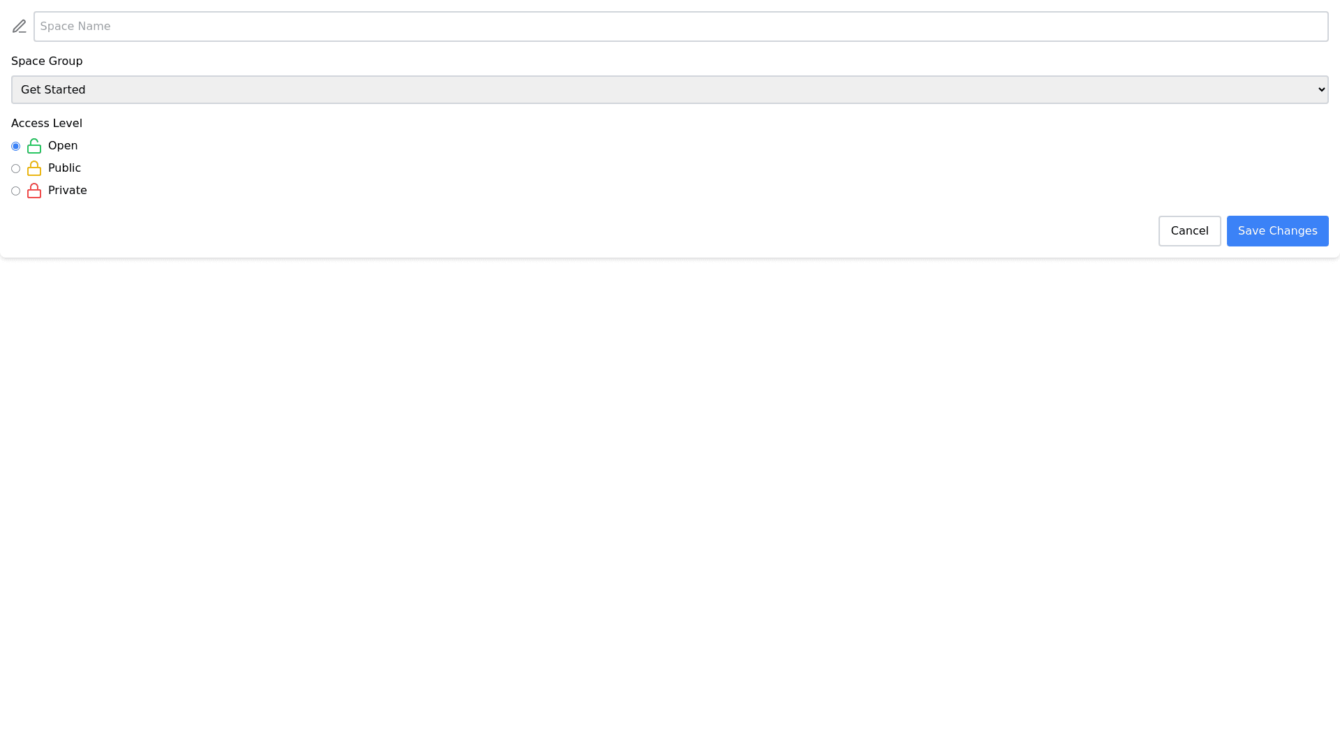
Create-a-settings-panel-for-configuring-a-new-community-space,-which-should-encompass:-A-"General"-section-at-the-top,-with-a-field-to-input-the-"Space-name",-adorned-with-an-icon-indicative-of-personalization-or-naming.-A-dropdown-menu-for-selecting-the-"Space-group"-with-a-default-option-like-"Get-Started".-An-"Access"-section-containing-radio-buttons-for-three-levels-of-space-accessibility:-Open:-Where-access-is-by-invitation-or-payment,-but-visibility-is-open-to-the-entire-community.-Public:-With-closed-access-(invitation-or-payment)-and-restricted-visibility-to-invited-members-only.-Private:-Accessible-openly-to-anyone-in-the-community-and-visible-to-all-community-members.-Each-access-level-should-have-brief-descriptions-for-both-"Access"-and-"Visibility"-to-provide-clarity-on-the-settings.-Buttons-at-the-bottom-for-"Cancel"-to-discard-changes-and-"Save-Changes"-to-apply-the-new-configurations.-The-interface-should-offer-clear-differentiation-between-access-levels-and-an-intuitive-layout-for-easy-use.-The-design-should-integrate-smoothly-with-the-overall-aesthetic-of-the-community-platform,-maintaining-brand-consistency.