Styled Table Cell - Copy this React, Mui Component to your project
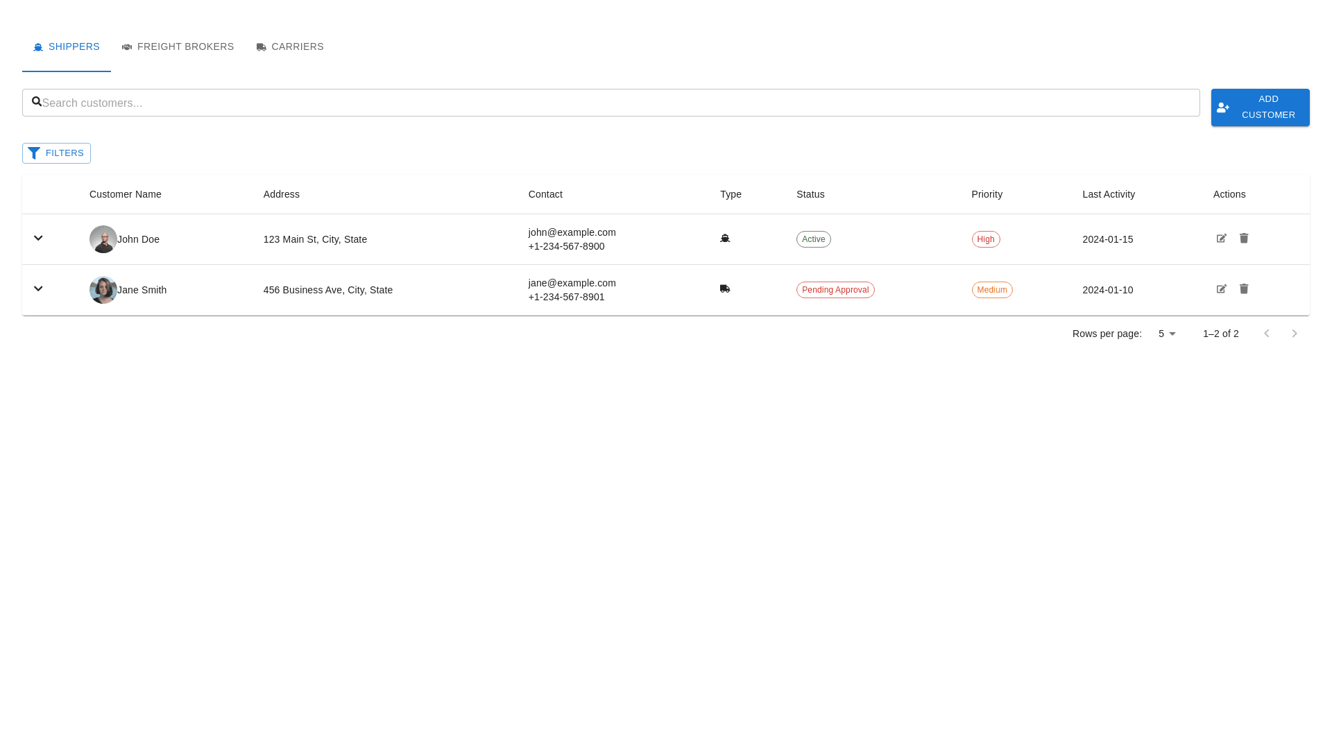
customer listing with the new table structure—Customer Name, Address, Contact, Type, Status, Priority, Last Activity, and Actions—here's a refined approach: Redesign Concept for Customer Listing 1. Updated Table Structure Customer Name: This column will feature customer names along with a photo or initials for visual appeal and easy identification. Address: A new column displaying the customer’s address (if applicable). This will ensure the user has quick access to this critical data point. Contact: The customer’s email address and phone number, styled consistently for clarity and quick reference. Type: Indicates whether the customer is a Shipper, Freight Broker, or Carrier, with corresponding icons for better visual clarity. Status: Continue showing whether the customer is Active, Inactive, or in other states like Pending Approval or On Hold, with color-coded status labels (Green for Active, Red for Inactive, etc.). Priority: This column would include color-coded badges or labels to easily identify customers with High, Medium, or Low priority. Last Activity: A straightforward date field showing the most recent interaction with the customer (use a relative time format like "1 week ago" for added user-friendliness). Actions: Icons for editing, deleting, or assigning actions like Assign Sales Rep, Track Shipments, or View Details. 2. Design Enhancements Icons for Clarity: Use small, clean icons in the Type column to represent Shippers (truck), Freight Brokers (network symbol), and Carriers (moving truck). Color-Coding: Ensure all critical information, like Status and Priority, is color-coded for fast identification (e.g., Active in green, Pending Approval in yellow, High Priority in red). Action Icons: Keep the Actions column compact with small icons for View, Edit, and Delete. You might add hover-over tooltips to explain each action. 3. Layout Clear Header Row: Use bold, legible font for column titles such as Customer Name, Address, Contact, etc. Interactive Rows: Make rows interactive with hover effects for better user interaction and quick recognition of the selected row. Expandable Rows (Optional): Include the option for users to click and expand a row to view more detailed information (e.g., customer interaction history, more detailed address info). 4. Filters & Search Search Bar: Keep the search bar at the top to allow users to search by customer name, contact information, or other relevant fields. Filters: Enhance the Filters section to allow filtering by Status, Type (Shipper, Carrier, etc.), Priority, and Region. No Export Button: As you preferred, we’ll remove the Export button to keep the layout cleaner. 5. Responsive Design Ensure the table is mobile-friendly, adapting to smaller screens by collapsing columns or stacking important information when viewed on mobile or tablet devices. Final Design Outline: Header Section: Search bar. Category tabs for Shippers, Freight Brokers, and Carriers. Filters button. Body Section: Table with columns: Customer Name, Address, Contact, Type, Status, Priority, Last Activity, Actions. Each row features compact, intuitive action icons for quick management. Footer: Pagination controls (with the option to choose the number of rows per page). Mock-Up of the Suggested Layout: Here’s a conceptual mock-up: Customer Name Address Contact Type Status Priority Last Activity Actions John Doe 123 Elm St. john@example.com Shipper Active High 2024-01-15 [Edit][Delete] Jane Smith 456 Oak Rd. jane@example.com Carrier Pending Approval Medium 2024-01-10 [Edit][Delete] This design prioritizes clarity, accessibility, and visual appeal while maintaining a user-friendly interface for managing customers efficiently. The inclusion of Priority, Status, and Type allows for quick insights into each customer, and the Actions section keeps management options easily accessible.