Styled Table Cell - Copy this React, Mui Component to your project
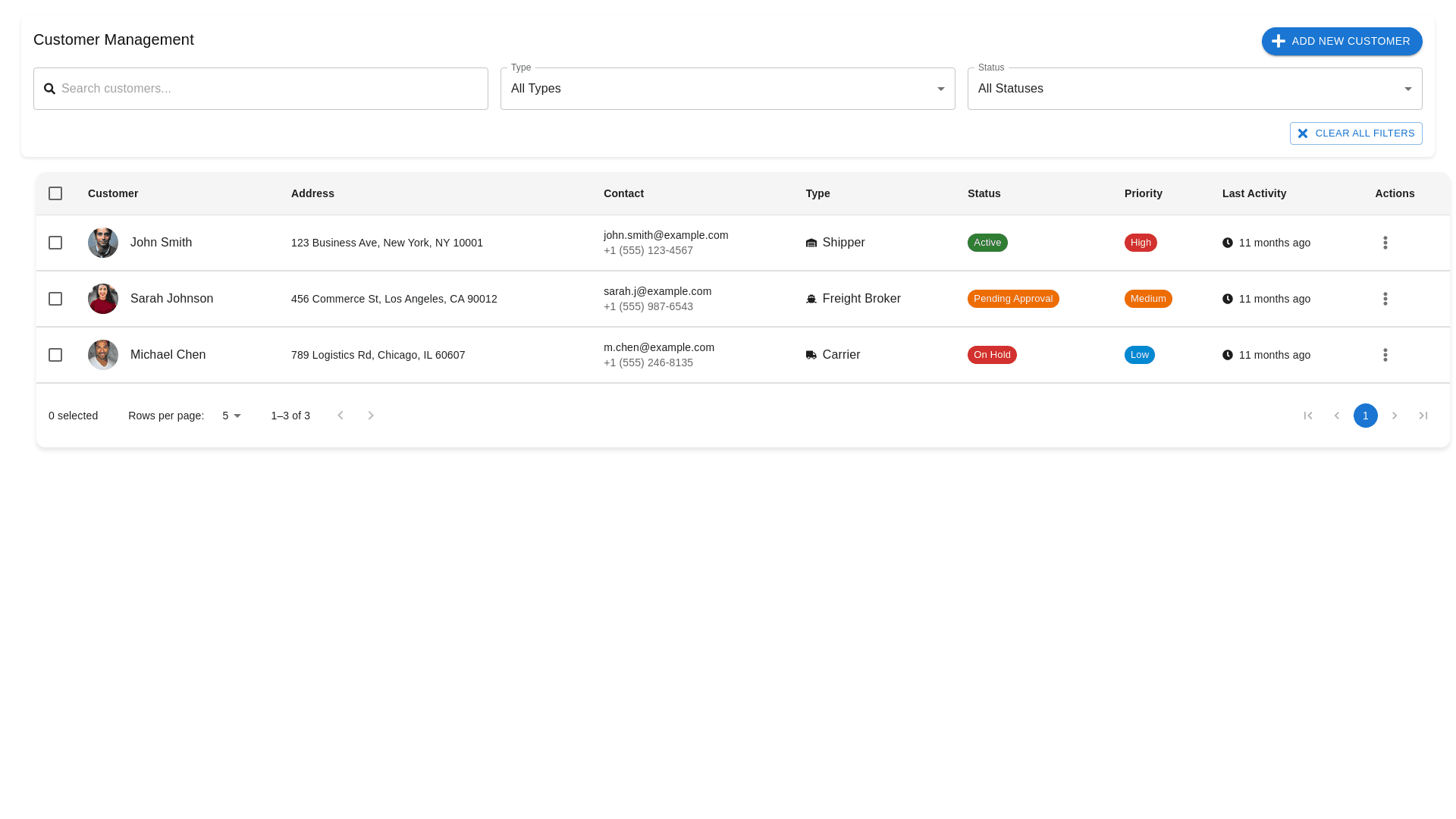
To make the "Add New Customer" button fully functional and improve the customer management interface further, here’s an updated plan that focuses on making the Add New Customer feature intuitive and user-friendly while maintaining the clean layout: 1. Make the "Add New Customer" Button Functional: Design & Placement: The "Add New Customer" button is placed well in the top-right corner of the header, making it easy for users to locate and use. Ensure it stands out by keeping it in a primary color (like blue) and adding a plus icon next to the text for visual clarity. Functionality: Click Action: When clicked, the "Add New Customer" button should open a modal window or a side panel with the form for entering new customer details. This keeps the user on the same page and provides a smooth workflow without the need for page redirection. The modal or panel should include the following fields: Customer Name (text input) Address (textarea or multi-line input for long addresses) Contact Information (email and phone number fields) Type (dropdown with options: Shipper, Freight Broker, Carrier) Status (dropdown with options: Active, Pending Approval, On Hold, etc.) Priority (dropdown with options: High, Medium, Low) Save and Cancel Buttons at the bottom. Save: After clicking the Save button, the modal should close, and the newly added customer should instantly appear in the customer list without requiring a page reload. 2. Improving Table & Row Selection: Checkbox for Multi-Selection: Add checkboxes next to each customer row to enable multi-selection. This allows users to easily select multiple customers and perform bulk actions like Delete, Change Status, or Assign Representative. Bulk Actions: Display a bulk action toolbar at the top of the table once the user selects one or more checkboxes. The toolbar should have options like: Delete selected Update status Assign to a rep Export selected (optional) Row Hover & Expandability: Add hover effects to the table rows to make them feel interactive. Expandable rows can be added where users can click a row to reveal more customer details, such as recent activity, notes, or shipments. This will keep the table clean but allow users to access more information as needed. 3. Improving Filter Functionality: Filter Reset: The "Clear All Filters" button should remain at the top right, allowing users to easily reset the filter options. Consider adding an "Apply" button next to the filter dropdowns, ensuring that filters only apply after the user confirms, reducing the chance of unintentional filter changes. Search Enhancements: Real-time search: Implement real-time search where the customer table automatically updates as the user types in the search box. This improves the speed of filtering and helps users find customers faster. Search Suggestions: Add search suggestions within the search bar (e.g., customer names, email addresses) as users type to make finding customers easier. 4. Pagination & Navigation: Enhanced Pagination: For easier page navigation, implement a pagination slider along with page numbers (e.g., "Page 1 of X") so users can quickly jump to a specific page. Additionally, you could allow users to change the number of rows per page directly in the pagination area (e.g., options like 5, 10, 25, 50). 5. Visual Design & Cleanliness: Status & Priority Design: Color-coded Status: Keep the color-coding for Status (e.g., Active in green, Pending Approval in orange, On Hold in red). However, consider making the status badges slightly rounded for a cleaner, modern look. Priority Badges: Use rounded priority badges with colors like red for High, orange for Medium, and blue for Low. This enhances the design consistency and helps users quickly identify priority levels. 6. Responsive Design: Ensure that the table and filters are fully responsive. On mobile or tablet devices, the table should stack vertically with essential fields like Customer Name, Contact, and Status easily visible. Other fields like Address and Priority can collapse into expandable rows or tooltips. Final Concept: Header Section: Search Bar with real-time search functionality and clear all button. Filter Dropdowns for Type and Status with a clear all filters button. "Add New Customer" Button at the top-right with a plus icon for clarity. Body Section (Table): Checkboxes for multi-selection, hover effects on rows, and expandable rows for additional customer details. Real-time search and filtering to instantly update the table. Color-coded badges for Status and Priority. Footer Section: Pagination Controls with page numbers, page jump, and rows per page options. Bulk Action Toolbar that appears when rows are selected, allowing actions like Delete or Update Status. This design approach will ensure a clean, functional, and interactive customer management experience while making the Add New Customer feature intuitive and easy to use.