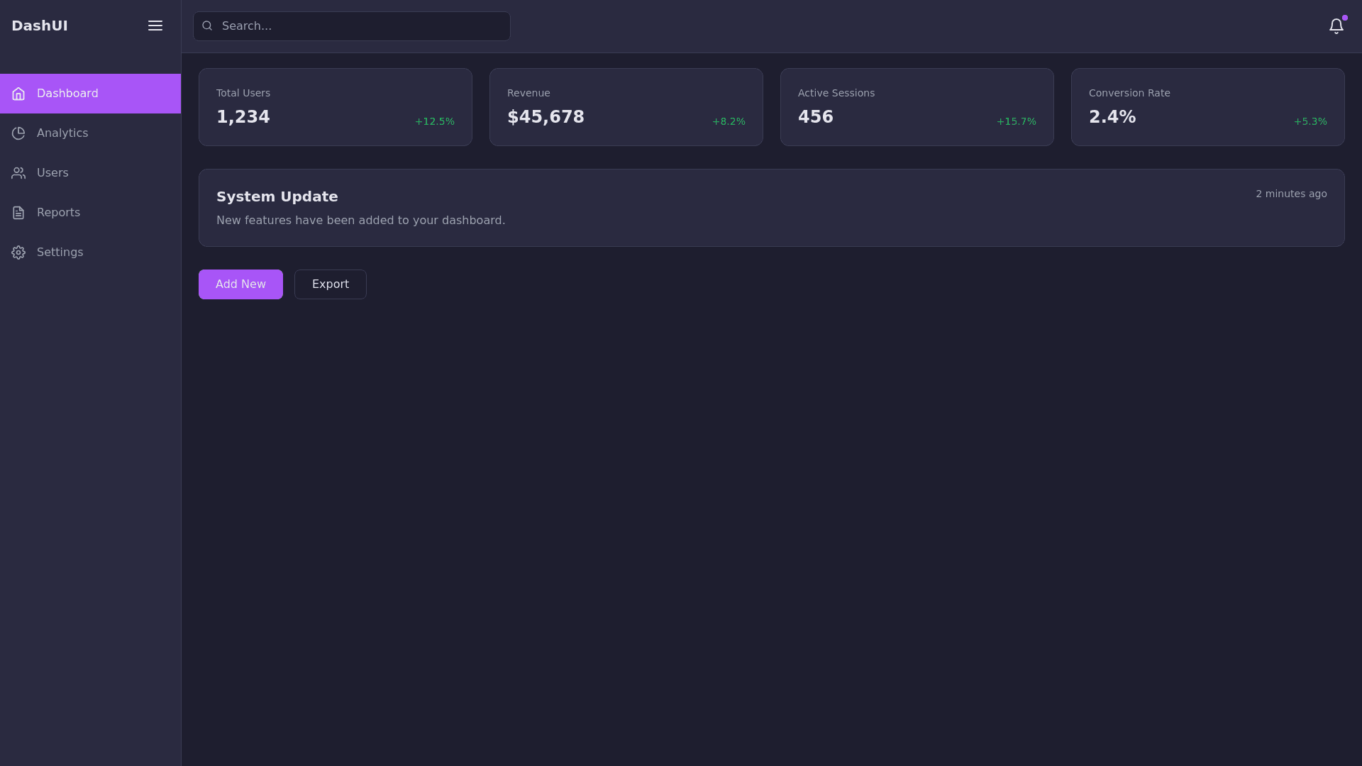
Dark Dashboard - Copy this React, Tailwind Component to your project
Create-a-dark-themed-UI-interface-inspired-by-a-modern-dashboard-style.-Use-the-following-color-palette-for-the-design:-Primary-Background:-#1E1E2F-Secondary-Background:-#2A2A40-Border-Color:-#3B3B54-Accent-Color:-#A855F7-Hover-Accent-Color:-#9333EA-Primary-Text:-#E4E4EB-Secondary-Text:-#9CA3AF-The-design-should-include-the-following-elements:-A-sidebar-on-the-left-with-menu-options-styled-using-the-secondary-background-and-border-color.-A-header-at-the-top-using-the-primary-background-with-bold-text-in-primary-text-color.-A-main-content-area-with-a-grid-layout-for-cards-or-posts.-Buttons-with-the-accent-color-and-a-hover-effect-using-the-hover-accent-color.-A-notification-card-or-message-box-styled-to-blend-into-the-dark-theme-while-highlighting-important-text-using-the-accent-color.-Ensure-the-design-is-minimalistic,-user-friendly,-and-easy-to-navigate.
