Dark Theme - Copy this React, Mui Component to your project
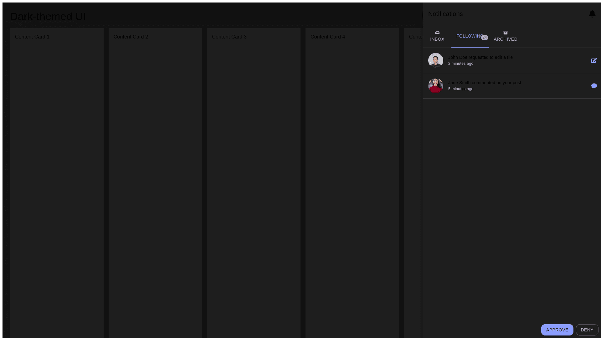
Create a dark themed user interface showing a notification panel open on the right side of the screen. The main UI is sleek and modern with a focus on blacks, grays, and minimal colors. The notification panel is divided into three tabs: 'Inbox', 'Following', and 'Archived'. The 'Following' tab is active, showing a notification count of 24. Notifications contain user avatars, short text descriptions, timestamps, and interactive buttons like 'Deny' and 'Approve'. Examples of notifications include a request to edit a file (e.g., 'Dylan has requested to edit the file Astro Illustration') and an edited file preview ('Marina Niki edited Earthfund Master'). Each notification has a specific icon indicating actions like file edits or comments. The layout features rounded edges, with certain elements highlighted in blue, purple, and other soft tones. The rest of the interface behind the notification panel is blurred and contains placeholders for content, such as grids or cards, maintaining a clean and minimalist design throughout.