Styled Avatar - Copy this React, Mui Component to your project
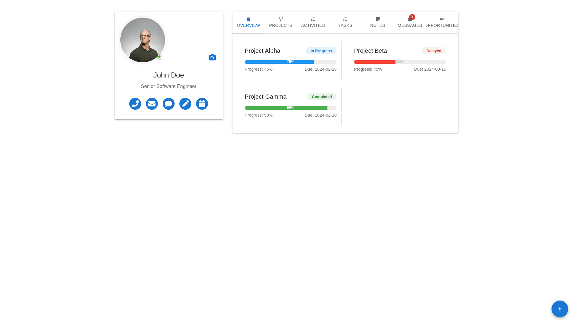
Here are a few suggestions: 1. Profile Section: Avatar and Status: Place the user’s avatar and their status (e.g., online/offline) in a circular container with a subtle shadow to make it pop. Additionally, the status could be interactive, showing details when hovered (e.g., "Active", "Busy", "Away"). Expandable Profile Info: Consider expanding the profile section with a clickable area that shows more details about the user (e.g., full name, department, etc.) when clicked. Icons for Contact Info: The contact buttons (phone, email, etc.) can be modernized with cleaner, subtle icons. Group these icons together in a rounded container with a hover effect for better interaction. 2. Navigation Bar: Sticky Navigation: Make the navigation bar sticky so users can quickly access any section as they scroll down. Icon Buttons with Labels: The icons for different sections (e.g., Overview, Projects, Tasks) are a good start. To make them even more user-friendly, add labels next to each icon to clarify the section's function, especially for new users. Highlight Active Section: Add a visual cue to highlight the currently active section. This could be a border or an underline beneath the active section. 3. Project Cards: Hover Effects on Cards: Use hover effects to give the user more interactive feedback. For example, make the project cards slightly expand or display a summary of the project when hovered. Progress Indicators: The project progress bars can be improved by adding a percentage indicator inside the bar, along with color coding for different statuses (e.g., Blue for In Progress, Green for Completed, Red for Delayed). Card Statuses: Instead of showing just "In Progress" or "Completed" as plain text, you could add a tag-like design that wraps around the status text with matching background colors for better visibility (i.e., blue for in-progress, green for completed, red for delayed). 4. Metrics & Stats Section: Grouped Stats: The project completion, success rate, and hours logged are important stats. Group these into compact cards with minimal text. Add some animation (e.g., a smooth counter effect) when the page loads to grab attention. Icons for Stats: Use custom icons next to the stats like projects, success rate, and hours logged to make them more visually interesting. 5. Activity Section: Detailed Info in Projects: Add more details under each project (e.g., team members, last update time, or link to project page). Filter Options: Add filter options on the top of the project section (e.g., by status, due date, etc.), allowing users to sort and prioritize their view. Task Visibility: Show tasks directly linked to the projects within the project cards. Use expandable sections or hover actions to view tasks for each project, providing quick access. 6. Responsiveness & Mobile Layout: Mobile Adaptation: Ensure that the layout adapts well to smaller screens. Use collapsible elements for sections like projects, tasks, and the profile section for a smooth mobile experience. Tab Design for Mobile: Implement a horizontal scroll or collapsible menu for the top bar on mobile. This will allow the user to switch between sections without taking up too much space. 7. Overall Aesthetic Enhancements: Modern Color Palette: Use a more modern color palette with a mix of pastel and vibrant colors, making the design more visually appealing while ensuring accessibility. Typography: Use modern fonts like 'Roboto' or 'Poppins' with proper spacing and weight hierarchy to improve readability. Smooth Transitions & Shadows: Apply smooth transition effects and subtle shadows for interactive elements such as buttons, cards, and dropdowns to make the UI feel more dynamic. 8. Other Functional Improvements: Real-time Updates: Implement real-time updates for the project progress and task statuses. If possible, allow users to update project and task statuses directly from the dashboard, improving workflow efficiency. Collapsible Sidebar: Allow the sidebar to collapse for more screen space when viewing projects or tasks, especially useful on smaller screens. With these changes, the dashboard will not only look more modern and engaging but also provide a smoother and more efficient user experience.