Dashboard - Copy this React, Tailwind Component to your project
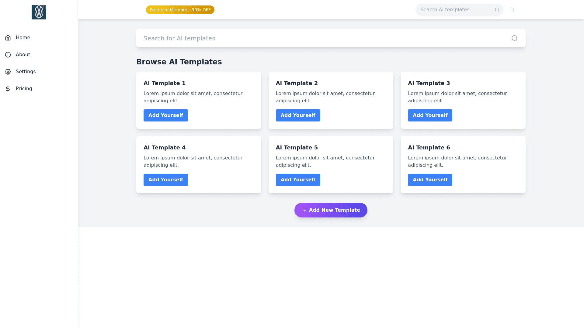
Dashboard Layout and Design: Sidebar (left side): Position: Fixed on the left side, occupying full height. Top Section: Display a logo at the very top with a sleek and modern design. Below the logo, include navigation links: Home, About, Settings, Pricing. UI Style: Clean, minimalist, and smooth hover effects with icon support for each item. Responsive: The sidebar should collapse into a hamburger icon on smaller screens, with smooth transitions and an overlay effect. Navbar (top bar): Position: Fixed at the top, running full width. Left Section: A noticeable Premium Member label with 90% off text, styled with vibrant colors like gold or gradient to stand out. Right Section: A Search Bar with a placeholder text like "Search AI templates," styled with soft rounded edges and a magnifying glass icon. Responsive: The search bar should reduce in size on smaller screens, keeping the layout intact, and the Premium Member badge should scale down. Main Content Area: Positioned below the navbar and to the right of the sidebar, allowing ample space for content. At the very top, add a large search box with an eye catching design, placed centrally with soft shadow effects for a modern touch. The box should be prominent but blend with the overall aesthetics. Browse AI Templates section: Just below the large search box, display a section for browsing templates. Use a card grid layout, where each card represents an AI template. Card design: Each card should have subtle animations on hover, a drop shadow for depth, and include a button that says "Add Yourself". The cards should include an image, template name, and brief description, and be designed with a high level UI, maintaining responsiveness. Below the grid, provide an "Add New Template" button with a plus icon, styled with a floating effect and animated on hover. High Level UI Details: Overall design should include glassmorphism and neumorphism effects for a futuristic, high tech feel. Use gradients and modern fonts, focusing on smooth, elegant animations. Light and dark mode support. Responsive design, ensuring optimal performance across devices (desktop, tablet, and mobile). Color Scheme: Primary: Soft blues, purples, or pastels for a futuristic tech feel. Accents: Gold or neon highlights for premium elements. Text and Backgrounds: Clean whites, greys, or dark themes for contrast. This will ensure the design is visually stunning, functional, and responsive, creating a premium experience.