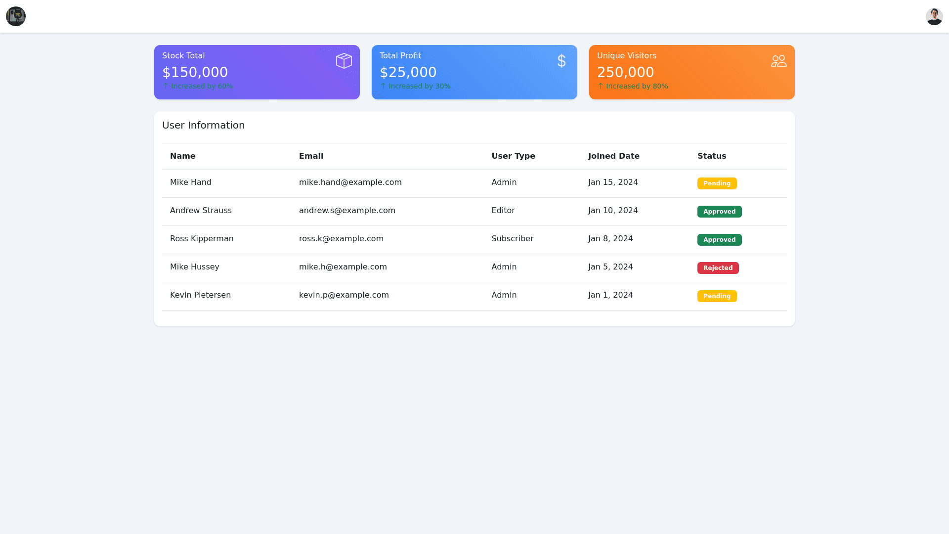
Company Performance Dashboard - Copy this Html, Bootstrap Component to your project
Here’s a clear and detailed explanation of this page, so anyone (a chatbot, kid, or developer) can replicate it: Page Overview: This is a dashboard page designed for a company, showcasing key performance metrics and a table with user information. The layout is simple, colorful, and functional. Key Components: 1. Header: Company Logo: Positioned at the top left corner. User Profile Icon: Positioned in the top right corner. 2. Main Content: Metrics Section: Three colorful cards displaying statistics: 1. Stock Total (Purple card): Value: $150,000 Subtitle: "Increased by 60%" 2. Total Profit (Blue card): Value: $25,000 Subtitle: "Increased by 30%" 3. Unique Visitors (Orange card): Value: 250,000 Subtitle: "Increased by 80%" Each card has a distinct color gradient. Table Section: A standard table displays user information, including: Columns: Name Email User Type (e.g., Admin, Editor, Subscriber) Joined Date Status (Pending, Approved, Rejected) Sample Data: 1. Mike Hand (Admin, Pending) 2. Andrew Strauss (Editor, Approved) 3. Ross Kipperman (Subscriber, Approved) 4. Mike Hussey (Admin, Rejected) 5. Kevin Pietersen (Admin, Pending) Visual Details: Color Scheme: Purple, blue, and orange gradients for cards. Status tags (Pending, Approved, Rejected) have distinct colors for visual emphasis. Typography: Simple and modern font with clear distinctions between headings and content. Icons: A small icon is placed near the title of each metric card (e.g., stock, profit, visitors). Features for Implementation: Responsive Design: Ensure it looks good on different devices. Dynamic Data: Allow metrics and table data to be dynamically updated. Interactive Tags: Make the status tags clickable or interactive for further actions. This description should provide clear guidance to recreate this dashboard visually and functionally!