Dashboard U I - Copy this React, Tailwind Component to your project
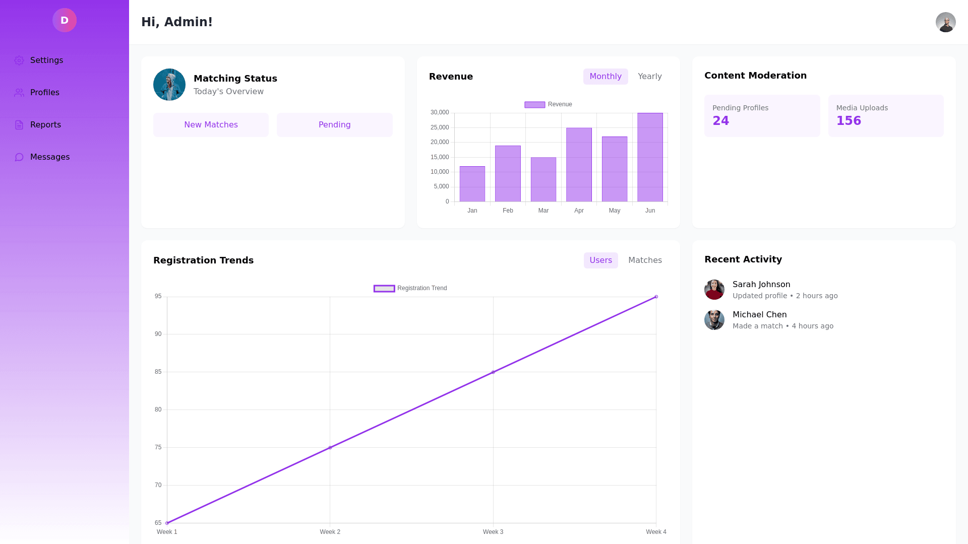
"Design-a-modern-dashboard-UI-layout-featuring-a-left-sidebar-and-main-content-area.-Sidebar:-Background:-Gradient-light-purple-to-white.-Structure:-Vertical,-collapsible-with-rounded-icons.-Include-icons-for-settings,-user-profiles,-reports,-and-messages.-Highlight:-Hover-effect-for-active-icons-with-a-glowing-ring.-Logo:-Place-a-circular-logo-at-the-top-with-a-gradient.-Main-Dashboard-Area:-Header:-Display-a-personalized-greeting-('Hi,-[Name]!')-at-the-top-left.-Include-a-circular-profile-image-at-the-top-right.-Sections:-Matching-&-Engagement-Panel:-Card-with-a-rounded-image,-count-data,-and-vertical-buttons-for-quick-actions.-Revenue-Graph:-Display-a-bar-graph-with-dropdown-toggles-for-data-filters-like-'Monthly'-or-'Yearly.'-Content-Moderation-Panel:-A-grid-showing-metrics-like-pending-profiles,-uploaded-media,-etc.,-with-icons.-Activity-Feeds:-A-vertical-timeline-of-events-on-the-far-right,-including-user-details-and-profile-pictures.-Register-Panel:-Line-graph-with-toggle-filters-(e.g.,-'Users,'-'Matches-Made')-and-categorized-data-(Total-Men/Women,-revenue-breakdown).-Design-Elements:-Use-a-soft-purple,-lavender,-and-white-color-scheme.-Include-rounded-borders,-light-shadows,-and-gradient-backgrounds.
