Landing Page - Copy this React, Tailwind Component to your project
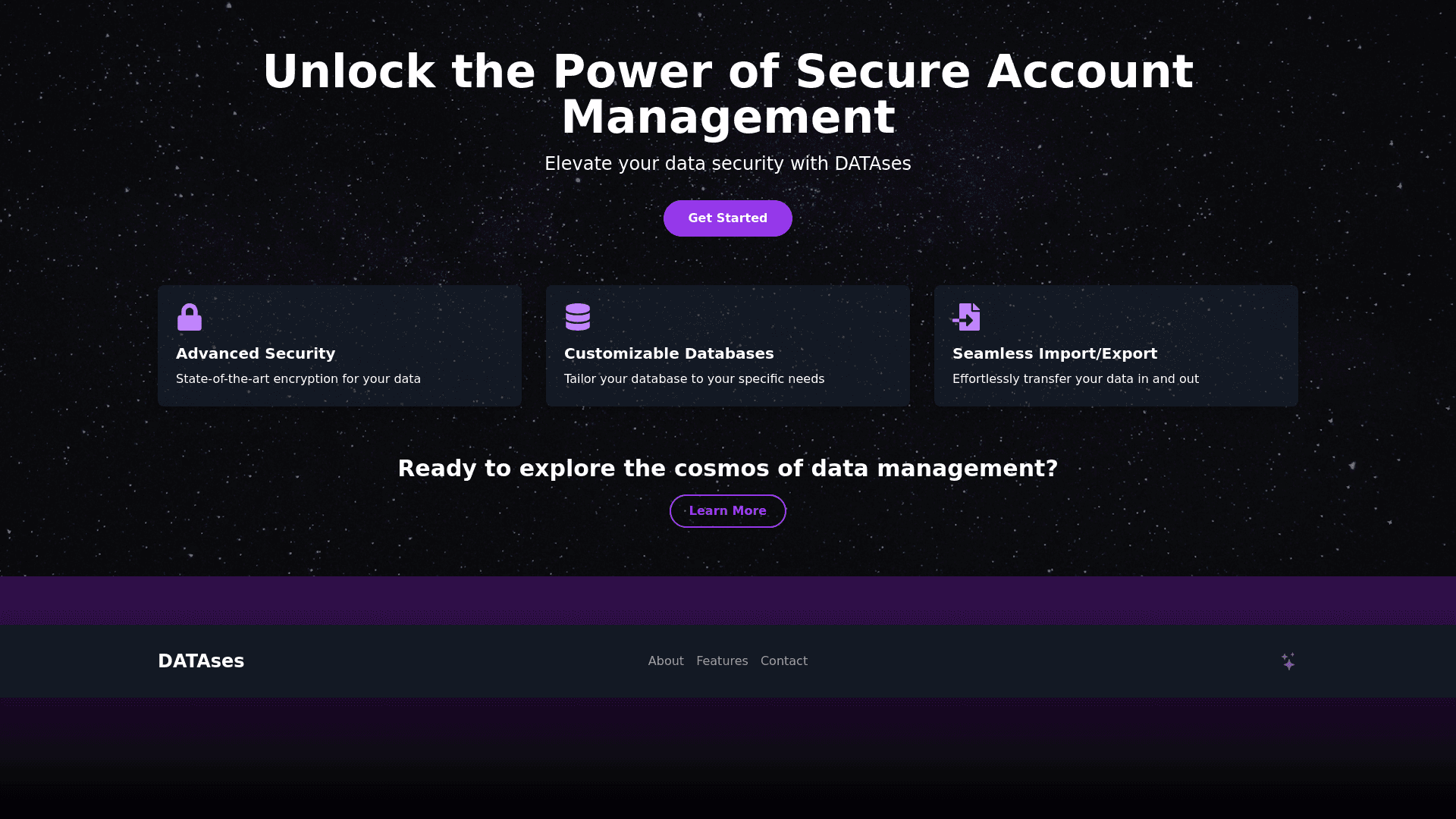
Create a stunning, mysterious, and visually captivating landing page for the "DATAses" website, which serves as a platform for managing and storing various types of accounts (gaming, email, etc.). The design should evoke a sense of intrigue, trust, and technological sophistication with dark themes, smooth animations, and modern visual effects. Here are the specific design elements: 1. Color Scheme and Atmosphere: Use a dark color palette (deep blues, purples, blacks) to create a sense of mystery and elegance. Add subtle gradients and shadows to give depth to the page. Include space or cosmic inspired backgrounds, like images of the night sky, stars, or abstract space elements, with a sense of vastness and exploration. 2. Hero Section: A central hero section with a large, striking headline: "Unlock the Power of Secure Account Management." Below the headline, a subheading: "Effortlessly organize and protect your digital identities with DATAses." Include a prominent call to action button, such as "Get Started" or "Explore," with hover animations (e.g., glowing edges, subtle scaling). The background of the hero section should include slow moving particles or stars to add an ethereal feeling. A slight parallax effect on the background to create depth as the user scrolls. 3. Interactive Elements: Integrate smooth, scroll triggered animations for text and images. For example, have content fade in or slide into view as the user scrolls down. Animated icons or buttons that respond to hover actions with smooth transitions (e.g., icons subtly rotating or changing color). Subtle floating or moving elements, like abstract lines or shapes, to maintain a dynamic and modern feel. 4. Key Features Section: A section below the hero with three to four key features displayed in cards or boxes. Each card can highlight features such as: "Customizable Databases" "Advanced Security Measures" "Seamless Import/Export" Use hover animations on each card (e.g., glowing borders or slight expansion) and icons for each feature that animate when hovered. Animate these cards when they appear (e.g., fade in with a slight upward movement). 5. Footer: A sleek footer with minimal design. Include links to key pages, social media icons, and a subtle animation for hover actions on each link. The footer background could fade into a darker gradient for a seamless finish to the page. 6. Animations: Include smooth CSS or JS based animations throughout the page. For example, make the headline in the hero section appear with a typewriter effect, or have the background image gently zoom in/out to create a sense of motion. Elements like buttons, icons, and text should have interactive hover effects, such as glowing edges, color transitions, or slight scaling. Integrate a loading animation or transition effect when switching between pages, such as a brief fade or swipe animation to enhance the overall experience. 7. Mobile Responsiveness: Ensure the design is fully responsive, with all animations and interactive elements optimized for mobile devices. Maintain the same visual appeal and animations, but adjust sizes and layout for smaller screens. 8. Overall Design Style: The overall style should feel futuristic, clean, and minimalistic while maintaining a sense of depth and complexity through design elements and animations. The typography should be bold, modern, and easy to read, with contrasting colors for better visibility on dark backgrounds.
