Data - Copy this React, Tailwind Component to your project
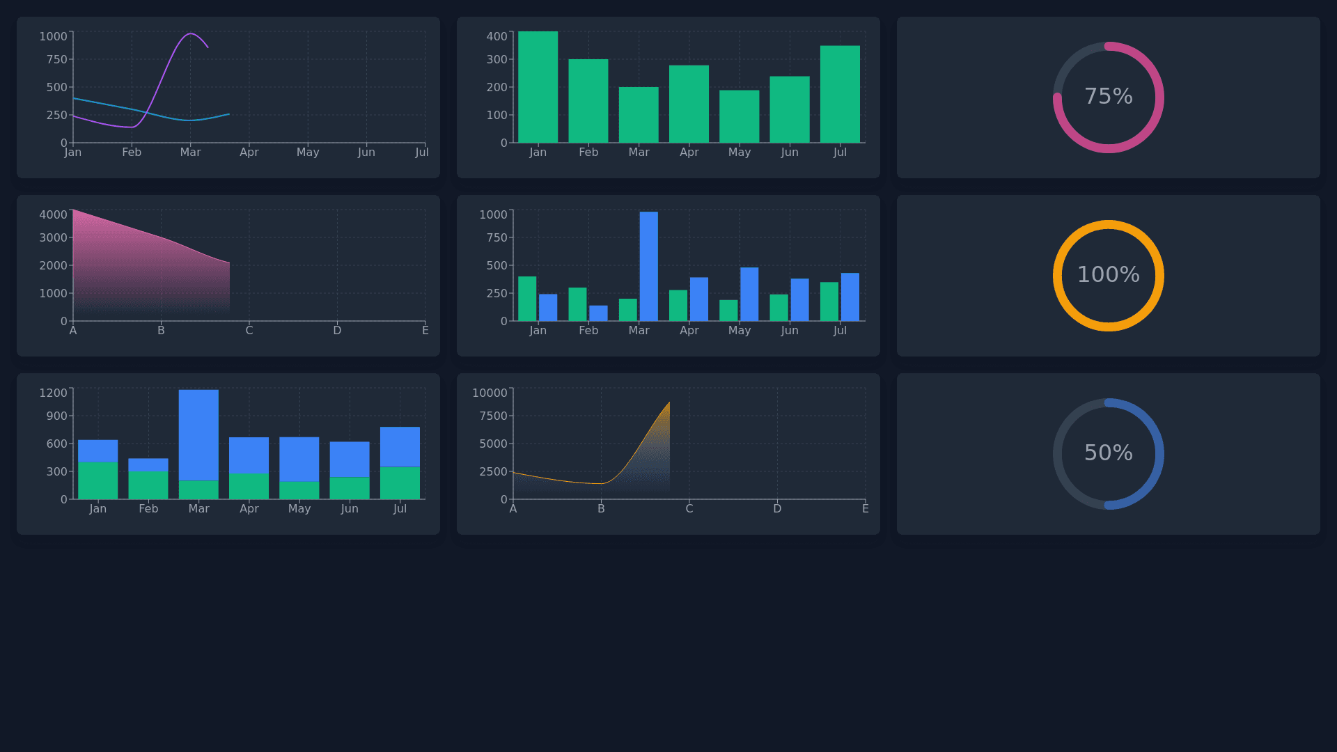
This image shows a collection of various modern data visualization components against a dark background, which enhances the vibrant colors and contrast of each chart. Here’s a breakdown of each visualization component shown: Top Left: A combination of a line chart and bar chart. It displays two lines with different colors (cyan and purple), each representing a data trend, and a series of vertical bars representing quantities on the same or a different scale. Top Center: A bar chart with overlaying line points, shown on a grid with labels on both axes. The x axis has monthly labels (Jan, Feb, etc.), while the y axis has labeled steps (Step 1 to Step 4), which could indicate different phases or categories. Top Right: A circular progress chart displaying "75%." The circular gauge is created with a gradient color from pink to yellow, showing a radial progression. Middle Left: A density chart with multiple smooth, colorful peaks, showing the distribution of values over a time period or set of categories. The lines and area under them are gradient filled, giving a heatmap like effect. Middle Center: Another bar chart with a gradient color scheme from green to blue, representing various values. Line points on top indicate specific data points on the bars. Middle Right: A circular dotted progress indicator, displaying "100%." This visualization uses a dotted, fading radial design from dense to sparse dots, visually filling up to indicate completeness. Bottom Left: A stacked or layered bar and line chart. The bars are colorful and resemble equalizers or histograms, each layer stacked with a gradient transition from purple to yellow, along with a line trend overlay. Bottom Center: Another density or area chart with smooth peaks in yellow and blue gradient shades, representing a distribution across categories or over time. Bottom Right: A circular progress indicator showing "50%" with a gradient from blue to yellow. The ring fills halfway to indicate the percentage. Each component demonstrates different styles and types of data visualization, combining traditional charts (bar, line) with modern progress indicators and density distributions, ideal for dashboards and data interfaces. The color gradients and dark background suggest an emphasis on a sleek, futuristic design.