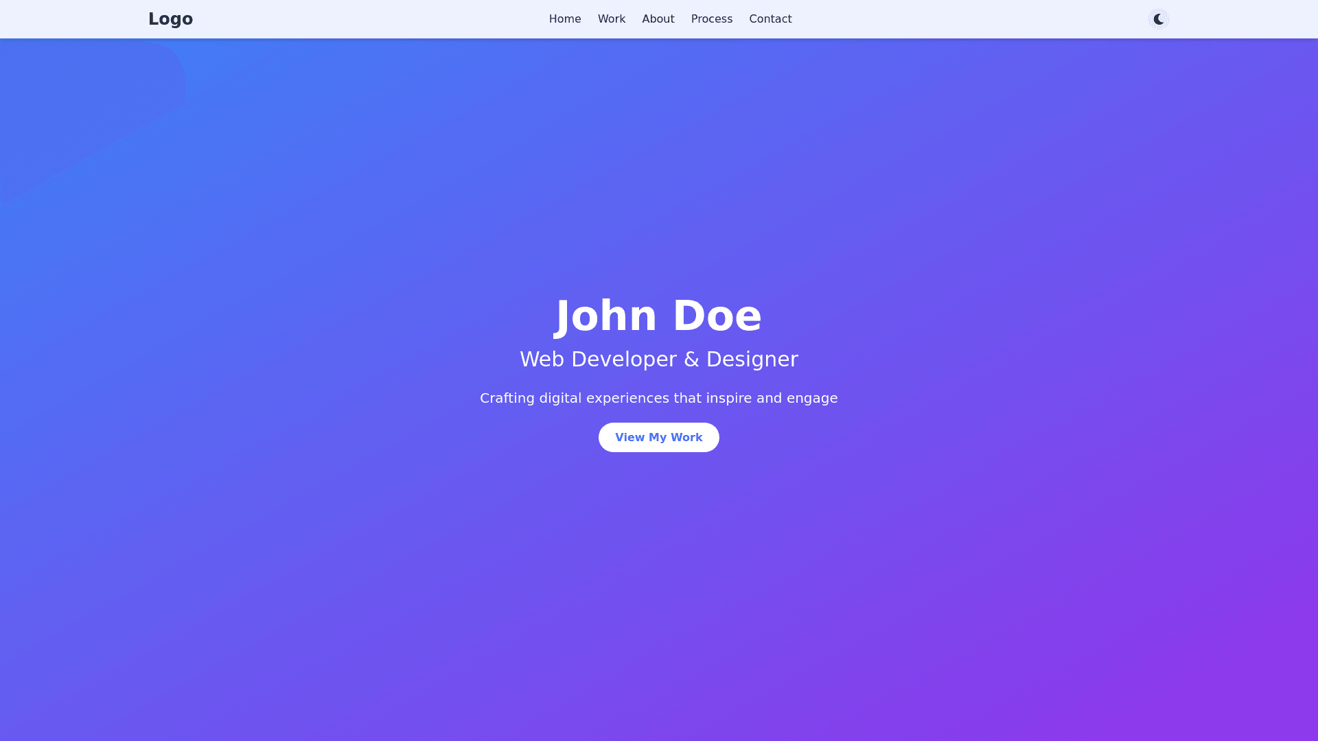
Modern Portfolio Component - Copy this Html, Tailwind Component to your project
Design Portfolio Website Brief Overview Create a modern, minimalist, and professional portfolio website that showcases creative work with emphasis on visual hierarchy, smooth transitions, and intuitive navigation. The website should reflect contemporary design trends while maintaining excellent usability and performance. Key Components 1. Header/Navigation Sticky navigation bar with subtle transparency Logo/personal brand mark on the left Main navigation items: Home, Work, About, Process, Contact Smooth scroll behavior when clicking navigation items Mobile responsive hamburger menu Optional dark/light mode toggle 2. Hero Section Full width layout with striking visual impact Large, bold typography for name and title Brief, impactful tagline describing specialty Subtle animated elements or particles background Call to action button leading to portfolio work Optional: Short showreel or featured project preview 3. Portfolio Grid Masonry style grid layout for project thumbnails Hover effects revealing project title and category Filtering system by project type/category Lazy loading for optimal performance Smooth transitions between filter states Each project card should include: Featured image Project title Category/type Brief description (on hover) Click/tap to expand to full case study 4. Project Case Study Pages Hero image/video of the project Project overview section Problem statement and objectives Process documentation with images Final solution presentation Results and outcomes Next/Previous project navigation Related projects section 5. About Section Professional headshot/photo Compelling personal story Core skills and expertise Professional experience timeline Education and certifications Downloadable resume option Social media links 6. Process Section Visual representation of work methodology Step by step breakdown of approach Interactive elements explaining each phase Supporting graphics or icons Client testimonials or success stories 7. Contact Section Clean, simple contact form Direct email link option Social media links Location/timezone information Availability status Optional: Meeting scheduler integration 8. Footer Secondary navigation Social media links Copyright information Newsletter signup (optional) Back to top button Visual Style Guidelines Typography Primary Heading Font: Modern sans serif (e.g., Neue Haas Grotesk, Inter) Body Font: Clean, readable sans serif (e.g., SF Pro Text, Roboto) Font Size Hierarchy: H1: 48 64px H2: 36 48px H3: 24 32px Body: 16 18px Small text: 14px Color Palette Primary Color: Bold, distinctive brand color Secondary Color: Complementary to primary Neutral Colors: Dark gray: #333333 Mid gray: #666666 Light gray: #F5F5F5 Accent Colors: 2 3 supporting colors for highlights Ensure all color combinations meet WCAG accessibility standards Spacing and Layout Consistent spacing system using 8px grid Generous whitespace around sections Responsive margins and padding Maximum content width: 1440px Comfortable reading width for text: 680px Interaction and Animation Subtle hover states on interactive elements Smooth page transitions Scroll triggered animations Loading states and transitions Micro interactions for enhanced engagement Technical Requirements Fully responsive across all devices Fast loading times (under 3 seconds) SEO optimized Cross browser compatible Optimized images and assets Progressive enhancement approach Additional Features Image lazy loading Smooth scrolling Custom cursor (optional) Page transitions Dynamic load more for portfolio items Filter animation for portfolio grid Parallax scrolling effects (subtle) Custom 404 page Performance Goals Google PageSpeed score > 90 First Contentful Paint < 1.5s Time to Interactive < 3.5s Optimized assets and code Efficient caching strategy Accessibility Requirements WCAG 2.1 AA compliance Proper heading hierarchy Alt text for all images Keyboard navigation support Screen reader friendly Sufficient color contrast Focus states for interactive elements
