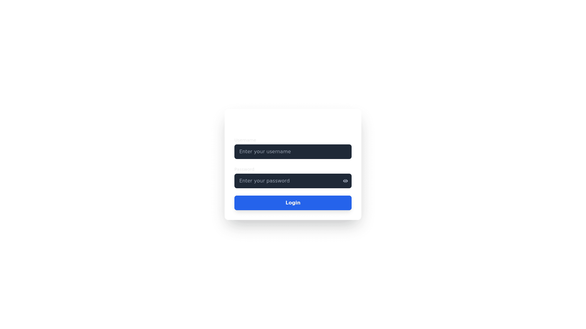
Developer Login - Copy this React, Tailwind Component to your project
Design-a-Developer-Login-Page-focused-solely-on-the-login-functionality,-offering-a-secure-and-straightforward-process-with-just-username-and-password-fields.-This-page-is-intended-to-be-used-only-by-developers,-so-there-will-be-no-options-for-sign-up,-forgot-password,-or-other-roles.-The-design-should-ensure-a-high-level-of-clarity,-simplicity,-and-security-while-maintaining-a-sleek,-professional-look.-It-should-be-fully-responsive,-with-a-user-friendly-experience-across-all-devices-(desktop,-tablet,-mobile).-Page-Structure-Background:-Full-Screen-Background:-Utilize-a-professional,-tech-themed-background-image-(e.g.,-abstract-tech-patterns,-a-blurred-code-editor,-or-dark-theme-related-imagery).-Apply-a-subtle-dark-overlay-to-the-background-to-enhance-the-visibility-of-the-login-form.-Ensure-the-background-doesn’t-distract-from-the-form-itself.-Login-Form-Container:-Positioning:-The-login-form-should-be-centered-both-vertically-and-horizontally-on-the-page.-Width-&-Padding:-Keep-the-form-max-width-around-400px-(or-80-90%-of-the-screen-width-for-smaller-devices).-Provide-adequate-padding-(e.g.,-24px)-around-the-form-for-a-clean-look.-Card-Like-Design:-The-form-should-have-a-soft-shadow-(e.g.,-box-shadow:-0-4px-20px-rgba(0,0,0,0.1))-to-create-depth.-Round-the-corners-(12px)-for-a-modern,-friendly-design.-Form-Fields-&-Interactions-Input-Fields:-Username-Field:-Use-a-standard-text-input-field-for-the-username.-The-placeholder-should-be-clear-and-simple:-“Username”.-On-focus,-change-the-border-color-to-a-soft-highlight-(e.g.,-blue-or-green)-to-indicate-that-the-field-is-active.-Font-should-be-clear-and-readable,-with-appropriate-padding-inside-the-input-(e.g.,-10px-padding).-The-input-field-should-have-a-border-radius-of-8px-for-smooth-corners.-Password-Field:-Use-a-password-input-field-with-a-placeholder-saying-“Password”.-Allow-the-user-to-toggle-the-visibility-of-the-password-with-a-small-eye-icon-(FaEye,-FaEyeSlash).-Keep-the-input-field-similar-in-design-to-the-username-field-with-consistent-width,-padding,-and-border-radius.-Login-Button:-Primary-Action-Button:-Make-the-login-button-large-and-prominent-with-a-contrasting-color-that-aligns-with-the-design-theme-(e.g.,-primary-brand-color-like-blue-or-green).-Use-rounded-corners-(8px)-and-make-the-button’s-text-all-uppercase-with-a-size-of-around-16px-for-clarity.-On-hover,-apply-a-subtle-color-shift-or-increase-the-button's-size-slightly-(scale-effect)-to-indicate-interactivity.-Add-a-spinner/loader-inside-the-button-during-the-login-process-to-show-that-the-system-is-validating-the-user-credentials.-Error-Handling:-In-case-of-incorrect-username-or-password,-show-a-small-error-message-beneath-the-input-fields-in-red,-with-text-such-as-“Incorrect-username-or-password.”-Add-a-small-icon-(FiAlertCircle)-next-to-the-message-to-indicate-the-error-clearly.-If-the-login-attempt-is-successful,-redirect-the-user-to-the-Developer-dashboard.-Visual-and-UX-Design-Features-Hover-Effects-&-Animations:-Form-Fields:-On-hover-or-focus,-apply-a-border-color-change-(e.g.,-from-grey-to-blue-or-green)-and-a-slight-animation-(e.g.,-grow-the-field-border-by-2px).-Button-Hover:-Add-a-hover-effect-for-the-login-button,-where-the-background-color-darkens-slightly,-and-the-text-becomes-more-vivid.-You-could-also-add-a-slight-scale-effect-(e.g.,-transform:-scale(1.05))-to-make-the-button-feel-interactive.-Loading-Animation:-When-the-user-clicks-the-login-button,-show-a-spinner-or-progress-bar-inside-the-button-that-indicates-the-system-is-processing-the-login-request.-Accessibility-Considerations:-Labels-and-Input-Fields:-Ensure-all-input-fields-are-clearly-labeled-for-accessibility-purposes.-Use-aria-labels-to-support-screen-readers,-and-ensure-the-fields-have-proper-error-messaging-tied-to-their-respective-fields-for-better-accessibility.-Color-Contrast:-Ensure-the-text-in-the-form-(input-labels,-error-messages,-button-text)-has-high-contrast-against-the-background.-Text-should-be-easy-to-read,-even-for-users-with-visual-impairments.-Focus-States:-The-form-fields-should-have-a-clear-focus-state-when-tabbing-through-the-inputs,-such-as-a-visible-outline-or-border-color-change-to-blue.-Mobile-Responsiveness-Mobile-View:-On-mobile-screens,-the-login-form-should-expand-to-fill-most-of-the-screen-width-(around-80-90%-of-the-width).-Input-Fields:-Make-sure-the-input-fields-are-large-enough-to-be-easily-tapped,-with-enough-space-around-them.-Login-Button:-The-login-button-should-be-larger-on-mobile,-ensuring-it's-easy-for-users-to-press.-Input-Spacing:-Ensure-there-is-sufficient-vertical-spacing-between-the-username-field,-password-field,-and-the-login-button-on-mobile-to-avoid-overcrowding.-Mobile-Keyboard-Adjustment:-When-the-keyboard-is-active-on-mobile-devices,-make-sure-the-form-remains-visible-by-preventing-the-keyboard-from-pushing-the-form-out-of-view.-Adaptive-Design:-On-large-desktop-screens,-the-login-form-should-be-centered-on-the-page-with-ample-whitespace-around-it.-On-medium-sized-screens-(e.g.,-tablets),-adjust-the-form-size-so-it-remains-legible-and-aesthetically-balanced.-The-login-form-should-not-feel-too-cramped-or-too-spread-out.-Branding-&-Visual-Design-Typography:-Use-modern-and-clean-fonts-such-as-Roboto,-Poppins,-or-Inter-for-a-professional-look.-The-heading-“Developer-Login”-should-be-bold-and-large-(24-28px),-placed-above-the-form-fields-for-clarity.-The-font-for-the-inputs-and-button-should-be-smaller-but-still-clear-and-legible.-Color-Palette:-Primary-Color:-Use-the-brand’s-primary-color-(e.g.,-blue,-green,-or-dark-theme-colors)-for-the-button-background-and-form-highlights.-Text-Color:-For-text,-use-a-contrasting-color-like-white-or-light-grey-against-the-darker-background.-Error-Color:-Display-error-messages-in-a-red-color,-with-a-small-icon-to-indicate-the-issue.-Additional-Features-Security:-Password-Strength:-Include-a-small-indicator-(e.g.,-text-or-progress-bar)-below-the-password-field-to-indicate-the-strength-of-the-password-entered-(if-applicable).-Ensure-that-the-password-field-is-hidden-by-default-and-can-only-be-revealed-via-the-"Show-Password"-toggle.-Summary-The-Developer-Login-Page-should-be-minimal,-focused,-and-secure,-with-only-username-and-password-fields.-The-design-should-prioritize-user-experience,-making-the-login-process-simple,-efficient,-and-visually-appealing.-It-should-be-fully-responsive,-ensuring-it-looks-and-functions-great-on-any-device,-from-desktop-to-mobile.-The-design-should-incorporate-subtle-animations,-clear-call-to-action-buttons,-and-clear-visual-feedback-for-errors-or-successful-login-attempts.
