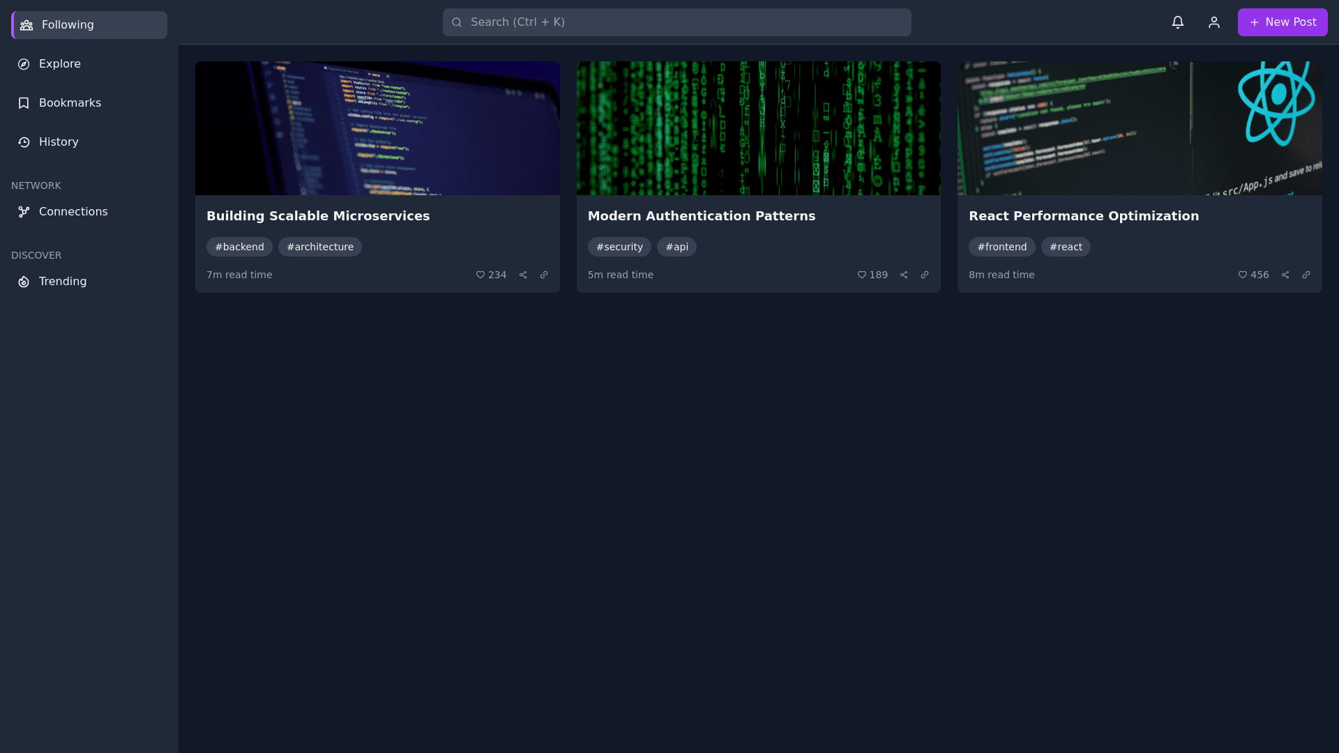
Developer Interface - Copy this React, Tailwind Component to your project
Design-a-sleek,-modern-web-application-interface-for-a-developer-focused-platform.-The-layout-should-include:-Sidebar-on-the-left:-Dark-background-with-clean,-simple-icons-and-text-labels.-Sections:-My-feed-(with-a-profile-picture-at-the-top).-Main-options:-Following,-Explore,-Bookmarks,-History.-Group-headers-(e.g.,-"Network",-"Custom-feeds",-"Discover",-"Resources")-to-separate-sections.-Discover-options:-Tags,-Sources,-Leaderboard,-Discussions,-Submit-a-link.-Resources-options:-Docs,-Changelog,-Feedback.-Active-menu-item-highlighted-with-a-vertical-accent-bar-and-a-lighter-background.-Main-content-area:-A-dark-theme-with-a-grid-layout-of-content-cards.-Each-card-should-include:-A-bold-title.-Tags-(e.g.,-#security,-#backend)-displayed-as-chips.-Read-time-(e.g.,-"7m-read-time").-A-preview-image-or-graphic.-Interaction-buttons-(e.g.,-like,-share,-save,-link).-Top-navigation-bar:-A-search-bar-at-the-center.-Icons-on-the-right-for-notifications,-user-profile,-and-post-creation-(e.g.,-"New-Post"-button).-Add-keyboard-shortcut-hints-(e.g.,-Ctrl-+-K-for-search).-Responsiveness:-Sidebar-should-collapse-into-icons-only-mode-on-smaller-screens.-On-mobile,-replace-the-sidebar-with-a-hamburger-menu-and-stack-the-content-cards-vertically.-Accents:-Use-a-minimal-and-modern-color-palette:-dark-gray-for-backgrounds,-light-text,-and-purple-or-blue-for-highlights.-Smooth-transitions-for-hover-and-active-states."
