Dropdown Button - Copy this React, Tailwind Component to your project
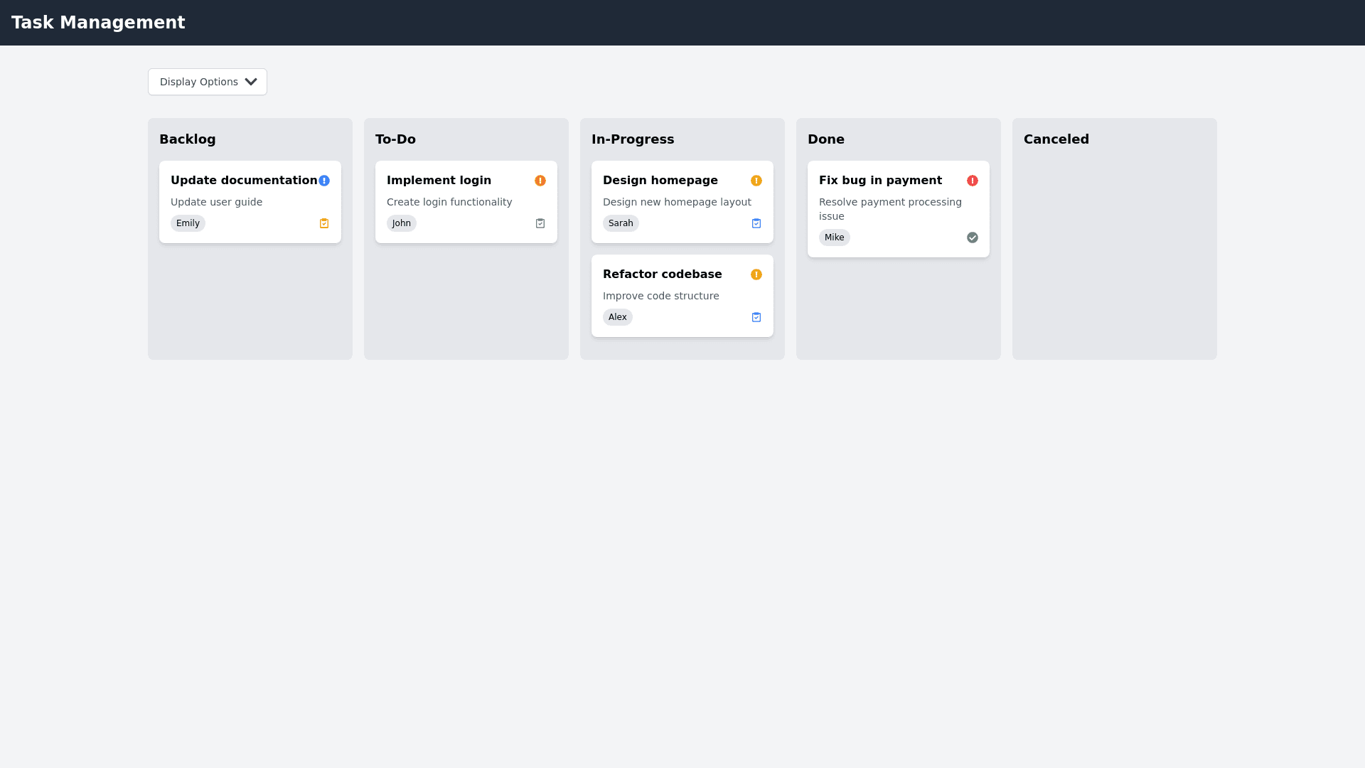
Display State Details: • Dropdown Button Display: o A dropdown button located below the navbar, allowing users to choose between grouping By Status, By User, or By Priority, as well as sorting by Priority or Title. ________________________________________ Three Grouping Options: 1. By Status: Default Kanban columns – Backlog, To Do, In Progress, Done and canceled . Tasks will be displayed in these columns based on their current status . 2. By User: o Columns will be dynamically generated based on json data assigned user to the task. o Find the number of the users, and tasks will be grouped under the corresponding user’s column. 3. By Priority: o Tasks will be grouped into 5 priority levels: Urgent, High, Medium, Low, and No Priority. o The priorities will be arranged as follows: Urgent (Priority 4) High (Priority 3) Medium (Priority 2) Low (Priority 1) No Priority (Priority 0) ________________________________________ Sorting Options: 1. Sort by Priority: Tasks within the current grouping (Status, User, or Priority) will be sorted in descending order of priority. 2. Sort by Title: Tasks will be sorted alphabetically within the current grouping (Status, User, or Priority). ________________________________________ Visual Layout: • Navbar: A fixed top navigation bar spanning 100% width, positioned at the top of the page with a dark background color. • Display Dropdown Button: Positioned to the right below the navbar, controlling the grouping and sorting functionality of the tasks on the Kanban board. • Columns: o For By Status: Three fixed columns for "To Do," "In Progress," and "Done". o For By User: Dynamically generate columns based on assigned users. o For By Priority: Dynamically generate columns for each priority level. • Task Cards: o Each card will display a Title, Assigned User, Priority Level, and a short description. o Cards will have a white background, box shadow, and rounded corners for clean aesthetics. ________________________________________ Responsiveness: • Large Screens: Columns will be arranged horizontally using a flexbox layout. • Small Screens: On screens below 768px, columns will stack vertically, occupying the full width. ________________________________________ State Persistence: • localStorage: Store the last selected grouping and sorting method. When the page is refreshed, the board will retain the last selection. ________________________________________ Styling and UX Design: • Navbar: Fixed, 100% width, dark background, white text. • Dropdown Button: Simple, clean, and easy to interact with. It will open a dropdown containing the grouping and sorting options. • Columns: Each column will have distinct background colors. Tasks will be organized in columns with clean margins and padding. • Cards: o White background, subtle shadow, rounded corners. o On hover: Slight scale effect or shadow increase for interactivity. ________________________________________ Example Workflow: 1. When Group by User is selected: o The board will generate 5 columns, each representing a different user, and tasks will be displayed under the user they are assigned to. o If sorting by priority, tasks will be arranged within each user column from highest to lowest priority. 2. When Group by Priority is selected: o The board will display 5 columns representing priority levels from Urgent (4) to No Priority (0). o Tasks will be displayed in their respective priority columns.