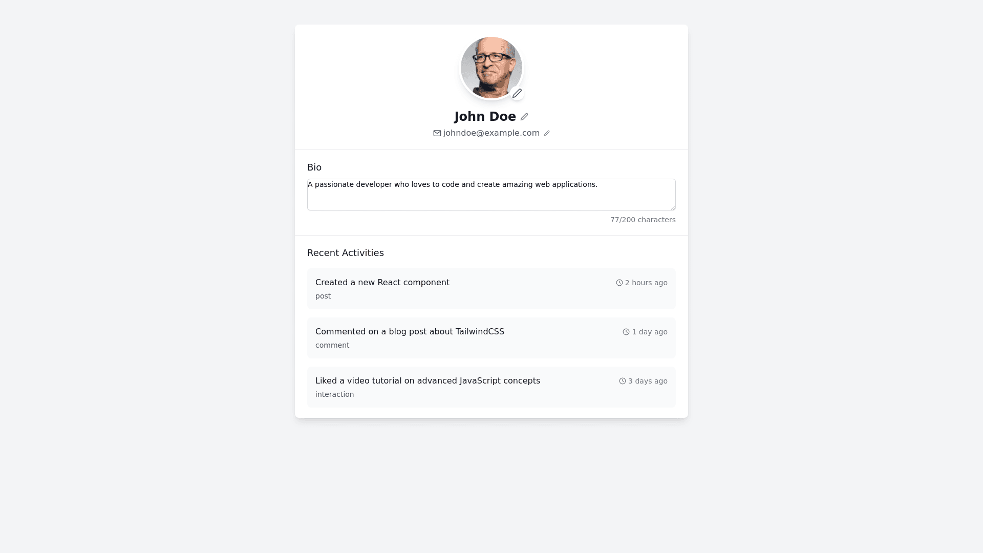
User Profile - Copy this React, Tailwind Component to your project
Design a sleek and modern web interface for a 'Drowsiness Detection System' with a focus on usability, real time data visualization, and customization options. The interface should follow a dark theme with a clean and minimalistic design, using a dark grey background, light blue highlights, and white text. At the top, include a header with the system’s logo on the left and a navigation bar on the right with three sections: Home, Analytics, and Settings. The font style should be tech oriented, and the header should feature smooth hover animations for the menu items. Home Section: Display a large title reading 'Drowsiness Detection' centered at the top of the page. Below that, include a space for the live video feed with a circular loading animation in the center until the webcam starts. Provide clear, rounded buttons for starting and stopping the webcam, with hover effects that subtly change the button’s color. The buttons should feel interactive and responsive. Analytics Section: Create a real time dashboard displaying key metrics (Uptime, Alerts Triggered, and Average Detection Score). Each metric should be presented in separate cards with soft shadows and rounded edges. The data should be shown using bold, easy to read fonts, and metrics such as the 'Average Detection Score' should feature a color changing gauge (e.g., green for safe, red for drowsy). Include subtle animations that update the numbers dynamically as data flows in. Settings Section: Allow users to adjust the drowsiness detection sensitivity using a sleek horizontal slider. Add toggle switches for notification preferences (email, text, sound alerts). The toggles should change color when activated (e.g., blue for active). Include a dark mode/light mode switch to let users customize the theme of the app. Login Screen: Design a simple, centered login form with email and password fields. The form should be compact, with a large 'Login' button below, and provide an option to reset the password. Ensure that the entire design is mobile responsive, with the navigation menu collapsing into a hamburger icon on smaller screens. The layout should be flexible and optimized for both mobile and desktop views.
