Nav Item - Copy this React, Tailwind Component to your project
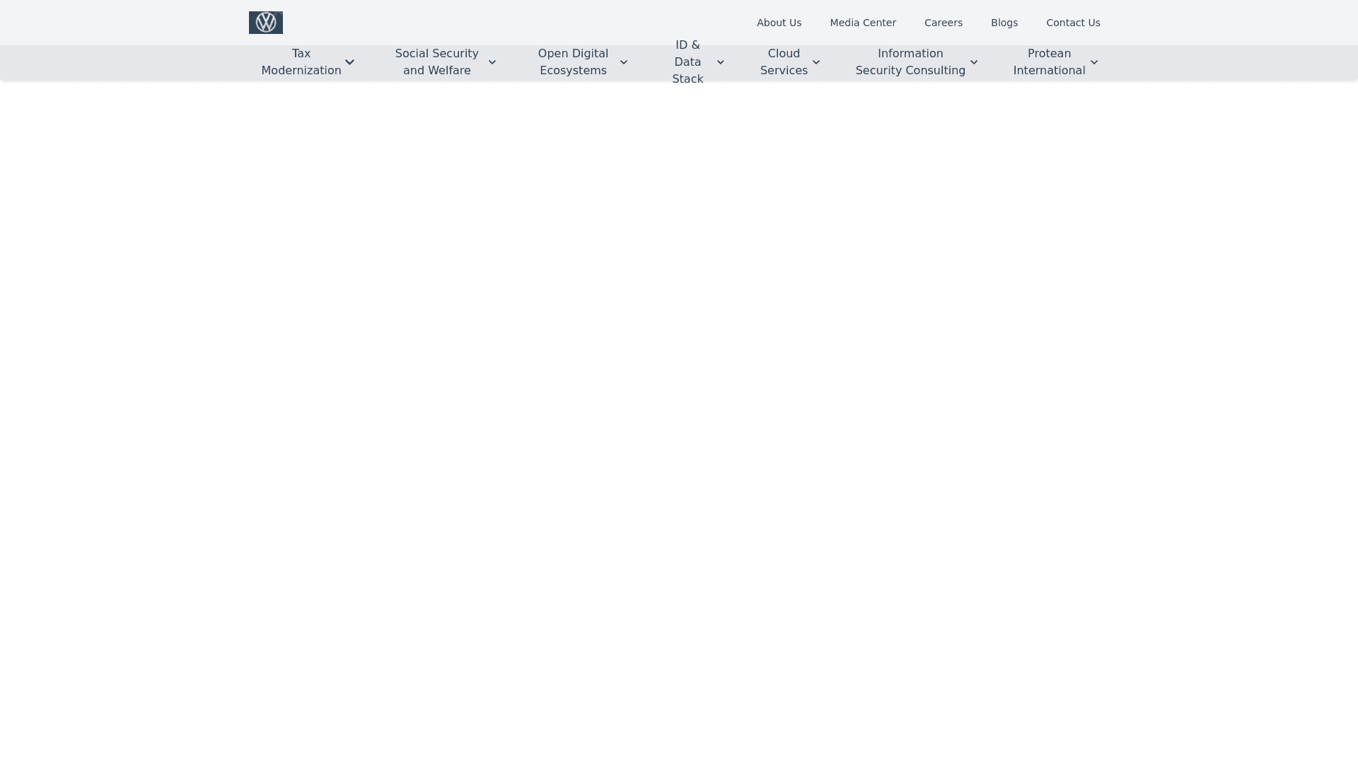
"Create a dual layer responsive navbar design for a website. The top layer should have a clean and modern look, featuring a logo aligned to the left and a set of navigation links aligned to the right. The top navbar links should include: 'About Us,' 'Media Center,' 'Careers,' 'Blogs,' and 'Contact Us.' Next to the links, add a mobile friendly hamburger menu icon for small screen sizes. The bottom layer of the navbar should include more navigation options, each with dropdown menus. Example dropdown items include: 'Tax Modernization,' 'Social Security and Welfare,' 'Open Digital Ecosystems,' 'ID & Data Stack,' 'Cloud Services,' 'Information Security Consulting,' and 'Protean International.' The dropdowns should expand when hovered over or clicked. Design the navbar with a light grey background and dark text. Ensure the navbar is fully responsive, collapsing into a mobile friendly hamburger menu on smaller screens. The overall look should be sleek, professional, and minimalistic."
