Dynamic Checkbox Cards - Copy this Html, Tailwind Component to your project
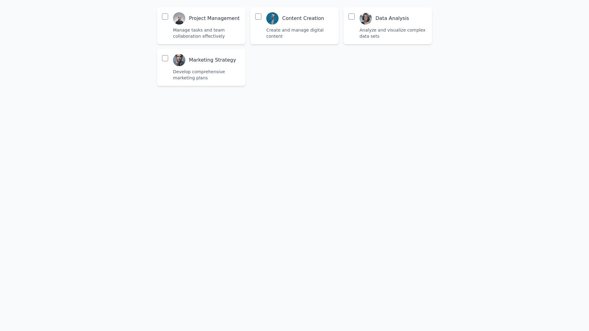
Design a dynamic checkbox list within a card based layout, where each card represents an individual item. Place a checkbox at the top left corner of each card for easy selection, with the item’s title or label clearly displayed next to it. Optionally, enhance each card with an avatar, icon, or a brief description to provide more context. The cards should have a modern, clean aesthetic with rounded corners, soft shadows, and a subtle hover effect to convey interactivity. Apply a visually appealing color palette, ensuring ample spacing between cards for clarity. Optionally, include dividers between the cards to improve organization and enhance readability. Ensure the layout is fully responsive, adapting seamlessly to various screen sizes for an optimal mobile friendly experience. The design should be intuitive, engaging, and optimized for efficient user interaction.