Dashboard - Copy this React, Tailwind Component to your project
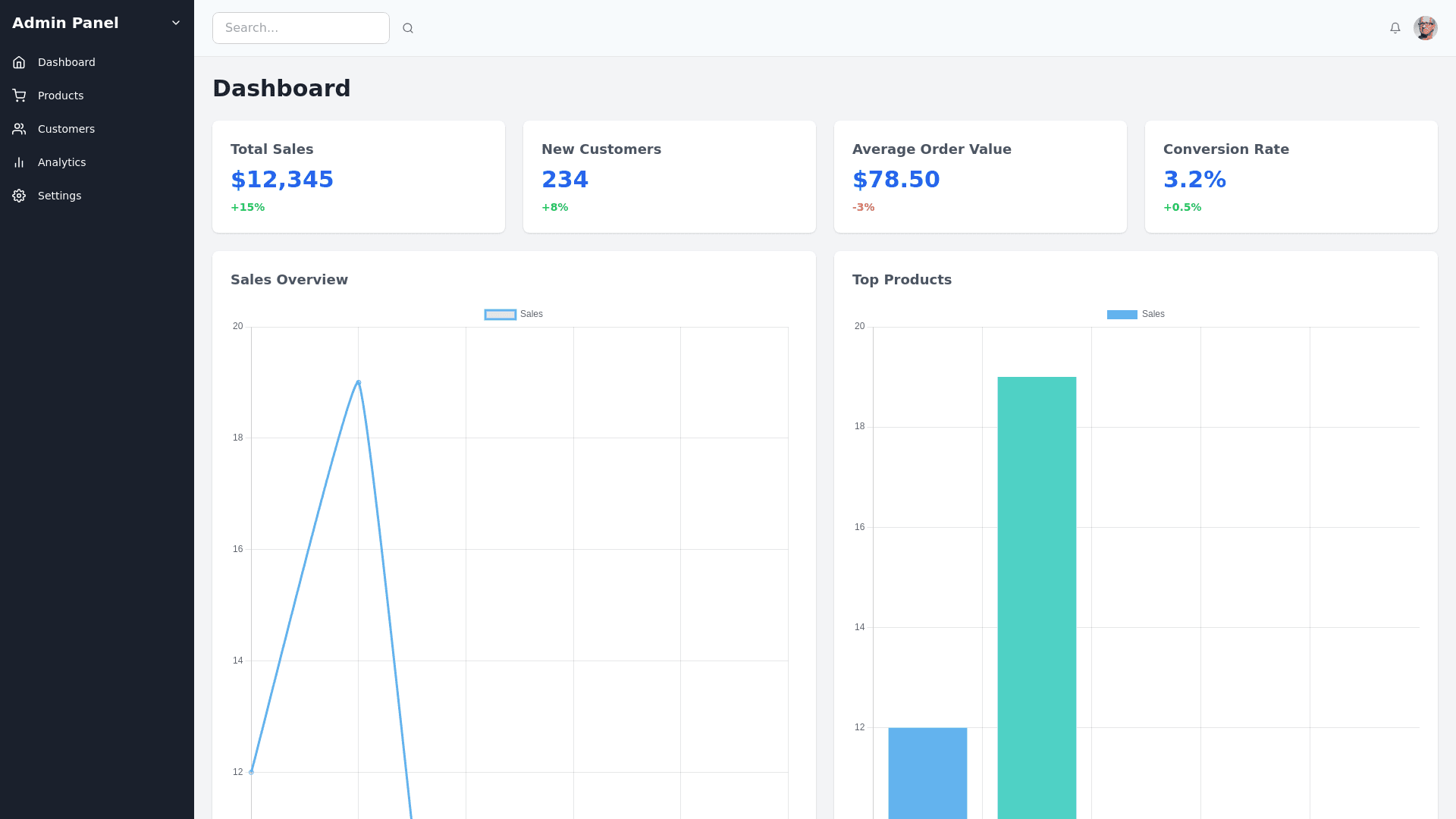
E Commerce Admin Panel Design: Layout & Structure: The admin panel has a three column layout: A left sidebar for navigation. A main content area displaying cards and metrics. A top navigation bar for user profile and settings. Sidebar: Background color: Dark blue (#1A202C). Font color: White (#FFFFFF) for inactive text and light blue (#63B3ED) for active items. Icon color: White (#FFFFFF) with an active hover effect transitioning to light blue (#63B3ED). Active state: The active sidebar item (like the "Dashboard") has a hover effect of light blue with a small shadow for focus. Sidebar icon size: 18px. Font size of sidebar items: 14px, using Roboto, sans serif. Spacing and Padding: Each item is evenly spaced with 15px padding on the sides. Each section is clearly grouped with subtle dividers. Top Navigation Bar: Background color: Light gray (#F7FAFC). Font: Bold, 18px, Roboto, sans serif, primary text color dark gray (#4A5568). User avatar hover effect: Slight border (2px solid light blue). Icons (Search, Notification, Settings): Default color dark gray (#A0AEC0), hover effect transitioning to dark blue (#3182CE). Profile section on the right: Includes a dropdown menu on hover with white background and subtle shadow. Content Cards (Main Dashboard Cards): Card structure: Each card displays a category (e.g., Acme Plus, Acme Advanced) with a metric. Background color: White (#FFFFFF). Border radius: 8px for smooth, modern UI. Shadow effect: Slight shadow (0px 4px 10px rgba(0, 0, 0, 0.05)) for elevation. Font and Text: Title: Bold 16px using Roboto, #2D3748 (dark gray). Metric: Bold 22px, primary color #2B6CB0 (blue). Percentage change: Positive values in green (#48BB78) and negative values in red (#F56565), with font size 14px. Line chart: Thin stroke chart for each card, light blue (#63B3ED), with subtle gridlines. Real Time Data Section (below): Bar chart and line chart layout: The bar chart represents comparison, with one bar being darker (primary) and the other a lighter shade. Font size: Titles at 16px, metrics at 22px, with subtle padding between bars and chart legends. Hover effect for bars/lines: Tooltips on hover show exact values and percentage differences. Add View Button & Filters (Top right corner): Button styling: Background color: Light blue (#3182CE). Font: White, bold 14px. Padding: 12px horizontally, 8px vertically. Border radius: 4px for a modern feel. Hover effect: Button transitions into a darker blue (#2B6CB0) with smooth animation over 200ms. Filters: Small icons for adjusting the view, dropdown selectors for dates, etc. Messages Section: The notification icon has a badge with a small circle indicating 4 unread messages. Badge background color: Red (#F56565), with white font for the count. User Profile Section (Top right): Displays the company name (Acme Inc.) next to the profile avatar. Hover effect: Drop down menu with options such as profile settings and logout, subtle shadow for the dropdown menu. General UI/UX Enhancements: Responsive design: The layout adjusts for smaller screen sizes, with the sidebar becoming collapsible. Smooth transitions and hover effects applied to all buttons, icons, and cards for a modern interactive experience. Consistent padding between elements: Use 16px padding for outer containers and 8px for inner elements. Focus state: When elements like buttons or input fields are focused, a light blue border (#63B3ED) appears for accessibility. Typography: Primary font: Roboto, sans serif. Font size hierarchy: Dashboard headings: 18px. Sub headings: 16px. Content text (metrics): 14px. Font weight hierarchy: Use bold for emphasis on metrics and regular for general text.