Styled App Bar - Copy this React, Mui Component to your project
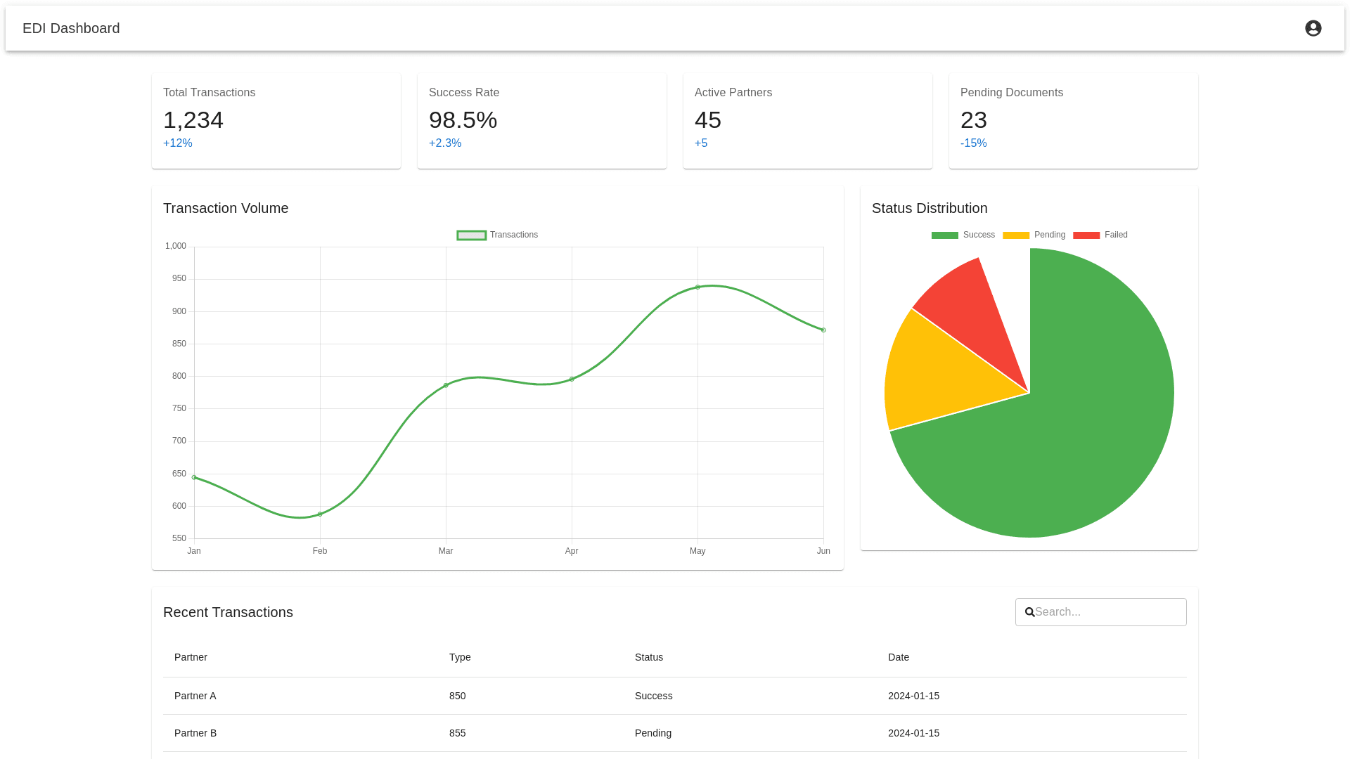
EDI Dashboard Design and Functional Improvements 1. Dashboard Structure: Sticky Navigation Bar: A sticky navigation bar at the top of the dashboard that allows users to quickly switch between the primary sections: Overview Tenders Responses Issues Invoices EDI Log Partners Each section should be clearly labeled, with active states for the selected section, ensuring smooth navigation. 2. Sub Sections Under Tenders: In the Tenders section, provide the following sub tabs for easy navigation: New Tenders: Displays tenders that are incoming and need processing. Received Tenders: Shows tenders that have been successfully processed or accepted. Rejected Tenders: Lists tenders that have been rejected, along with the reasons for rejection (e.g., data format errors, missing details). 3. Shipment Information Table: Under each sub tab (New, Received, Rejected), present a Shipment Information Table that displays important shipment data, including: Column Name Description RECEIVED Date and time when each shipment was recorded (e.g., 2024 01 18 09:30 AM). REFERENCE Various identifiers for the shipment: Shipment Ref, Tender ID, and PO Number (e.g., SHP12345, TND789, PO046789). BILL TO Company name and address responsible for the payment (e.g., DPP Logistics Inc, 123 Logistics Way, Atlanta, GA). STOP Sequential stop numbers for shipment destinations with associated dates and locations (e.g., Stop 1: ABC Warehouse, Savannah, GA, Stop 2: Stuarts Draft, VA). SHIPMENT DETAILS Information about the shipment's transportation, such as equipment type (Dry Van), weight (24,000 lbs), miles traveled (450), and rate charged ($2,500). DESCRIPTION A description of the shipment contents (e.g., Kitchen Cabinets). EDI STATUS Status of the shipment in the EDI system, such as New Tender, Processed, Accepted, with options for actions like Accept or Reject. 4. Metric Cards (At the Top of the Dashboard): Display key performance metrics as color coded cards at the top of the dashboard for quick insight: Total Transactions (Blue): Shows the total number of processed transactions with a growth percentage indicator (e.g., +12.5% from last period). New Tenders (Orange): Displays the number of incoming tenders that need processing (e.g., 456 tenders with a +5.2% change from the last period). Today Accepted (Green): Displays the number of tenders accepted today (e.g., 89 tenders, +8.7% from last period). Last 30 Days (Purple): Shows how many tenders were accepted in the last 30 days (e.g., 2,567 tenders, +15.3% from last period). Rejected Tenders (Red): Displays the number of tenders rejected (e.g., 23 rejections, 2.1% from last period). Last 7 Days Accepted (Teal): Shows how many tenders were accepted in the last 7 days (e.g., 634 accepted tenders, +9.4% from last period). 5. Interactive Graphs and Data Trends: Transaction Trends Graph (Line Chart): A dynamic line chart showing trends of transactions over time (e.g., monthly or weekly). Include an option to select different time frames, such as Last 7 Days, Last 30 Days, or Custom Date Range. Graph Customization: Enable interactive features like tooltips when users hover over data points, displaying exact values and dates (e.g., January: 450 transactions). Add a dropdown to filter by different metrics or types of data (e.g., New Tenders, Accepted Tenders, etc.). 6. Alerts Section: A dedicated alerts section should display critical updates or actions that need attention: Critical Alerts (Red): For system issues (e.g., System maintenance scheduled in 2 hours). Warning Alerts (Yellow): For non critical issues (e.g., Network performance degradation detected). Informational Alerts (Blue): For updates or successful processes (e.g., New partner integration completed successfully). Each alert should have a "Take Action" button that redirects the user to the relevant section for further steps. 7. Export & Filter Features: Export Data: Provide an Export button (CSV/Excel) near tables and graphs for downloading data in a report friendly format. Filtering Options: Allow users to filter data by date ranges, tender ID, EDI status, or partner name. 8. Pop up Modals for Actions: When users click on "View Details" or "Take Action" in any section (e.g., shipment details, tender status), display a pop up modal with detailed information and action buttons for managing that specific item. For instance, "View Tender Details" would open a detailed modal showing full shipment details with options to Accept or Reject. 9. Full Responsiveness: Mobile & Tablet Views: Ensure the layout adjusts for smaller screens. For example: Cards (Total Transactions, New Tenders, etc.) should stack vertically. Tables should be scrollable horizontally for better mobile experience. The alerts and navigation bar should be easily accessible and fit within smaller screen sizes. 10. User Friendly Interface: Interactive Buttons: Use action buttons (Accept, Reject, View Details) that are large, easily clickable, and color coded to indicate their function (e.g., green for accept, red for reject). Tooltip Hints: Add tooltips for each metric, providing more detailed explanations when the user hovers over an item. Final Layout: Top Navigation Bar: Always visible, sticky at the top. Alert Section: Display important system alerts. Metrics: Cards for each key performance metric (Total Transactions, New Tenders, etc.). Graphs: Transaction Trends graph for data visualization. Tenders Table: Organized table with shipment details under each sub tab. Actionable Buttons: Clear action buttons like Accept, Reject, Export, and Take Action. Conclusion: This EDI Dashboard design ensures that users can quickly view and manage tenders, process shipments, monitor performance, and address issues. The dashboard is fully responsive, interactive, and user friendly, providing a seamless experience on both desktop and mobile devices. The focus on clear metrics, intuitive layout, and actionable insights will improve efficiency and decision making for EDI system users. Let me know if you'd like further assistance with implementing or customizing any specific part of the dashboard!
