Styled Card - Copy this React, Mui Component to your project
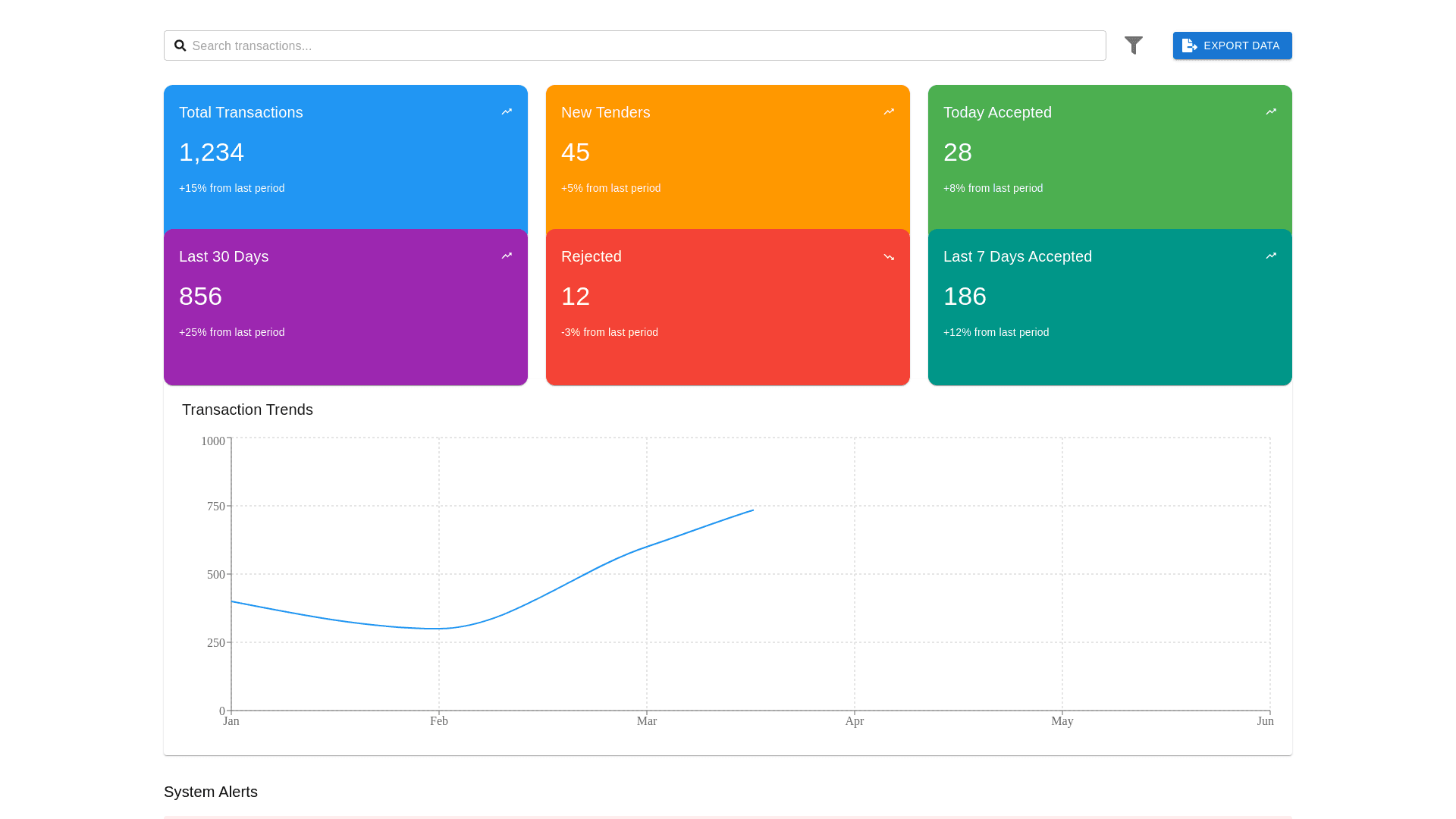
O enhance the EDI System Dashboard design and make it more functional, user friendly, and visually appealing, here's an improved approach: Dashboard Layout and Design Suggestions: 1. Visual Design Refinements: Metric Cards: Total Transactions (Blue): Display the total number of processed transactions, with a percentage change from the previous month (e.g., "+15% from last month"). This is the first card on the top left, giving users a high level view. New Tenders (Orange): Show how many new tenders are in progress. The "New Tenders" card can be next to Total Transactions, ensuring that users can quickly spot any new submissions. Today Accepted (Green): A green colored card with the number of tenders accepted today. This gives immediate feedback on recent activity. Last 30 Days (Purple): Displays the number of accepted tenders in the past 30 days. This card provides a snapshot of recent trends. Rejected (Red): Highlight the number of rejected tenders in the last 7 days. The red color will draw attention to potential issues and allow the user to address them quickly. Last 7 Days Accepted (Teal): Shows the number of tenders accepted in the past week, providing a more recent performance indicator. Recommendation for Card Design: Use rounded corners for a modern feel and apply subtle shadow effects to make the cards pop out against the background. Cards should display key metrics and important data in large, readable numbers. Subtext can provide additional context like percentage change or trends. 2. Transaction Trends: Line Graph for Trends: Improved Line Graph: Make sure the line graph is smooth (use spline curves) to show a clearer progression of transactions. Interactive Date Ranges: Add a dropdown for users to select date ranges like Last 7 Days, Last 30 Days, Last 5 Months, or a Custom Range for the graph. This gives users flexibility and more control over the data they view. Hover Effects: Implement hover interactions that show detailed data points when users hover over the graph. For example, "April: 600 Transactions" should appear when hovering over a specific point on the graph. Dual Axis Option: If you plan to compare multiple data points (such as accepted and rejected tenders), consider using a dual axis chart or a stacked bar chart. Recommendation for the Graph: The graph could dynamically update based on the user's selection from the time filter dropdown. It should also have clear labels on both the X and Y axes. 3. System Alerts Section: Alerts Section Enhancements: Create a dedicated alerts section beneath the graph or as a sticky bar at the top. This section will provide updates on critical issues, like failed transactions or errors. Critical Alerts (Red): For errors such as failed document processing. Warnings (Yellow): For non critical issues that still require attention. Informational Alerts (Blue): For system updates or information. Actionable Alerts: Allow users to click on the alert for more details or even to take corrective actions. Recommendation for Alerts: Sticky Alert Bar: This can be a persistent bar at the top of the page that changes color depending on alert severity (e.g., red for critical errors). Clear Action Buttons: Each alert could have a button or link like "View Details" or "Resolve Now," making it easy for users to act. 4. Navigation Menu Enhancements: Sticky Navigation Bar: A sticky navigation bar should be placed at the top of the dashboard, allowing users to easily navigate between sections such as Overview, Tenders, Responses, Issues, Invoices, EDI Log, and Partners without scrolling back up. Tab Navigation Improvements: Highlight the active tab with a bold font or change the background color of the active tab to provide visual clarity on which section the user is currently viewing. 5. Mobile Responsiveness and Accessibility: Responsive Design: Ensure the dashboard is fully responsive to fit any screen size. Elements like cards and graphs should adjust accordingly on smaller devices. On mobile, consider accordion style collapsible sections for metrics and data that need more space, ensuring ease of navigation. Accessibility: Ensure that colors used for alerts and graphs meet WCAG accessibility standards (e.g., using high contrast colors for readability). Include keyboard navigation and screen reader support for users who may have visual impairments. 6. Additional Features: Search & Filter Functionality: Add a search bar at the top of the dashboard for quick access to specific tenders, invoices, issues, etc. Filter options should be available for searching by date ranges, tender IDs, or partner names. Data Export: Provide an Export to CSV/Excel button near data tables (such as for invoices or tenders) to let users download reports for offline analysis. Visual Design Example: Header: Sticky navigation bar with clear, interactive tabs (e.g., Overview, Tenders, Issues). Main Dashboard: A grid layout with cards for each key metric (e.g., Total Transactions, New Tenders, Accepted Today). Graphs and Charts: A smooth, interactive line chart below the metric cards, with selectable date ranges. Alerts Section: Below the graph, showing critical system issues or updates with clear call to action buttons. Search & Filter Options: Positioned at the top right corner for easy access. With these suggestions, your EDI System Dashboard will have a clean, modern, and user friendly interface that provides actionable insights with interactive, dynamic elements. The design will improve usability, increase the speed of decision making, and help identify potential issues in real time. Let me know if you'd like to explore specific parts of this design further!