Edit Profile Page - Copy this React, Tailwind Component to your project
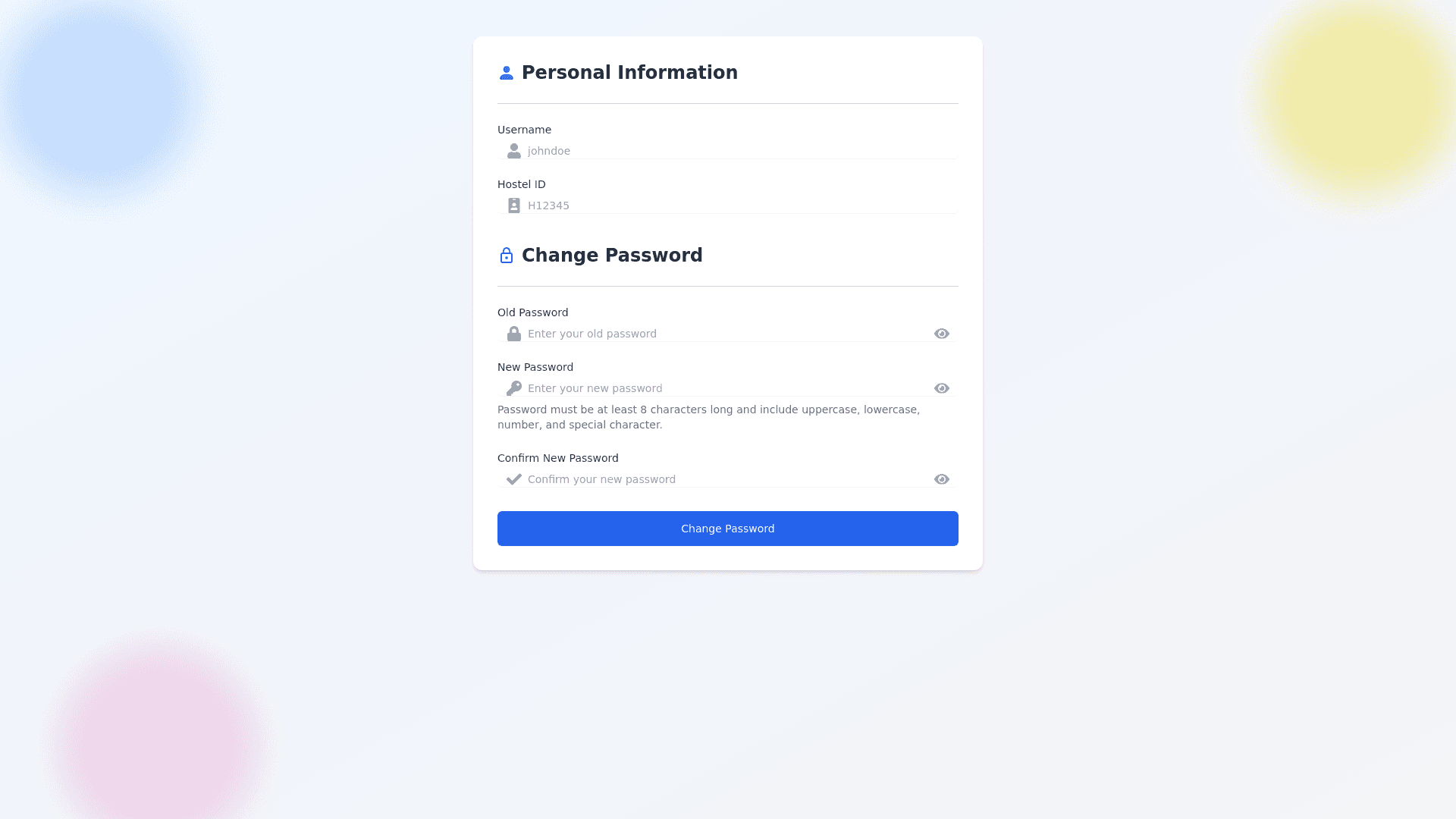
Design a modern and highly responsive Edit Profile Page with a clear and user friendly UI. The page should be divided into two main sections in the following order: 1. Personal Information Section (Top) Section Header: Label this section as "Personal Information" and include a profile icon next to the header for visual guidance. Horizontal Divider: Place a thin, subtle horizontal line right below the section header to visually separate this section. Username: Display the username in a read only input field (non editable). Add a user icon inside the field, aligned to the left for visual interest. Hostel ID: Display the hostel ID in another read only input field (non editable). Add a badge icon aligned to the left inside the field. Make sure the fields are properly spaced, with plenty of padding to create a clean, airy look. Use subtle shadows and a modern design with rounded corners to create a premium look and feel for input boxes. 2. Change Password Section (Bottom) Section Header: Label this section as "Change Password" and add a lock icon next to the header for a clear, visual cue. Horizontal Divider: Include another thin, soft colored horizontal line beneath the section header to separate it from the content above. Old Password: Create an input field (type: password) with a lock icon inside the field to the left. Add a small eye icon to allow users to toggle password visibility. New Password: Input field (type: password) with a key icon inside, aligned to the left. Include an eye icon for password visibility. Confirm New Password: Input field (type: password) with a checkmark icon to indicate confirmation. Include the eye icon for visibility toggle. Include tooltips or helper text near password fields to assist users with password strength requirements. Conclude this section with a "Change Password" button, styled with a color that contrasts the background but complements the overall theme. The button should be wide and easy to tap on mobile devices, giving it prominence. UI and Background Design: Use a soft gradient background with light colors (e.g., light blue or soft gray), and add subtle geometric shapes or abstract patterns in the corners to make the design lively but not distracting. Ensure that the icons and sections are harmonized for a clean, modern aesthetic. The layout should be fully responsive, working seamlessly on both desktop and mobile devices. Use ample white space and clear sectioning to avoid clutter and promote focus on the user’s task. The fields should have rounded corners with subtle shadows to give depth and a premium feel.
