Filter Component - Copy this React, Tailwind Component to your project
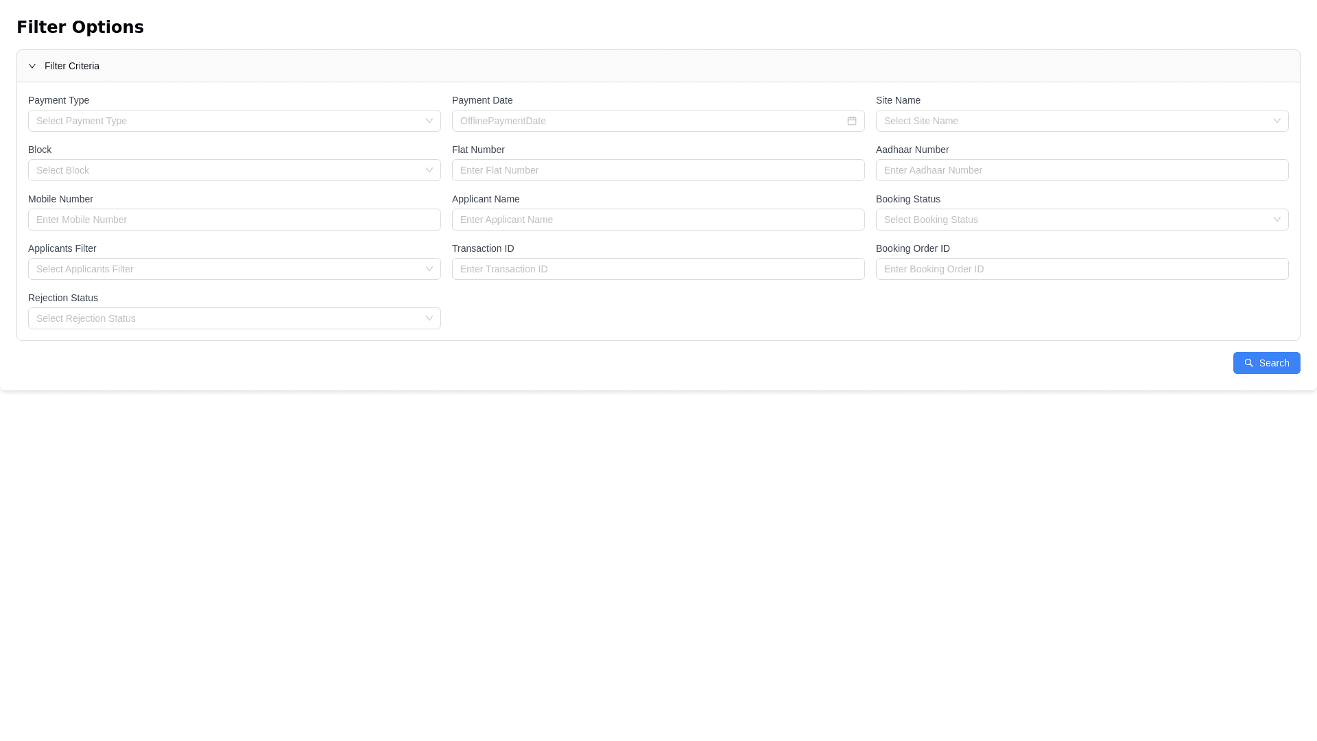
Objective: Create an elegant filter component using Ant Design (antd) components enhanced with Tailwind CSS animations. The UI should be visually appealing and user friendly, incorporating collapsible elements and a search button. Requirements: Payment Type: Dropdown selection (Ant Design single select) for "Online" or "Offline". Payment Date: Datepicker (Ant Design) for selecting either "CreatedAt" (Online) or "OfflinePaymentDate" (Offline). Site Name: Single select dropdown (Ant Design). Block: Single select dropdown with search capability (Ant Design). Flat Number: Text input field (Ant Design). Aadhaar Number: Number input field (Ant Design). Mobile Number: Number input field (Ant Design). Applicant Name: Text input field (Ant Design). Booking Status: Dropdown selection (Ant Design). Applicants: Filter for applicants with or without sub applicants. Transaction ID: Text input field (Ant Design). Booking Order ID: Text input field (Ant Design). Rejection Status: Single select dropdown (Ant Design) that requires prior development of rejection forms and processes. Additional Features: Implement a collapsible design to enhance user experience. Integrate a search button for easy filtering. Ensure all fields have appropriate labels for clarity.